
Elevated a community brand and website, resulting in 45% growth in sign-ups
Get a peek behind the scenes with Brandhero Studio! This case study showcases how our project made a real difference for the client, consumers, and everyone involved.
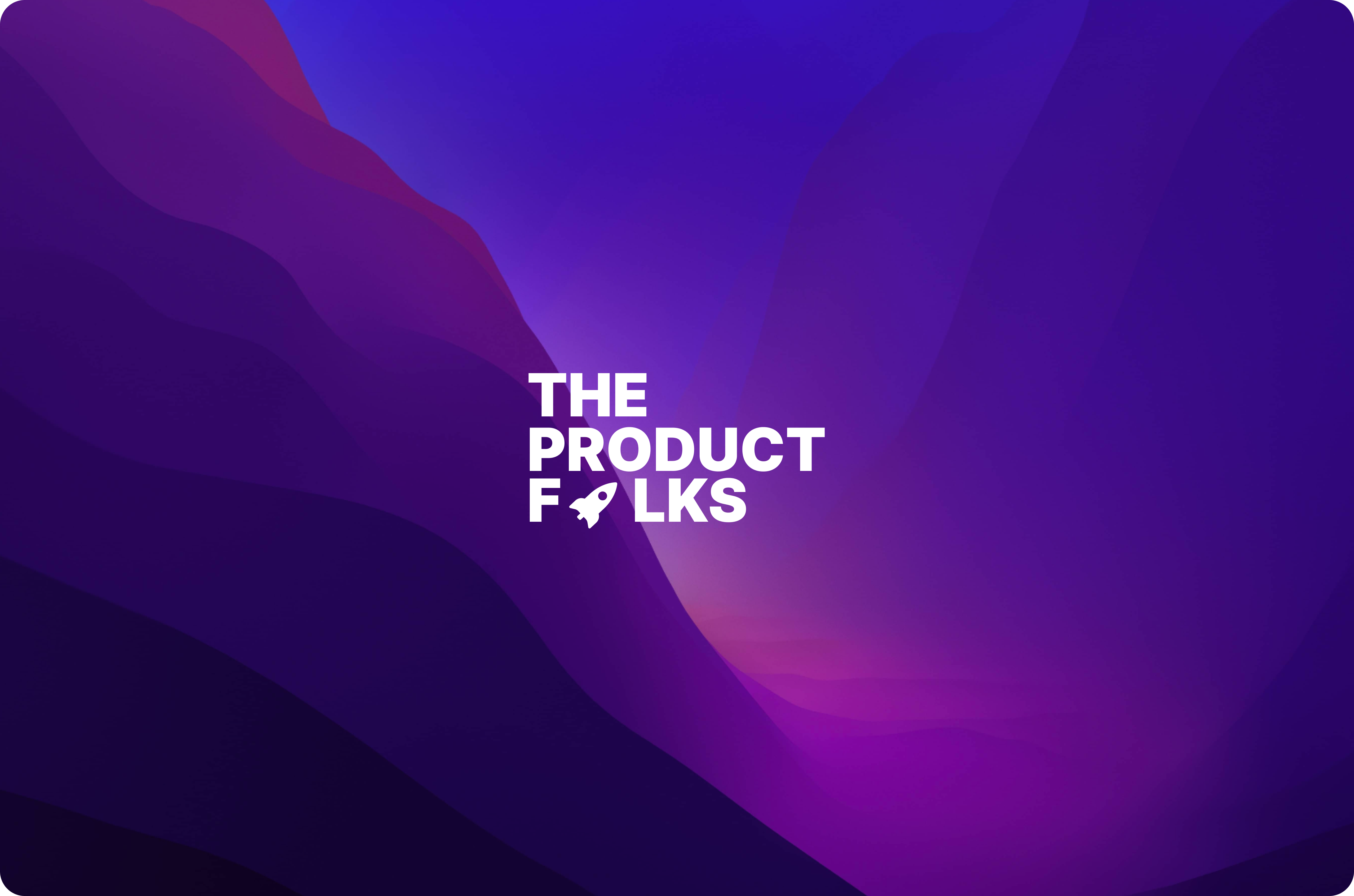
The Product Folks is a fast-growing, volunteer-led community that empowers product managers and enthusiasts through knowledge sharing, networking, and collaboration. With a strong digital-first presence, they serve professionals across industries such as technology, startups, SaaS, and education.

Your brand is a story unfolding across all customer touchpoint
- Jonah Sachs
Your brand is a story unfolding across all customer touchpoint
- Jonah Sachs
Challenge
The Product Folks needed a brand and website that reflected their energy, inclusiveness, and fast-growing presence—without losing their professionalism. The challenge was to strike a balance between a dynamic, community-first vibe and a clear, trusted voice in the competitive world of product management communities. They also needed a visual identity that would not only differentiate them but also engage users from the moment they landed on the site.
Approach
We focused on building a visual identity that could represent both the collaborative spirit and the professional edge of The Product Folks. The design process included a refreshed logo, a vibrant color palette, and a user interface that was simple, clean, and easy to navigate. Our goal was to design an experience that felt welcoming and functional—especially for users seeking resources, community updates, and events. Every design decision aimed to highlight their mission of shared growth while improving user experience across digital platforms.
Key Findings
The redesigned branding and website for The Product Folks led to a 30% increase in user engagement, enhancing their appeal in the product management community.
Engaging UX
The new website structure made browsing content and joining the community easier. A smoother flow encouraged users to explore, engage, and return more often.
Engaging UX
The new website structure made browsing content and joining the community easier. A smoother flow encouraged users to explore, engage, and return more often.
Engaging UX
The new website structure made browsing content and joining the community easier. A smoother flow encouraged users to explore, engage, and return more often.
Distinct Branding
With a fresh, modern identity, The Product Folks stood out clearly in the product space. The design reflected their tone—friendly, inclusive, and growth-focused—while reinforcing their credibility.
Distinct Branding
With a fresh, modern identity, The Product Folks stood out clearly in the product space. The design reflected their tone—friendly, inclusive, and growth-focused—while reinforcing their credibility.
Distinct Branding
With a fresh, modern identity, The Product Folks stood out clearly in the product space. The design reflected their tone—friendly, inclusive, and growth-focused—while reinforcing their credibility.
Market Visibility
Their new digital look significantly improved how they showed up online. More people discovered the community, and more users chose to stay and participate.
Market Visibility
Their new digital look significantly improved how they showed up online. More people discovered the community, and more users chose to stay and participate.
Market Visibility
Their new digital look significantly improved how they showed up online. More people discovered the community, and more users chose to stay and participate.
Results
The complete redesign helped The Product Folks become more visible, accessible, and trusted in the product management space. Community engagement rose as users found it easier to connect, explore resources, and attend events. The refreshed brand identity gave the team a clearer voice—and helped attract new contributors, partners, and members to their growing network.
Achieved
78%
Member Retention Rate
Achieved
78%
Member Retention Rate
Achieved
78%
Member Retention Rate
Established
4x
Industry Visibility
Established
4x
Industry Visibility
Established
4x
Industry Visibility
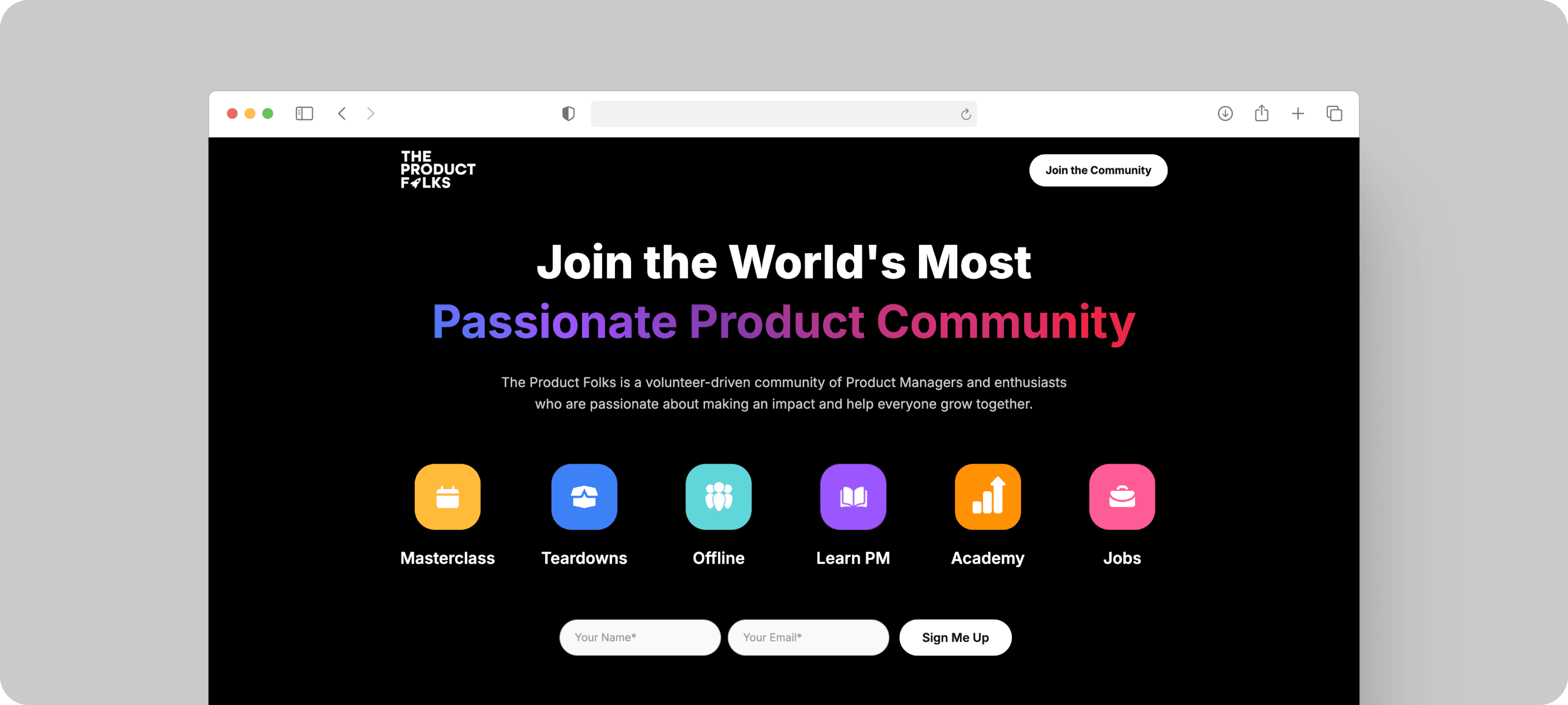
Brand Identification Result
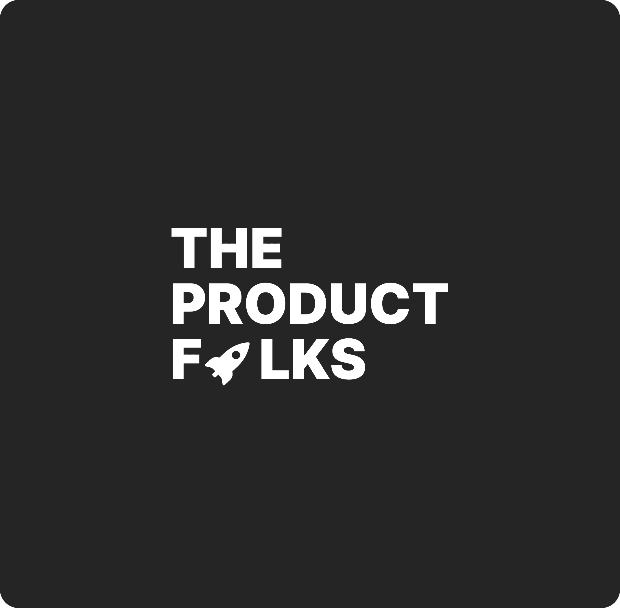
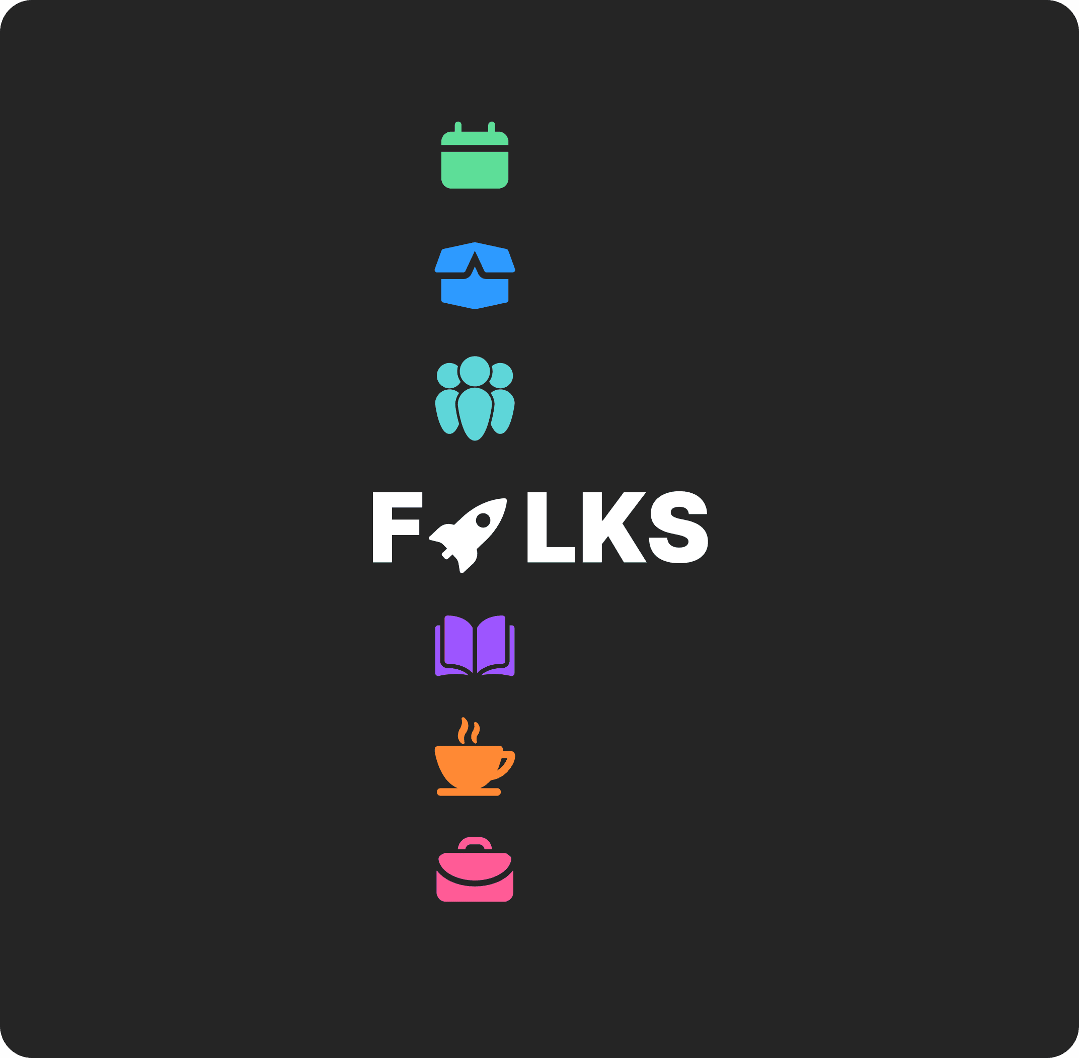
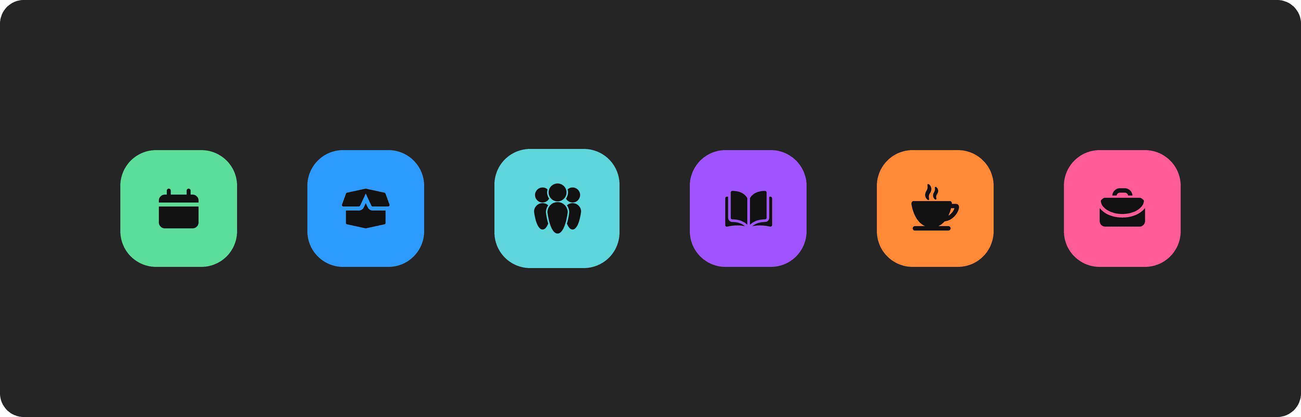
We created a brand system rooted in collaboration and inclusivity. The updated logo and bold, friendly colors gave the community a fresh identity that felt modern but approachable. Paired with clean fonts and playful elements, the visuals now better represent their open and growth-focused mission. Every design detail supports consistent storytelling across digital touchpoints.
Brand Identification Result
We created a brand system rooted in collaboration and inclusivity. The updated logo and bold, friendly colors gave the community a fresh identity that felt modern but approachable. Paired with clean fonts and playful elements, the visuals now better represent their open and growth-focused mission. Every design detail supports consistent storytelling across digital touchpoints.
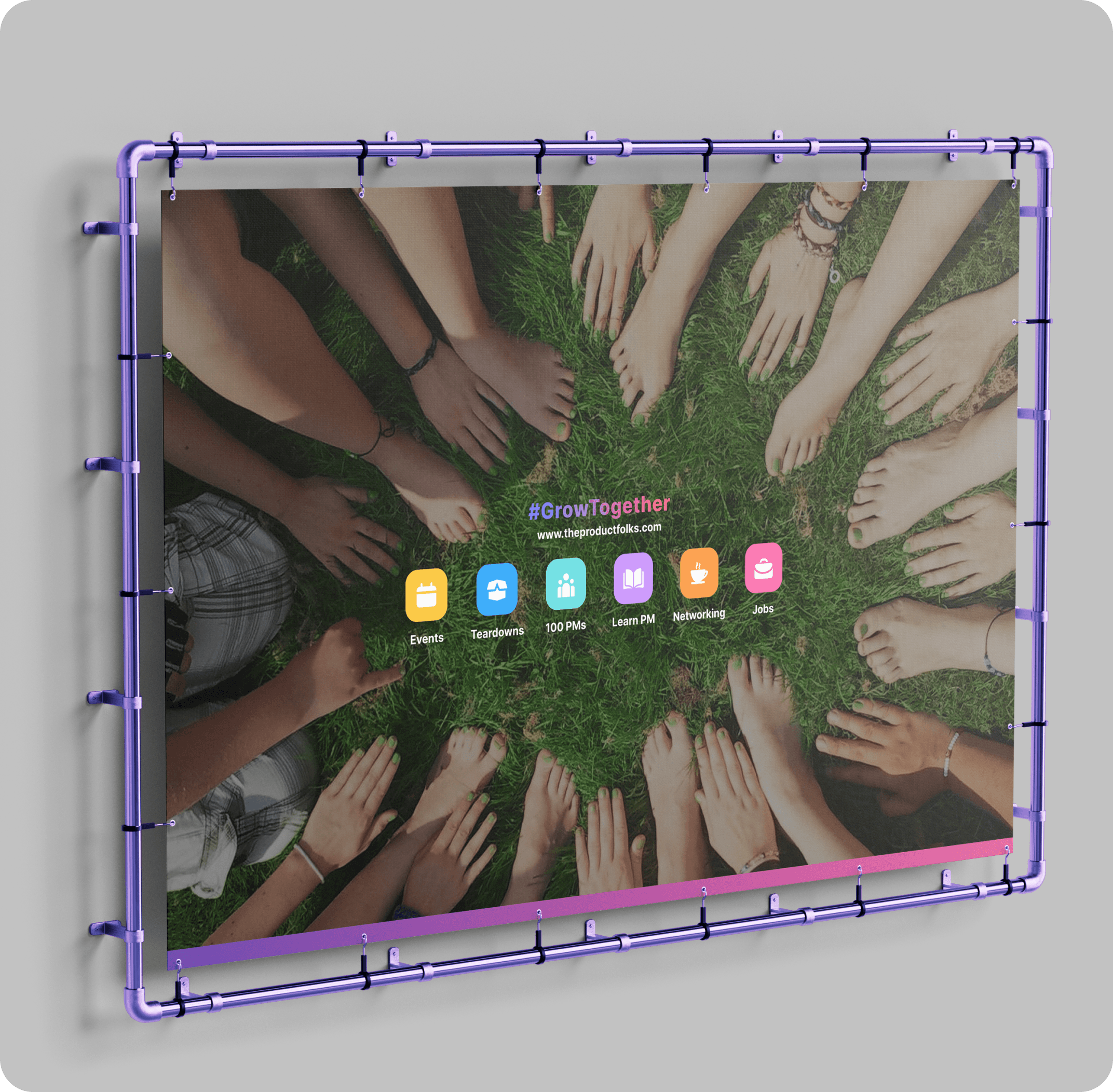
Mockups & Use Cases
We delivered mockups across various touchpoints—website, email, social media, and community event promos—to demonstrate how the brand adapts in real-world scenarios. These mockups helped the team apply the new identity with confidence and keep a cohesive look across campaigns and future initiatives.

Conclusion
The Product Folks rebrand successfully turned their vision into a digital presence that feels vibrant, professional, and easy to connect with. The new website and identity helped them reach more people, grow their user base, and strengthen their position as a go-to community for product managers and enthusiasts around the world.
Good Design is Good Business
- Thomas Watson Jr