
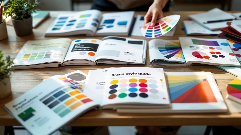
10 Inspiring Brand Style Guide Examples: Building Authentic Visual Identity
Why Brand Style Guides Make or Break Your Identity

Every interaction a customer has with your business shapes their perception of your brand. That's why brand style guides play such a crucial role - they ensure your company presents itself consistently and authentically across all channels. Think about seeing completely different logos, colors, and messaging from the same brand on various platforms. This kind of inconsistency makes it hard for customers to trust and connect with your brand. A well-crafted style guide acts as your north star, helping maintain a cohesive identity that builds recognition and loyalty.
The Importance of Authenticity and Consistency
Recent research from Stackla shows that 86% of consumers value authenticity when choosing brands to support. This highlights a key challenge - there's often a gap between how marketers think they're coming across and what customers actually experience. Brand style guides bridge this divide by providing clear frameworks for maintaining genuine, consistent communication at every touchpoint. When teams have detailed guidelines to follow, they can create content that truly reflects your brand's values and resonates with your audience.
Real-World Brand Style Guide Examples: Spotify and Urban Outfitters
Looking at successful brands shows how powerful style guides can be in practice. Take Spotify, whose guide goes beyond basic logo rules to include dynamic elements like motion graphics that perfectly match their music-focused identity. Their thoughtful approach to motion design creates an engaging, unified experience that helps them stand out in a competitive market.
Urban Outfitters offers another excellent example of effective brand guidelines. Their style guide enables seasonal refreshes while maintaining core brand elements through clear rules for photography, logo usage, and tone of voice. This balance of flexibility and consistency lets them stay current with trends while keeping their distinctive identity intact.
Measuring the Effectiveness of Your Brand Standards
Creating guidelines is just the beginning - you need to track how well they work. Key metrics like website traffic, social engagement, and brand mentions help measure impact. Your team's feedback about using the guide provides valuable insights too. Regular reviews based on this data and input help keep your brand identity strong and relevant. This active approach ensures your style guide remains a practical tool that helps your brand grow and connect with customers effectively.
Inside Spotify's Brand Guidelines

Spotify's brand guidelines go far beyond basic logo rules - they showcase how thoughtful design can create an engaging user experience. The guidelines emphasize motion design to build an identity that directly connects to music, the core of their platform. From animated album artwork to smooth transitions within the app interface, every dynamic element reinforces the natural energy and flow of music itself.
Creating Identity Through Motion
Motion plays a key role in making Spotify instantly recognizable. Their deceptively simple logo comes alive through subtle animations, often pulsing or transitioning smoothly as users navigate the app. This creates a sense of constant movement that mirrors their vast music library. The guidelines demonstrate practical ways to apply motion across album art and promotional materials while maintaining a unified look across different channels.
Striking the Right Balance
One of the biggest challenges brands face is keeping their identity consistent while allowing room for creativity. Spotify handles this by setting clear rules for essential elements like logo usage and color schemes, while giving creators freedom to interpret these guidelines across different formats. Their style guide includes diverse examples showing how to adapt brand elements for everything from social posts to large ad campaigns, proving that structure and creativity can coexist.
Building Community Through Color
The distinctive Spotify green does more than just help them stand out - it creates positive associations of growth and energy that enhance the user experience. But color is just one part of how Spotify builds community. Their guidelines actively embrace user-generated content, making playlist artwork and community features central to their marketing. This approach recognizes that users themselves shape the platform's identity and creates authentic connections.
Growing With Users
Rather than remaining static, Spotify's guidelines are designed to evolve alongside user behaviors and preferences. By carefully studying how people interact with their platform, they can update their brand while staying instantly recognizable. Their guide provides a foundation that can flex to incorporate new features without losing its core identity. This willingness to grow while maintaining consistency has helped Spotify maintain its position as a leader in music streaming, showing how brand guidelines can stay relevant by putting users first.
Urban Outfitters: Mastering Adaptive Brand Identity

Urban Outfitters stands out as an excellent example of maintaining a strong brand identity while staying current with changing trends. Their approach carefully balances connecting with their target audience while preserving the core elements that make their brand instantly recognizable. Let's explore how they achieve this through strategic seasonal updates and a well-crafted, flexible brand style guide.
The Art of Seasonal Rebranding
Every six months, Urban Outfitters refreshes its brand image to maintain relevance with its young, style-conscious customers who are always seeking something new. While frequent updates could risk brand consistency, Urban Outfitters succeeds by evolving visual elements while keeping their fundamental brand personality intact. For instance, they might update campaign aesthetics and promotional materials while maintaining their signature photography style and tone of voice. This approach satisfies their audience's desire for fresh content while ensuring the brand remains familiar and trusted.
Photography as a Cornerstone of Brand Identity
For Urban Outfitters, photography serves as a key element in their brand guidelines. Their detailed photography direction ensures a unified look across all channels - from their website and social media to store displays and print materials. The guidelines specify lighting techniques and color treatments that create a distinct visual identity. This careful attention to photographic style means customers can recognize Urban Outfitters content even as fashion trends change from season to season.
A Dynamic Brand Style Guide: Balancing Consistency and Flexibility
Urban Outfitters' brand guide provides clear direction on logo usage, colors, fonts, and brand voice while building in room for creative interpretation. Rather than rigid rules, their guidelines offer a framework that allows teams to respond to current trends while staying true to the brand's essence. This balanced approach helps various teams create content that feels fresh yet unmistakably Urban Outfitters.
Measuring Success and Adapting Strategies
The company takes an active approach to evaluating their brand standards by monitoring specific performance metrics. They track website visits, social media engagement, and sales data during rebranding periods. They also gather input from their creative teams about how well the guidelines work in practice. This data helps Urban Outfitters understand what connects with their audience and adjust their approach accordingly. By combining customer insights with performance metrics, they maintain a brand identity that stays relevant in the competitive fashion market while remaining true to their core values.
The Psychology Behind Successful Brand Colors
Just as we explored Urban Outfitters' branding approaches, color emerges as an essential element in any brand style guide. The impact of color on brand perception runs deep - studies show that 90% of quick product judgments are based solely on color. This makes selecting and documenting colors a fundamental part of building a strong brand identity. Let's explore how successful brands use color psychology to connect with their audiences.
Why Color Matters: First Impressions and Brand Recognition
Colors trigger immediate emotional responses that shape how people view a brand's personality. For instance, many banks choose blue in their branding because it conveys trust and reliability. Color also plays a key role in making brands instantly recognizable - think of the classic red of Coca-Cola or the distinct blue of Tiffany & Co. In busy markets filled with competing messages, these signature colors help brands stand out and stick in customers' minds.
Brand Style Guide Examples: Firefox and Spotify
Firefox's brand guide shows how to document color effectively. Beyond just listing their main colors - vibrant indigos and oranges - they detail exactly how to use these colors across different platforms and materials. This ensures their brand looks consistent everywhere. Similarly, Spotify's distinctive green has become central to their identity, creating positive links to growth and vitality. These examples demonstrate how well-planned color choices can become a core part of a brand's identity.
Building Flexibility Into Your Color Palette
While keeping colors consistent is key, brand guides should leave room for creative use. Your guide should outline primary brand colors but also include secondary and tertiary options, along with approved color combinations. This flexibility lets you adapt marketing materials and seasonal campaigns while staying true to your core identity. Including examples of different shades and tints creates a useful visual reference. The goal is finding the sweet spot between staying recognizable and being able to evolve.
Creating Practical Frameworks for Color Selection
Choosing brand colors requires more than personal preference - it needs a strategic approach considering your audience, values, and market position. Here's a practical framework for selecting colors:
Step | Description |
|---|---|
Define Brand Personality | Identify your key brand traits (e.g., playful, sophisticated, trustworthy). |
Research Target Audience | Learn how your audience responds to different colors. |
Analyze Competitors | Look at competitor color choices to find ways to stand out. |
Experiment and Test | Create sample palettes and get feedback from your target audience. |
Document and Implement | Record your final color palette in your brand guide with specific color codes (HEX, RGB). |
This structured method helps ensure your colors resonate with customers and express your brand message clearly. Through careful color selection and thorough documentation in brand guides, companies can build memorable visual identities that connect with their audiences.
Critical Components That Define Memorable Brands
A memorable brand requires much more than an attractive logo and catchy tagline - it needs a clear, consistent identity that resonates with the target audience across all touchpoints. At the heart of this is a well-crafted brand style guide, which acts like a musical score that sets the tone, rhythm, and flow for how your brand expresses itself. When everyone follows these guidelines, it creates a seamless and recognizable experience for your audience.
Brand Voice: Speaking With a Unified Voice
Your brand voice gives your communications a distinct personality and emotional quality, just like a person's unique way of speaking. This encompasses your word choices, tone, and the feelings you want to evoke. For example, Firefox's brand guidelines emphasize education in their communications, while Spotify's voice reflects their music-focused identity with energetic, passionate language. A clearly defined voice ensures consistency whether someone encounters your brand on social media, your website, or through customer service interactions.
Typography Hierarchy: Setting the Visual Tone
Typography does more than just determine fonts - it creates a visual structure that guides readers and reinforces your brand's character. Think of it as the architectural framework for your written content. A thoughtful typography system, like Urban Outfitters' detailed visual specifications, establishes which fonts to use for headlines, body text, and other elements. This creates both a consistent reading experience and strengthens your visual brand identity through careful organization and hierarchy.
Visual Elements: Painting a Consistent Picture
Your logo, color palette, and imagery form the building blocks that make your brand instantly recognizable. Just as Coca-Cola's signature red is unmistakable, your visual elements should be distinctive and applied uniformly. A comprehensive style guide details exactly how to use these elements across different contexts. For instance, Spotify provides specific logo variations for various applications to maintain recognition and impact. This attention to detail prevents diluting the brand and helps build strong visual recognition over time.
Creating a Living Document: Adapting to Change
While consistency matters greatly, brand guidelines shouldn't be rigid and unchanging. Markets evolve, and brands must adapt while staying true to their core identity. Your style guide should be regularly reviewed and updated to reflect changes in your brand, audience needs, and competitive landscape. Urban Outfitters exemplifies this by refreshing their brand image every six months for their trend-focused audience, while maintaining essential brand elements. This balanced approach between consistency and flexibility helps ensure long-term brand relevance and success.
Transforming Guidelines Into Living Brand Tools
A brand style guide must be more than a PDF collecting dust on a server. Instead, it needs to be an active resource that evolves with your organization. Think of it as a living system that grows alongside your business. But putting this into practice requires careful planning and strategic implementation. Let's explore practical ways to make your brand guidelines truly actionable.
Digital Implementation Techniques: Breathing Life Into Your Guidelines
Moving your style guide from a static document to an online platform makes it more accessible and easier to maintain. Everyone can access the latest version, and the digital format allows for interactive elements like video demos, practice exercises, and real-time feedback tools. This hands-on approach helps teams better grasp and apply the guidelines, building brand consistency across channels.
Measuring Guideline Effectiveness: Data-Driven Brand Management
Creating a dynamic guide is just the first step - you also need to track how well it works. Key metrics include how many teams are using the guide, how consistent content remains across channels, and how customers view your brand identity. This data reveals where guidelines are working well and where they need adjustment. Armed with these insights, you can fine-tune the guide to better serve your teams.
Adapting to Market Changes: Maintaining Integrity in a Dynamic Landscape
Urban Outfitters shows how to refresh branding while keeping core elements intact through seasonal updates. Your guide should provide clear frameworks for adapting to market shifts and trends. This balanced approach lets you update your brand expression while preserving the fundamental values and visuals that make your brand unique. The result? A fresh, engaging brand that still feels familiar and trustworthy to your audience.
Overcoming Common Pitfalls: Practical Solutions for Brand Consistency
Making guidelines truly effective means addressing typical challenges head-on. Teams often resist guidelines they see as too restrictive. The solution? Include them in developing the guide to build ownership. Another common issue is overly complex guidelines that are hard to use. Keep things clear and simple instead, making the guide easy to understand and apply. Spotify's guide sets a great example with its straightforward sections and clear examples. By tackling these challenges early, you create guidelines that truly help teams maintain consistent branding.
Ready to transform your brand's visual identity and create a consistent online presence? Brandhero Design, a leading UI/UX design agency, can help you build a dynamic and effective brand style guide. Visit Brandhero Design to learn more and take your brand to the next level.

