


You can usually save a bad photo. It just takes strategic cropping, aggressive filtering, and the confidence to frame mistakes as "conceptual choices." Blur effects, grain textures, and bold typography can redirect attention from weak image quality to the actual message.
Most startups run into this constantly. Marketing budgets never seem to cover photography needs. Stock images look generic, client photos arrive underexposed, and product shots lack polish. But deadlines don't wait for reshoots.
Why Bad Photos Happen (And Why They'll Keep Happening)
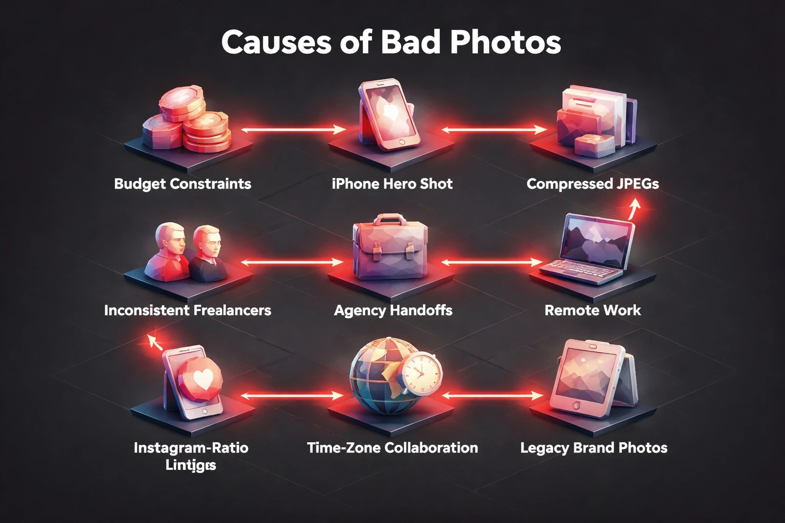
Budget constraints force most startups to prioritize development over aesthetics. A founder's iPhone shot becomes the hero image. A client emails compressed JPEGs from 2018. Freelance photographers deliver inconsistent quality. Agency handoffs lose original files.
Remote work made this worse. Teams collaborate across time zones with whatever assets exist. The engineering firm uploads machinery photos taken in poor warehouse lighting. The wellness brand sources product images from manufacturers who never considered Instagram ratios. Financial platforms inherit legacy brand photos that predate retina displays.
This isn't negligence. It's operational reality. Design teams inherit imperfect assets and have to deliver anyway. The skill isn't avoiding bad photos. It's designing around them so well that nobody notices.
The Cropping Strategy: Isolate What Works
Cropping eliminates distracting backgrounds and refocuses composition on the strongest visual element. Start by finding the 20% of your image that carries 80% of its impact. A product detail. A facial expression. An architectural line.
Tight crops create intimacy. A blurry conference photo becomes compelling when cropped to hands gesturing over a laptop. An overexposed office shot transforms into abstract shapes when you isolate geometric desk elements. Poor depth-of-field becomes irrelevant when you frame only the sharp foreground subject.
Don't feel trapped by aspect ratios. Square crops work for social platforms and remove awkward vertical space. Ultra-wide banners let you extract usable horizontal slivers from otherwise unusable photos. Portrait orientations can salvage the focused portion of landscape-oriented failures.
Tools matter less than judgment. Figma, Photoshop, or even Canva provide identical cropping power. The designer's eye determines which 30% of a bad photo has potential. Our approach at Brandhero emphasizes understanding user attention patterns where eyes land first determines crop boundaries.
Duotone and Color Overlays: Uniform Quality Through Limitation
Duotone filters apply two-color gradients that mask image quality issues while reinforcing brand identity. Poor exposure disappears when you map highlights to your primary brand color and shadows to a complementary tone. Inconsistent photo sets become cohesive series.
High-contrast duotones work best for maximum concealment. Map shadows to navy or black, highlights to vibrant accent colors. This works brilliantly for hero sections where bold statements matter more than photographic accuracy. Check our case study work to see how consistent color treatment unifies diverse client photography.
Gradient overlays add depth without requiring quality source material. Layer a subtle radial gradient from dark edges to lighter centers, drawing focus inward regardless of the underlying photo's composition. Linear gradients can simulate professional lighting that the original shoot lacked.
Blend modes equalize quality. Multiply modes darken and saturate, hiding noise in shadows. Screen modes lighten and blur, softening harsh contrasts. Color modes let you entirely replace hue while preserving luminosity structure bad color temperature vanishes instantly.
The threshold for "bad photo" rises dramatically once you commit to stylized color treatment. A mediocre image processed through a signature filter becomes a brand asset. Consistency matters more than individual photo quality when every image receives identical treatment.
Strategic Blur and Depth Effects: Make Softness Intentional
Blur transforms accidental softness into deliberate artistic choice. When your product photo lacks sharpness, add motion blur that suggests speed and dynamism. When your team photo suffers from poor focus, apply selective focus techniques that mimic expensive portrait lenses.
Gaussian blur backgrounds while keeping foreground elements crisp. This mimics the bokeh effect luxury cameras create naturally. Your audience reads intentional depth-of-field, not photographic failure. The technique works especially well for profile images and testimonial sections.
Radial blur creates energy around static subjects. A boring product shot gains movement when you apply outward blur from the center. An uninspiring office photo suggests productivity when motion blur sweeps across the frame. The original image quality becomes invisible beneath the effect.
Tilt-shift effects miniaturize and dramatize simultaneously. Apply gradient blur that keeps a horizontal band sharp while softening top and bottom areas. Suddenly your generic crowd photo becomes an artful aerial perspective. Your warehouse interior reads as intentional miniature modeling.
Professional photographers sometimes shoot sharp images then add blur in post-production. You're simply starting from the blur and claiming it as intentional. The UI/UX principles that guide user attention apply here selective sharpness directs eyes exactly where you want them.
Typography as the Hero: Let Words Carry the Design
Typography-forward designs reduce photos to textural backgrounds. When your image quality can't lead, let bold headlines dominate. Size text to 60-80% of your canvas, making photos secondary atmospheric elements.
Layer text directly over the weakest photo areas. Poor exposure in the upper third? Place your headline there with sufficient contrast treatment. Distracting background clutter on the left? Position your call-to-action button to cover it. Typography becomes functional concealment.
Create contrast through multiple techniques simultaneously. Color contrast: white text on dark overlays, dark text on light images. Size contrast: pair massive headlines with subtle body copy. Weight contrast: combine heavy display fonts with light supporting text. Spatial contrast: dense text blocks against spacious photo areas.
Text boxes with solid or gradient backgrounds provide guaranteed readability regardless of underlying image chaos. A 70% opacity black rectangle transforms any photo into a usable backdrop. Your message remains clear even when the image contributes nothing beyond color.
Typography hierarchy redirects attention from photographic weaknesses to strategic messaging. Visitors read your value proposition, not critique your image compression. This approach aligns with conversion-focused design psychology words persuade, images support.
Texture and Pattern Overlays: Add Complexity to Hide Simplicity
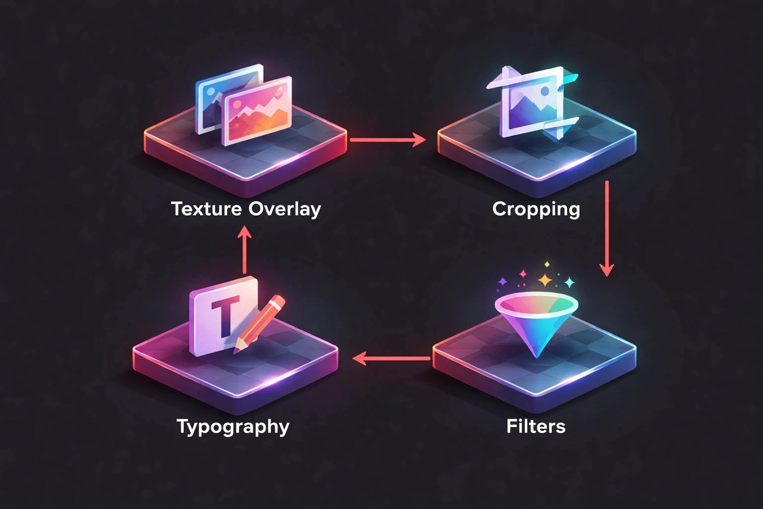
Texture overlays introduce visual interest that distracts from poor source material. Layer subtle grain, concrete textures, or fabric patterns at 10-30% opacity. The added complexity makes flat, boring photos feel intentionally textured and dimensional.
Halftone patterns convert photos into pop-art statements. Apply dot or line screens that abstract image details into graphic elements. Poor photo quality becomes irrelevant when the design language is deliberately pixelated or stylized.
Geometric pattern overlays create branded consistency across mismatched photos. Apply the same triangular mesh, hexagonal grid, or circular motif to every image in your library. Suddenly disparate quality levels feel like intentional variation within a cohesive system.
Noise and grain additions make digital photos feel film-inspired and authentic. Add analog texture that suggests vintage photography rather than modern failure. A grainy overlay transforms a cheap smartphone photo into something that feels deliberately lo-fi and honest.
These techniques thrive in our Webflow and Framer implementations where texture layers live as reusable components. One well-designed overlay system salvages hundreds of mediocre photos across a website's lifespan.
Illustration and Icon Integration: Supplement Weak Photography
Combine weak photos with strong illustrations that carry the visual load. Let custom icons or graphic elements dominate the composition while photos provide subtle contextual background. The illustration quality elevates overall perception.
Cutout techniques blend photos with graphic elements seamlessly. Extract the usable subject from a bad photo using careful masking, then place it against clean illustrated backgrounds. A poorly lit product shot becomes striking against abstract shapes or gradient backdrops.
Line art overlays trace photo elements while adding graphic sophistication. Apply edge detection filters to create outline versions of your photos, then layer these traced lines over color fields or patterns. The resulting hybrid feels intentionally graphic rather than photographically compromised.
This mixed-media approach appears frequently in modern startup branding where playful illustration balances serious photography. When photo quality varies, consistent illustration style provides the through-line that holds the visual identity together.
Composition Tricks: Frame to Minimize, Guide to Control
Strategic framing uses borders, shapes, and containers to minimize how much bad photo actually shows. Circle crops display only the best 40% of a headshot. Rounded rectangles create generous padding that reduces visible image area. Geometric frames become the design focal point.
Diagonal cuts and angular frames introduce energy while concealing problematic areas. Instead of full-bleed photos that expose every quality issue, use clipped shapes that reveal only successful portions. The frame itself becomes a branded design element repeated throughout your interface.
Collage layouts distribute visual attention across multiple images, reducing pressure on any single photo to perform. A grid of six mediocre photos creates more impact than one poor hero image. Varied sizing lets you emphasize the best shots while minimizing the weakest.
Negative space exploitation surrounds small photos with generous margins and solid colors. Rather than stretching a 800px image to 1920px width and exposing compression artifacts, display it at natural size with breathing room. The composition feels intentionally minimal rather than quality-constrained.
These compositional strategies appear throughout our portfolio work where client-provided photography receives thoughtful framing that maximizes strengths while minimizing limitations.
The Monochrome Solution: When Color Becomes the Problem
Black-and-white conversion eliminates bad color casts, mixed white balance, and unflattering skin tones. Poor color photography often becomes acceptable grayscale imagery. Remove the color problem entirely rather than attempting complex corrections.
High-contrast black-and-white treatments create dramatic impact from boring source material. Push shadows darker and highlights brighter. The resulting images feel intentionally artistic rather than accidentally mediocre. This technique particularly suits testimonials, team photos, and behind-the-scenes content.
Selective color techniques let you retain one accent color while converting the rest to grayscale. Highlight your product in color against a desaturated background. This focused approach draws attention away from overall photo quality toward your strategic color choice.
Sepia and warm monochrome tones add vintage character that reframes technical limitations as aesthetic choices. A slightly soft, poorly exposed photo becomes a nostalgic throwback when processed with warm brown tones. Context shifts perception dramatically.
Contextual Typography: Make Text Part of the Image
Integrate typography directly into photographic elements rather than layering it on top. Wrap text around subjects, flow it through negative space, or position it to follow compositional lines within the photo. This integration makes design feel cohesive despite source quality issues.
Text-as-texture approaches treat words like graphic elements that enhance rather than obscure. Repeat key terms at various sizes and opacities throughout the photo area. The typographic pattern becomes the design while the photo provides color and general atmosphere.
Outlined and stroke text creates separation without requiring photo overlays. When you can't darken or lighten the background sufficiently for contrast, add text strokes that ensure readability regardless of underlying image chaos. The technique works across varied photo tonality.
This philosophy extends to our mobile app design approach where text and imagery must work harmoniously within constrained spaces. Integration beats separation when quality is uncertain.
Establishing a Salvage System: Process Over Perfection
Create reusable Figma components or Photoshop actions that apply your go-to fixes consistently. Build a library of duotone presets, overlay textures, and framing devices. Systematize how your team responds to bad photos rather than reinventing solutions per project.
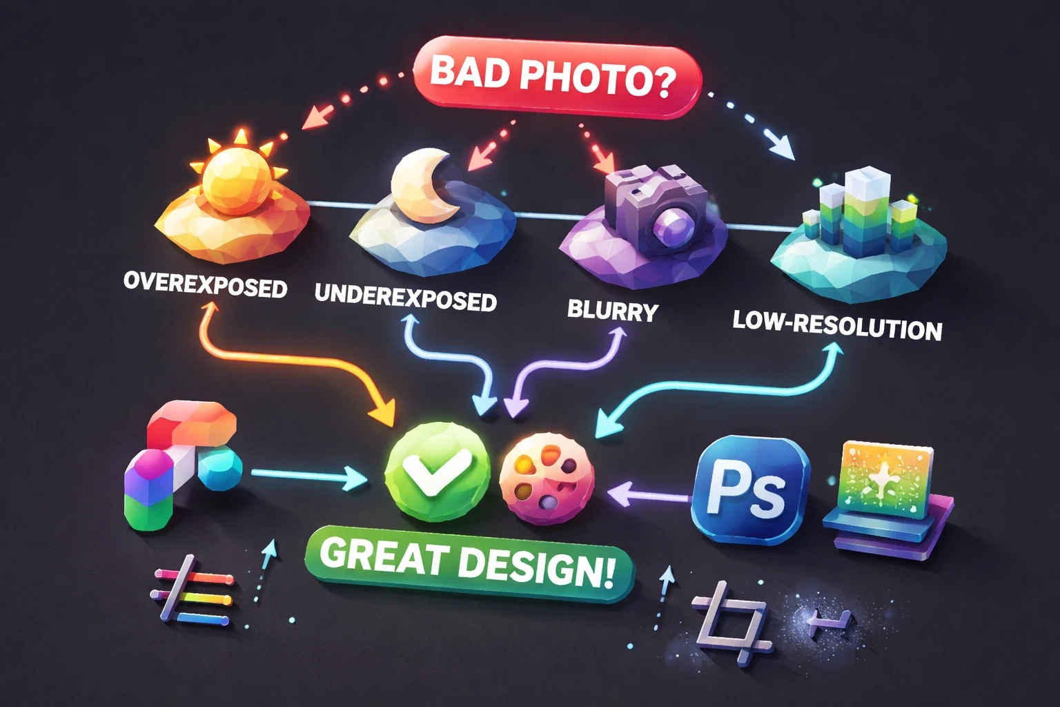
Document your decision tree. Overexposed images get overlay darkening. Underexposed photos receive gradient lighting. Blurry shots get motion blur. Low-resolution images become small, heavily filtered design accents. Consistency builds efficiency.
Brief stakeholders early about creative treatments. Frame your approach as a strategic brand decision rather than damage control. When clients understand that stylized processing is your signature aesthetic, they accept it across all photography rather than questioning individual image quality.
This systematic approach mirrors our end-to-end design process where repeatable frameworks produce consistent results even when variables like photo quality remain unpredictable.
Real-World Application: From Problem to Portfolio Piece
Consider a wellness brand launching with only founder-shot iPhone photos of their products. Direct photography fails. Lighting is flat, backgrounds are cluttered, colors are inconsistent. The deadline is immovable.
Solution: Apply a signature duotone treatment mapping all photos to brand purple and cream. Add subtle grain texture for analog warmth. Create generous white space around small, carefully cropped product images. Layer bold typography that communicates benefits while minimizing photo real estate. Use illustrated icons for feature explanations.
The result feels cohesive, branded, and intentional. Viewers perceive a deliberate design system, not photographic limitations. The "bad photos" become invisible within a stronger overall composition. Review our streamlined learning app case study to see similar problem-solving in action.
When to Reshoot vs. When to Design Around
Some photographic failures exceed design's ability to salvage. Blurred product details in e-commerce contexts undermine trust. Poorly lit team photos suggest unprofessionalism in corporate contexts. Recognize when design solutions create more problems than they solve.
Prioritize reshoots for hero images, conversion-critical product shots, and founder/team photography on about pages. These high-impact placements justify investment because they directly influence trust and conversion. Design solutions work better for supporting imagery, backgrounds, and decorative elements where perfect quality matters less.
Budget conversations should weigh design time against photography costs. Sometimes hiring a photographer for four hours costs less than design hours spent salvaging unusable images. Our project pricing insights often reveal that strategic photography investment early prevents expensive design workarounds later.
The Competitive Advantage of Constraint
Brands that master designing around imperfect photography move faster than competitors paralyzed by perfectionism. While others delay launches waiting for ideal images, you ship with what exists, beautifully treated. This velocity compounds into market advantage.
Your signature treatment becomes brand identity. Audiences recognize your duotone palette, your typographic boldness, your textural overlays. What began as limitation becomes differentiation. Constraint breeds creativity that unconstrained competitors never develop.
This mindset shift from "our photos are bad" to "our design system transforms any photography" unlocks consistent output despite variable inputs. It's the professional maturity that separates reactive designers from strategic ones. Our philosophy of "Design that Works" embraces real-world constraints rather than resisting them.
Building Your Photo Salvage Toolkit
Assemble these resources for consistent results:
Software essentials: Figma for layouts and component systems, Photoshop for advanced treatments, Webflow for implementation.
Preset libraries: Duotone color combinations matching brand guidelines, grain and texture overlays at various intensities, blur and filter effects calibrated to your style.
Frame components: Reusable shapes and masks at multiple sizes, branded border treatments, geometric containers.
Typography pairings: Pre-tested combinations that maintain readability over varied photo tones, size scales that work across different image qualities.
Reference collection: Screenshots of designs that successfully elevate weak photography, competitor examples of effective treatments.
This toolkit accelerates decision-making and ensures consistency across projects and team members. Build it incrementally as you solve real problems, documenting successful approaches for reuse.
Measuring Success: When Bad Photos Work Anyway
Track engagement metrics on pages using treated photography versus ideal shots. Often you'll discover that conversions correlate more with clear messaging and intuitive layout than photographic perfection. Users scan for information, not critique image quality.
A/B test heavily treated photos against cleaner alternatives when budget eventually permits reshoots. Sometimes your stylized "workaround" actually outperforms expensive new photography because it's bolder and more distinctive. Don't assume expensive equals better.
Monitor how treatments scale across devices. Designs that work brilliantly on desktop sometimes fail mobile when complex overlays become cluttered on small screens. Test your solutions across all contexts where they'll appear.
These validation practices connect to our UX research emphasis where real user data trumps designer assumptions about what "should" work.
Graphic design around bad photos is professional resilience made visible. It's the gap between theoretical design practice and actual business constraints. Master these techniques not as emergency measures but as fundamental skills that prove your strategic value beyond aesthetic judgment. When you transform unusable assets into effective communication, you solve the problems clients actually face rather than the theoretical challenges design education emphasizes. That practical problem-solving builds trust, retention, and referrals faster than perfect work with perfect inputs ever could.