


GOVERNMENT
Public information nobody can find isn't public
GIZ's platform held everything a citizen might need. Structure was the problem, not content. We rebuilt the information architecture and the interface around one measure: can someone unfamiliar with government language find the right service without knowing its name?
Industry


OVERVIEW
GIZ supports digital transformation of public services. Its platform carried a large and growing volume of public information, accumulated the way government content usually accumulates: correctly, comprehensively, and without anyone owning the shape of the whole.
Brandhero partnered with GIZ to redesign the experience — information architecture, a scalable UI component system, and navigation built for people who don't know the internal vocabulary of the organisation they're trying to use.
Public-sector design carries a constraint most commercial work doesn't. The interface has to feel trustworthy before it feels modern. Citizens who doubt a government service is legitimate abandon it, and no amount of visual polish recovers that.
The mission was:
Make public information simple to reach, easy to understand, and unmistakably credible.
Product Strategy
UI System
Website Experience


MISSION BRIEF
The portal lacked visual consistency and modern usability patterns. Large volumes of information were difficult to navigate, so users struggled to reach the service they came for - the specific failure that pushes people back to phone lines and counters, which costs the institution far more per interaction.
GIZ wanted improved navigation, a stronger information hierarchy, and a scalable interface capable of carrying future digital initiatives without another rebuild.
The platform needed to feel:
Clear
Accessible
Trustworthy
Modern
Easy to navigate


THE CHALLENGES
01
Managing Large Information Architecture
Government platforms contain extensive content that must remain organized, searchable, and easy to understand for all users.
02
Designing for Diverse Public Audiences
The platform needed to support users with different levels of digital familiarity while maintaining clarity and accessibility across every interaction.
03
Creating a Scalable Government UI
A flexible design system was required to ensure consistency across current services while supporting future platform expansion.
THE SOLUTION
01
A modern public-sector interface
Cleaner layouts and a stronger visual hierarchy, using contemporary patterns that improve usability while preserving institutional credibility.
02
Restructured navigation
Information architecture rebuilt so users reach services in fewer steps, organised around what people are trying to do rather than how the organisation is structured internally.
03
Scalable Design System
A consistent UI component library and visual framework supporting long-term maintainability across the platform.

KEY MOMENTS
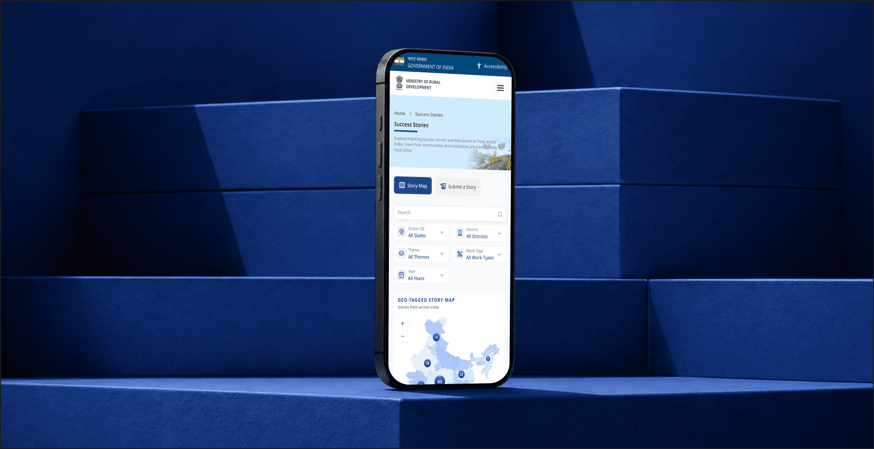
Every interaction was designed to make government information easier to discover while improving confidence and usability for public users.
We designed:
Government portal interface
Modern navigation system
Scalable UI components
Information architecture
Responsive digital experience
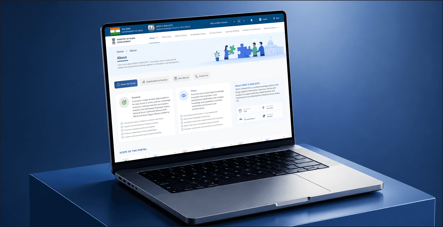
How can government services become easier for everyone to access and understand?
DESIGNING FOR CLARITY
Simplified information hierarchy
Intuitive navigation
Accessible layouts
Consistent visual system

MISSION COMPLETE
Building better public services through thoughtful design.
GIZ demonstrates how user-centered UX can modernize government platforms without compromising trust or accessibility. By combining intuitive navigation, scalable design systems, and a cleaner visual experience, we created a digital platform that helps citizens access information more easily while providing a stronger foundation for future public services.
The project successfully delivered a modern government portal redesign supported by a scalable UI system that improves consistency, usability, and long-term maintainability.
Because the best government platforms don't just provide information.
They help people find what they need with confidence.
