


FINTECH
A lending app rebuilt against the industry's own drop-off problem.
Digital lending loses more applicants than it keeps — industry research puts fintech onboarding abandonment as high as 68%. Klinq set out to be the exception: Brandhero designed the end-to-end mobile and web experience, from loan discovery to repayment and rewards, around removing exactly the friction that research says causes most of that drop-off.
Industry


OVERVIEW
Klinq is a digital lending platform built for young, salaried Indians who expect speed, clarity, and convenience in every interaction. Where traditional borrowing experiences often feel overwhelming and transactional, Klinq set out to build a modern alternative that puts users in control. Brandhero partnered with Klinq to design the complete end-to-end mobile and web experience - from onboarding and loan discovery to repayment, rewards, and long-term engagement.
The mission was simple:
Create a borrowing experience that feels effortless, transparent, and empowering.
End-to-End Product UX & UI Design
Mobile App & Web App
Conversion & Growth

MISSION BRIEF
The lending market was crowded with products that looked and behaved the same. Most experiences felt transactional, visually outdated, and filled with complex financial language that created hesitation instead of confidence. That hesitation isn't a Klinq-specific problem - it's the industry's defining one: Signicat's multi-year research puts average fintech onboarding abandonment at 68%, up from 40% in 2016, and a joint PIF and HooYu benchmarking study found the average digital lender completes onboarding for only about 74% of applicants, losing roughly a quarter to KYC friction alone. Klinq wanted to build against those numbers, not add to them.
The goal was to build a product that felt:-
Fast
Familiar
Trustworthy
Rewarding
Mobile-first
More importantly, it needed to remove the emotional friction that often prevents users from taking action.


THE CHALLENGES
01
Poor clarity
Users struggled to quickly understand eligibility, repayment structures, and loan benefits.
02
Lack of trust
Lending interfaces created hesitation & reduced confidence during decision-making moments.
03
Low Engagement
Most loan apps focused purely on transactions, creating little reason for users to return after borrowing.
THE SOLUTION
01
Better Clarity
Information was simplified into short, scannable sections that helped users understand their options instantly.
02
Strong trust
A clean visual hierarchy and transparent communication system created confidence throughout the borrowing journey.
03
Higher Engagement
Rewards, memberships, referrals, and loyalty systems transformed borrowing from a utility into an ongoing relationship


KEY MOMENTS
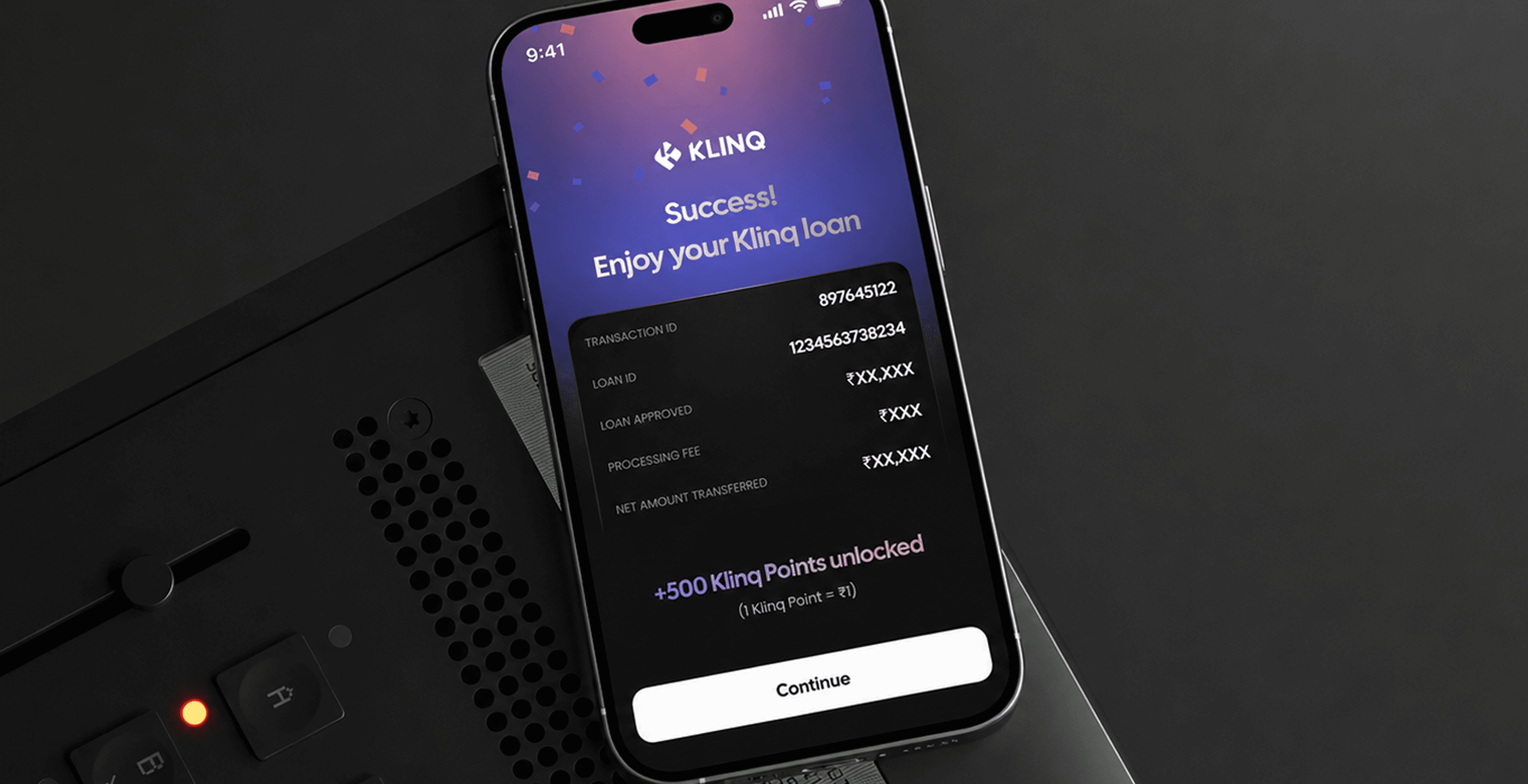
The entire experience was redesigned to remove hesitation at every step.
We streamlined:
Sign Up
Verification
Loan Selection
EMI Understanding
Repayment Actions
Every screen was designed to answer one question:
What does the user need to understand immediately?

The lending market was crowded with products that looked and behaved the same. Most experiences felt transactional, visually outdated, and filled with complex financial language that created hesitation instead of confidence.
DESIGNING FOR EMOTIONAL EASE
Friendly
Modern
Reassuring
Confidence-building
CREATING A VISUAL IDENTITY
Dark-mode-first UI
High-contrast layouts
Modern typography
Modular card-based systems

MISSION COMPLETE
Building a financial experience people actually want to use
Klinq demonstrates how thoughtful product design can transform complex financial systems into intuitive everyday experiences. Built against an industry where roughly a quarter of applicants abandon onboarding at the KYC stage alone, every screen was designed to remove a specific, well-documented reason people walk away — not a guess at one.

