


FINTECH
One visual redesign. A payments brand that finally looks as big as it is.
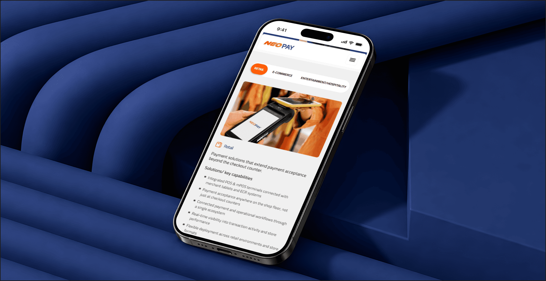
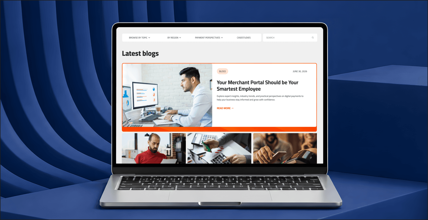
NeoPay — formerly Mashreq Bank's payments division, now backed by a $385M Arcapita–Dgpays consortium and positioned as the UAE's fastest-growing payment solutions provider — had a website that undersold the business behind it. Brandhero redesigned the visual experience to match NeoPay's actual scale: a cleaner interface, stronger hierarchy, and a presentation built for enterprise merchants sizing up a payments partner, not a smaller regional processor.
Industry



OVERVIEW
NeoPay is the UAE's fastest-growing payment solutions provider - formerly Mashreq Bank's payments division, now backed by a $385 million Arcapita–Dgpays consortium. Its platform spans merchant acquiring, card issuing, consumer payments, BNPL, data monetization, and SaaS-bundled payment tools, serving retail, government, hospitality, and e-commerce clients across the region.
That scale wasn't showing up on the website. Brandhero redesigned NeoPay's visual experience - layout, hierarchy, and interface - so the site could carry the same weight as a business now valued in the hundreds of millions, instead of reading like the smaller regional processor it started as.
The mission was simple:
Build a website that looks like the UAE's fastest-growing payments company, because that's what NeoPay actually is.
Website Redesign
Visual Experience
UX/UI


MISSION BRIEF
Financial services carries a trust problem before a single word of copy is read — Edelman's Trust Barometer has ranked it among the least-trusted industries globally for well over a decade. For NeoPay, that meant the website's visual credibility mattered more than most, and the site wasn't clearing that bar. Six distinct business lines were presented without a clear hierarchy, and the visual system didn't reflect a company now backed by a nine-figure investment consortium and positioned as the region's fastest-growing payments provider.
The goal was to build a platform that felt:
Modern
Trustworthy
Professional
Intuitive
Easy to navigate


THE CHALLENGES
01
Six business lines, one flat presentation.
Merchant acquiring, card issuing, consumer payments, BNPL, data monetization, and SaaS bundles all lived on the site with no hierarchy connecting them — reading as a feature list rather than one platform.
02
A trust deficit built into the industry.
Financial services starts every visitor interaction from behind — Edelman's Trust Barometer has placed it among the least-trusted sectors globally for over a decade *(source: Edelman Trust Barometer, multi-year tracking)*. A payments brand doesn't get the benefit of the doubt; the site has to earn it visually, immediately.
03
A visual identity that didn't match the valuation.
NeoPay's 2024 recapitalization by Arcapita and Dgpays implied a business worth roughly $385 million. The website's visual language hadn't caught up to what the company had become.
THE SOLUTION
01
One visual system across six business lines.
A consistent design system now carries merchant acquiring, issuing, consumer payments, BNPL, data monetization, and SaaS bundles as one coherent platform story instead of six separate pitches.
02
Trust signals built into the interface itself.
Cleaner layouts and stronger visual hierarchy work to establish credibility on sight, rather than asking a skeptical fintech visitor to read their way to trust.
03
A visual identity sized to the business.
The redesigned interface reflects a company backed by a nine-figure consortium and positioned as the UAE's fastest-growing payment provider.


KEY MOMENTS
Every interaction was designed to help users understand NeoPay's payment solutions while reinforcing confidence in the platform.
We designed:
Complete visual redesign across all product lines
A unified design system spanning six business lines
Modern, responsive interface
Improved information hierarchy
How can a digital payments platform communicate innovation while strengthening user trust?
DESIGNING FOR CLARITY
Simplified content hierarchy
Improved visual consistency
Clearer product communication
Intuitive navigation

MISSION COMPLETE
A visual identity that finally matches the business
NeoPay demonstrates how a redesign doesn't have to touch the product to change how a payments brand is read. By combining a unified design system, clearer hierarchy, and a more contemporary interface, the site now carries the same weight as a company backed by a $385 million consortium and positioned as the UAE's fastest-growing payments provider - instead of underselling it.
Because the best fintech brands don't just process transactions. They look like they're worth trusting with the next one.

