

Chicago UI Design Principles: Practical Modernism for Midwestern Users
Brandhero Team
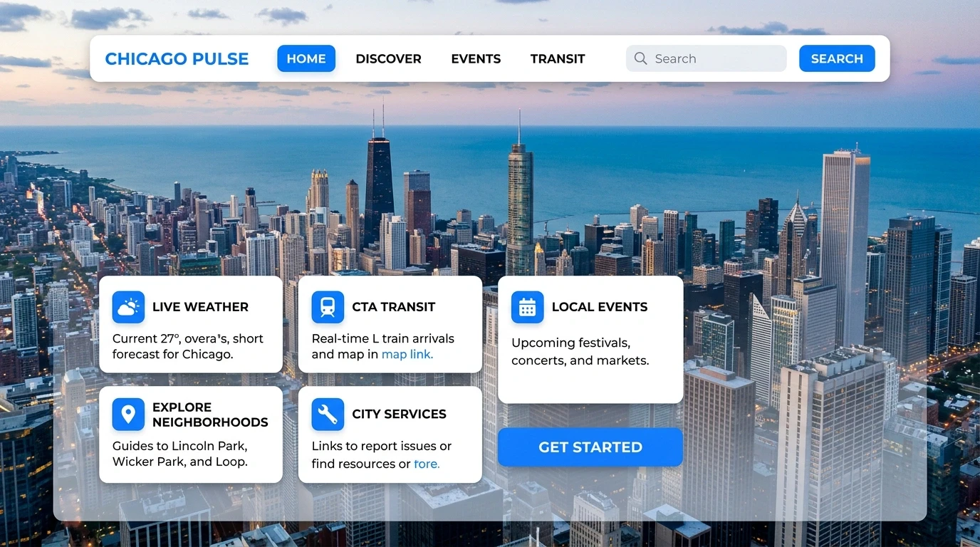
Discover Chicago's unique UI design approach rooted in practicality and Midwestern sensibilities. Learn how to create effective digital products that convert.
Chicago design punches hard. Bauhaus modernism shaped this city's skyline. Now that same practicality is hitting screens in the tech corridors up and down the river. But here's the thing: great UI in Chicago isn't about chasing what's trending in San Francisco or New York. It's about how Midwestern users actually think, click, and convert.
If you're building a digital product in this market, the interface decisions you make now determine whether you're relevant in a year. Here's what makes Chicago UI different and how to use that.
Why Chicago UI is Different
Chicago isn't San Francisco. It isn't New York. That's the point.
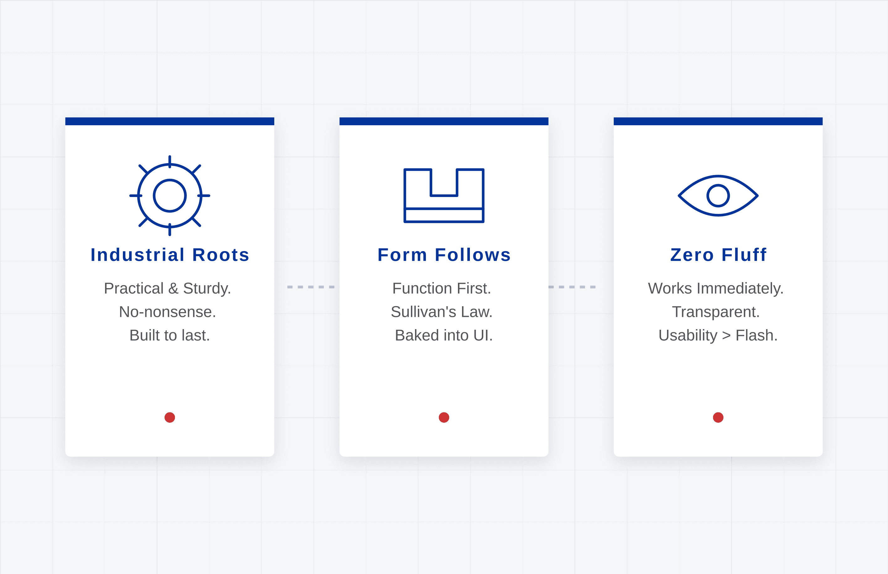
The design ethos here comes from industrial roots. Practical. Sturdy. No-nonsense. When Louis Sullivan said "form follows function" in the 1890s, he wasn't just talking about buildings. That philosophy is baked into how Chicago approaches digital now.
Local users expect interfaces that work immediately. They have zero patience for clever interactions that sacrifice usability. They'd take transparency over flashiness every time. So the challenge becomes: how do you build something that feels modern while respecting that pragmatic sensibility?
The answer is handling complexity under the hood. Present something clean on top. Think about the L passengers tap a card and go, while underneath there's a complex grid system making it happen. That's the model.
Where Chicago Companies Mess Up
I've looked at hundreds of digital products from Chicago-based companies. Same problems show up again and again.
The homepage as museum. Companies treat their homepage like a showcase for every feature they've built. Chicago users especially in B2B, which dominates here want to understand what you do in seconds. If you're a financial services firm and your differentiator is buried three screens deep, you're handing leads to competitors.
Mobile as afterthought. Despite all the desktop workers in this city, 67% of first-time visitors to local business sites come via mobile. Yet companies still design for desktop first and cram mobile in later. Key actions get buried. Things break on smaller screens.
Load time denial. Chicago winters feel endless. Users won't wait through loading screens that feel the same. Every 100ms of delay drops conversion by roughly 7%. If your interface needs 15 HTTP requests before anything meaningful shows up, you've already lost.
Principles That Actually Matter
Tactical stuff. Here's what separates interfaces that convert from ones that confuse:
Visual hierarchy that works. Users' eyes follow patterns F-pattern for text-heavy stuff, Z-pattern for landing pages. Work with those behaviors, not against them. Primary CTAs should be 40-50% larger than secondary options. High-contrast draws attention. White space isn't waste; it's what makes important things visible. For Chicago B2B, this means contact options and demo requests are unmissable.
Consistency. Inconsistent interfaces scream unprofessional. When button styles shift between pages, when navigation moves around, when terminology varies users wonder if they can trust you. Build a design system. Define your colors, typography, components, spacing (multiples of 4 or 8 work well). Document it. Share it. Treat it like code, because inconsistent design is technical debt that compounds.
Feedback loops. Users should never ask "did that work?" Submit a form, get confirmation instantly. Loading data, show skeleton screens that preview structure not spinners that mean "wait indefinitely." Something breaks, explain what went wrong and how to fix it. Chicago business culture likes directness. Apply that to copy. Don't say "An error has occurred." Say "We couldn't save your changes because the file is too large. Try under 10MB."
Accessibility as baseline, not bonus. 26% of U.S. adults have disabilities. That's $490 billion in disposable income. But accessibility helps everyone high contrast helps in bright offices, clear typography helps on commutes, keyboard navigation helps power users. Start here: 4.5:1 contrast ratio for text, 3:1 for UI components, keyboard-accessible interactive elements, proper heading hierarchy, labels on forms, error states that aren't just color changes. Test at 200% zoom. If it breaks, fix it.
A Process That Works
Theory is fine. Execution matters. Here's what I see work:
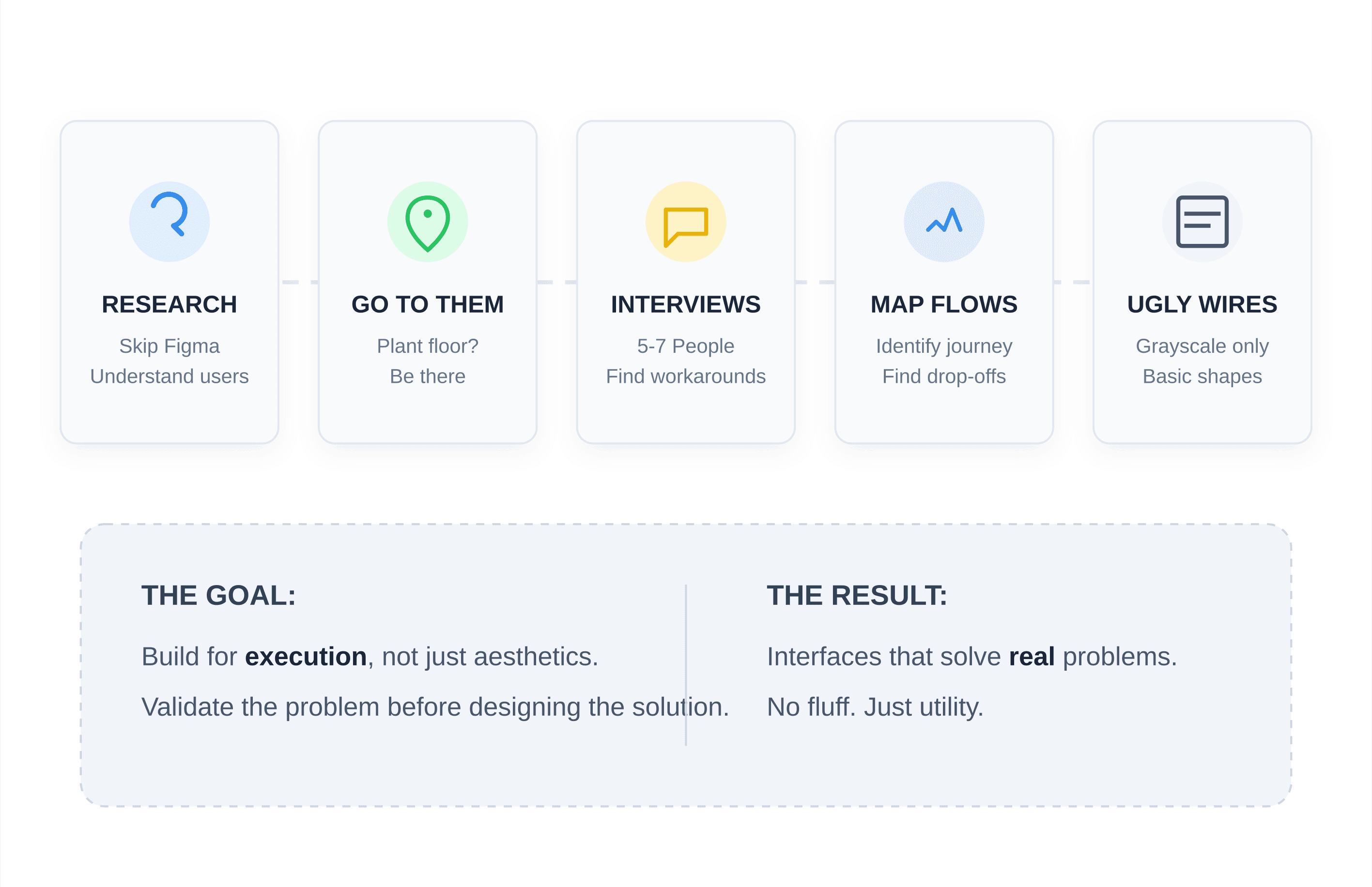
Research before Figma. Most projects start with a designer opening their laptop. Wrong. Start with understanding. Who are your users? What are they trying to do? What's in their way? Go where they are. Building for manufacturing? Visit a plant floor. Healthcare? Shadow administrators. Interview 5-7 people from your target audience. Ask about workarounds those reveal what existing interfaces don't provide. Map user flows. Find where people drop off.
Ugly wireframes. Wireframes should be deliberately ugly. Grayscale. Basic shapes. Strip away anything that makes people judge aesthetics. You're testing logic, not beauty. Does the structure make sense? Is hierarchy clear? Get feedback here. Changes cost hours at this stage. After visual design? Days. After development? Weeks. For complex stuff, build clickable prototypes with gray boxes. Test navigation flows before you add polish.
Systems, not screens. Don't design individual screens. Design systems that generate them. Build component libraries in Figma buttons, forms, cards, nav elements as reusable components. When you need a button, use the component. Update once, it changes everywhere. If you're working with UI/UX agencies, make sure they deliver a documented component library. 50 individual screens with no system underneath? That's just pretty pictures.
Prototype what matters. Not every screen needs high-fidelity. Focus on critical paths: signup, checkout, complex workflows. Build interactive prototypes with real content, not Lorem Ipsum. Add transitions. Watch people use it without help. Where do they pause? Click wrong? Give up? That's where you learn.
Chicago-Specific Stuff
B2B heavy. Chicago's economy leans enterprise. Your interface serves multiple stakeholders, long sales cycles, ROI-focused buyers. That means clear value above the fold, easy sales contact, accessible case studies, IT-compatibility, and enterprise security.
Diverse demographics. Chicago is the most demographically balanced major city in the U.S. Don't assume a homogenous user base. Test with different groups. Consider multi-language support for specific neighborhoods, cultural appropriateness of imagery, various assistive technologies, and device diversity iPhones in Lincoln Park, budget Androids elsewhere.
Transit usage. Extensive public transit means lots of mobile browsing during commutes. Design for thumb-friendly touch targets (44x44 pixels minimum), readable typography on moving trains, quick-resume when signals drop in tunnels, and PWA capabilities for spotty connections.
Weather extremes. Gloves make touchscreens struggle. Bright summer sun washes out low contrast. Dry winter air affects touchscreen responsiveness. Make targets large enough for imprecise taps. Ensure contrast works outdoors. Don't rely on hover states (mobile has no cursor).
Tools Chicago Teams Use
Figma for collaboration. Real-time collaboration, cross-platform, dev integration. Chicago teams use shared component libraries, auto-layout for responsive systems, developer handoff with CSS specs, and version history.
Design tokens. Translate design decisions into developer-ready formats. Instead of "use primary button," tokens give exact hex values, padding, typography. Bridges the design-dev gap. Webflow supports token workflows natively.
Accessibility checkers. Automated tools catch issues during design contrast validators, heading analyzers, keyboard simulators, screen reader previews. They don't replace human testing, but they catch obvious problems early.
Performance tools. Designers can't ignore performance anymore. Image optimizers, SVG for icons, font subsetting, critical CSS extraction. Chicago markets punish slow sites. Core Web Vitals impact search rankings. Beautiful interfaces that don't load are worthless.
Common Mistakes
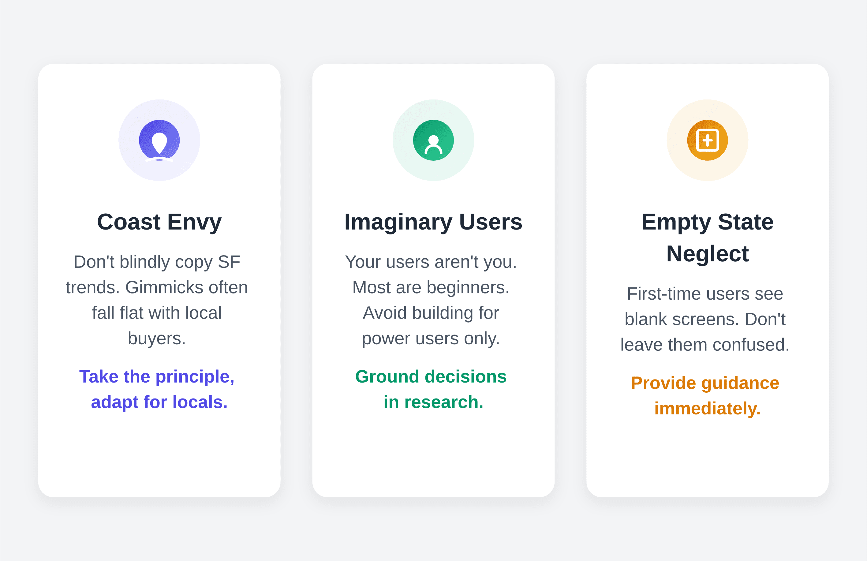
Coast envy. What works in San Francisco doesn't always work here. Overly casual copy, gimmicky interactions, trendy aesthetics that sacrifice clarity they might play on the coasts but fall flat with Midwestern buyers. Take the principle (more white space, say) but implement for local sensibilities.
Imaginary users. Your users aren't you. They don't have your context or mental model. Startups build for power users when 80% of their audience are beginners. Ground decisions in research. When someone suggests a feature, ask: "How do we know users need this?"
Empty state neglect. First-time users see empty states. No results? Filters return nothing? Lists unpopulated? These are conversion moments. Explain what appears after action. Guide next steps. Reduce anxiety. Blank screen signals abandonment. Helpful empty state signals polish.
No performance budget. Beautiful interface with 5-second load time is a failure. Set limits: under 1MB initial load, minimal requests, Largest Contentful Paint under 2.5s, First Input Delay under 100ms. Use system fonts. Optimize images. Lazy-load below-fold content. You're competing with products that load instantly.
Measuring Success
Design without measurement is decoration.
Task completion. Can users do what they came for? Set up tasks "find enterprise pricing" or "complete a purchase" and measure success rates. 80%+ on primary tasks. Anything lower means interface problems.
Time on task. How long does it take? Faster isn't always better, but huge variations between users suggest inconsistent experience.
Error rate. How often do users mess up? Wrong nav clicks, incomplete forms, bad selections, abandoned processes. Each error is friction. Fix through better affordances, clearer labels, simplified flows.
Satisfaction. Qualitative matters. Post-task surveys (System Usability Scale is standard), Net Promoter Score, support ticket analysis, user interviews. Chicago users give direct feedback. Use it.
Business metrics. Conversion rates, revenue per visitor, acquisition cost, lifetime value, support costs. Interface changes should move these numbers. If they don't, something's wrong.
What's Coming
AI personalization. Interfaces that adapt remembering preferences, suggesting content, streamlining repeated tasks are becoming expected. Not creepy tracking, just smart defaults. Finance and healthcare benefit most here.
Voice and multimodal. Visual interfaces are one option now. Consider voice commands for common tasks, mixed voice-and-touch interactions, conversational UI for complex workflows. Manufacturing and logistics need hands-free operation.
Progressive Web Apps. Line between websites and apps is blurring. PWAs give app-like experiences through browsers offline functionality, push notifications, home screen installation without app store friction. One codebase, all platforms.
Inclusive design. Accessibility is becoming competitive advantage, not compliance checkbox. Build inclusive from the start, capture broader audiences, avoid costly retrofits. Chicago's aging population makes this relevant designs for declining vision and mobility changes serve everyone.
Where to Start
Audit your current interface. Where does hierarchy break down? Where's feedback unclear? What accessibility problems exist?
Research actual users. Stop assuming. Five interviews teach more than a hundred stakeholder opinions.
Build a design system. Document colors, typography, components. Improve consistency dramatically.
Prototype before building. Test with real users. Design time saves development multiples.
Measure continuously. Track behavior. Make decisions on data, not opinions.
For expertise beyond internal teams, a UI/UX design agency can accelerate results while building your capabilities.
The Chicago Thing
Chicago design has something rare: coastal creative ambition plus Midwestern practicality. We're not designing for awards. We're designing to solve real problems for real users.
Form follows function. Beauty serves purpose. That's how Chicago built a skyline that still inspires. It's how we build digital products that work.
Your interface is your digital handshake. In Chicago, handshakes matter. Make yours firm and real.
Explore all blogs

Jun 18, 2026
Enhancing Customer Service Through UX Design & Strategic Audits
Enhancing Customer Service Through UX Design & Strategic Audits

Jun 16, 2026
User Insights: Unlocking Design Decisions with Data
User Insights: Unlocking Design Decisions with Data

May 31, 2026
User Experience Optimization: Boost Conversion & Retention
User Experience Optimization: Boost Conversion & Retention

May 31, 2026
User Experience Optimization: Fixing Friction for Growth
User Experience Optimization: Fixing Friction for Growth

May 11, 2026
Phone Number Chunking: Reduce Errors & Improve Conversion Rates
Phone Number Chunking: Reduce Errors & Improve Conversion Rates

May 9, 2026
Mastering Gating in UI/UX Design: Convert Without Pushing
Mastering Gating in UI/UX Design: Convert Without Pushing

May 7, 2026
Gestalt Laws Explain Visual Grouping for Designers
Gestalt Laws Explain Visual Grouping for Designers
May 6, 2026
Checklist for Evaluating Microinteractions in UX
Checklist for Evaluating Microinteractions in UX