


User experience optimisation is just the practice of fixing the friction between your users and your product. Most startups treat UX as a one-time design phase ship it and move on then wonder why engagement drops or support tickets pile up. Today, when users expect AI-native speed and zero learning curves, the difference between a product that grows and one that stagnates is often just how much you keep refining after launch. This is the framework, toolset, and process we use at Brandhero to deliver UX-focused websites that actually convert.
Why this matters right now
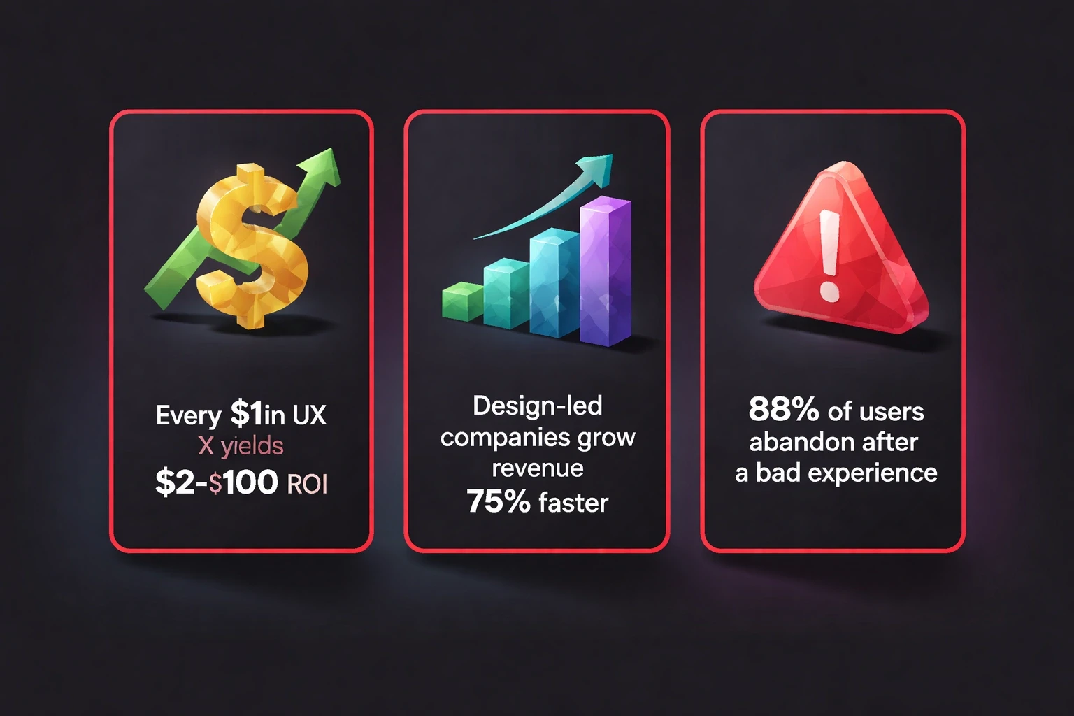
The numbers are hard to ignore. Forrester Research found that every dollar invested in UX returns between $2 and $100. Design-led companies grow revenue 75% faster than competitors. On the flip side, 88% of users won't return to a site after a bad experience.
Expectations have shifted. AI chatbots set a standard for instant feedback. Voice interfaces removed typing friction. Users now expect personalization and sub-second load times. If your product needs a tutorial, you are already behind. At Brandhero, we have seen clients get 42% faster task completion and 45% growth in sign-ups just by building feedback loops into the workflow from day one.
Five areas to focus on
We usually break this down into five elements: usability, accessibility, performance, content clarity, and emotional resonance.
Usability: Cutting the friction
Usability is simply how easily people get things done. Every extra click or confusing label adds friction. Psychological UI/UX design works because it leans on mental models people already have.
Run task-based usability tests monthly. Watch five users try to do core things without helping them. Note where they pause or misclick. Tools like Hotjar and Microsoft Clarity show you rage clicks and dead zones in real time.
Follow Jakob's Law: users spend most of their time on other sites, so they want yours to work the same way. Don't reinvent navigation patterns unless you have hard data showing your way is better.
Accessibility: Designing for everyone
Accessible design expands your addressable market by 15-20%. The Web Content Accessibility Guidelines (WCAG) 2.2 are the standard now. They require interfaces that are perceivable, operable, understandable, and robust.
Audit your product quarterly. Use tools like Axe DevTools and do manual keyboard navigation testing. Make sure color contrast ratios hit at least 4.5:1. Provide text alternatives for images.
Our case studies show that accessibility improvements help everyone. When we designed a bilingual finance app for India's gig workers, high-contrast modes and voice navigation upped task completion by 42% across all user segments not just users with disabilities.
Performance: Speed is a feature
Google's research shows 53% of mobile users leave sites that take more than three seconds to load. Users now expect sub-second interactivity.
Measure Core Web Vitals weekly. Keep Largest Contentful Paint (LCP) under 2.5 seconds, First Input Delay (FID) under 100 milliseconds, and Cumulative Layout Shift (CLS) under 0.1. Lighthouse and WebPageTest give you the diagnostics.
For Webflow and Framer websites, we turn on automatic compression and edge caching via Cloudflare to keep things fast globally. Also, use skeleton screens during load states. Show progress indicators for anything taking over a second. Perception matters as much as the actual load time.
Content Clarity: Writing for scanners
Eye-tracking studies show people scan in F-patterns or layer-cakes. They skim headings and the first few words of paragraphs. They rarely read word-for-word.
Structure your content with that in mind. Use descriptive headings. Front-load key information. Break long paragraphs into 2-3 sentence chunks.
Run content audits regularly to kill outdated info and simplify jargon. Tools like Hemingway App flag complex sentences. Aim for Grade 8 readability. Also, test your navigation labels with card sorting. Often, the internal terminology your team loves makes no sense to users.
Emotional Resonance: Building trust
Don Norman's three levels of design visceral, behavioural, and reflective explain how users form impressions.
Visceral design is about immediate aesthetics. Pick color palettes that match your branding and identity principles. Tech startups might use cool blues to convey trust; wellness brands might choose earthy greens.
Behavioural design is about the pleasure of use. Give clear feedback for every action. If users delete something, ask for confirmation. If an upload finishes, use a subtle animation. These micro-interactions add up.
Reflective design is about memory. Small surprises like a thoughtful empty state or timely help turn users into advocates. One case study showed how mindful micro-copy increased referral rates by 28%.
Building a real process
You need a system, not just ad-hoc fixes. Set up quarterly cycles that move from research to analysis to testing.
Start with research and audit
Begin with discovery. Interview users about their pain points. Use open-ended questions that surface unexpected insights rather than just validating what you already think.
Look at your quantitative data from Google Analytics 4, Mixpanel, or Amplitude. Find pages with high exit rates and forms with low completion. Cross-reference with session recordings to understand the why behind the numbers.
Do a heuristic evaluation using Nielsen's 10 usability principles. Rate each area of your product. Benchmark against competitors to see where you stand.
Move to hypothesis and prioritization
Turn your findings into testable hypotheses. Use this structure: "If we [change], then [metric] will [improve] because [rationale]."
For example: "If we cut checkout from five steps to three, cart abandonment will drop by 15% because users keep saying 'too long' in exit surveys."
Prioritize with the ICE framework: Impact, Confidence, and Ease. Focus on high-ICE initiatives.
Build prototypes in Figma for the top ideas. Test with 5-8 users before writing code. For complex redesigns, use the design DAFO analysis framework to map strengths and weaknesses against user needs.
Test and implement
Deploy A/B tests. Platforms like VWO, Optimizely, and Google Optimize let you test without shipping permanent code. Wait for statistical significance usually 95% confidence and 1,000+ conversions per variant.
Run tests for full business cycles. E-commerce sites need two weeks to catch weekday and weekend differences. B2B might need 4-6 weeks.
When you have a winner, implement it. Document the decision in your design system. Monitor for side effects. We once simplified navigation for a SaaS product and primary conversions went up, but feature discovery dropped. We had to add tooltips to fix it.
Analyze and scale
Measure the long-term impact. Track cohorts of users who saw the new version against those who didn't. Look for sustained improvements in retention.
Collect qualitative feedback. Did support tickets go down? Did users seem happier in interviews? Numbers tell you what changed; stories tell you why.
Document what you learned. Share it across the team. If you found that streamlining forms worked in checkout, apply it to account creation and profile updates.
The tools we use in 2026
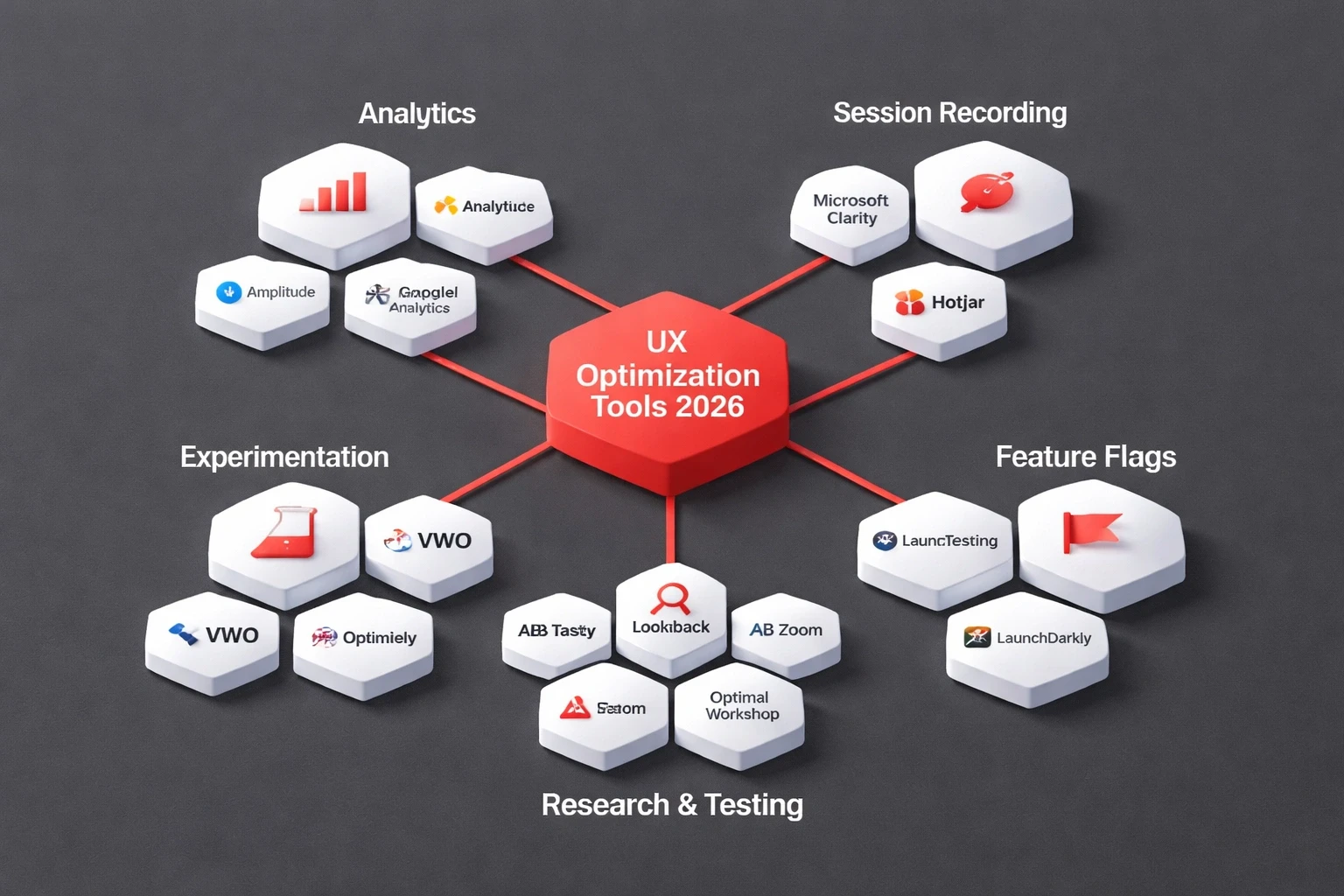
The stack has changed. AI tools now handle a lot of the routine analysis, freeing us up for strategy.
Analytics and Behavior
Amplitude or Mixpanel for product analytics.
Microsoft Clarity or Hotjar for session recordings. The free tier is usually enough for startups.
Google Analytics 4 for traffic sources and funnels.
Research and Testing
UserTesting or Maze for remote unmoderated studies.
Lookback or Zoom for moderated interviews.
Optimal Workshop for information architecture testing.
Experimentation
VWO or Optimizely for A/B testing.
LaunchDarkly for feature flags.
AB Tasty for personalization.
Design and Prototyping
Figma remains the standard. We build all client work here first.
Webflow and Framer for no-code implementation.
Spline or Rive for 3D and animation.
Accessibility and Performance
Axe DevTools or WAVE for accessibility audits.
Lighthouse or WebPageTest for performance.
SpeedCurve for ongoing monitoring.
Where teams fail
We see the same traps over and over when working with startups and growth-stage companies.
Optimizing before product-market fit
If you are still searching for your core value proposition, don't run A/B tests. Do qualitative discovery instead. Build rough prototypes and show them to people. Only start optimizing once you have traction.
Testing too much at once
Multivariate tests need huge amounts of traffic. Start with simple A/B tests on high-traffic pages. Once you find winners, combine them.
Ignoring the human context
Numbers show what happened. Stories explain why. A drop in checkout might be a UX problem, a pricing issue, or a bug. You need user interviews to know the difference. This drives human-centred UX.
Optimizing the wrong metrics
Page views look good on a chart but rarely pay the bills. Focus on North Star metrics like activation rate, retention, or lifetime value. Define success before you test.
Declaring victory too early
A test might show a 2% lift with 95% confidence, but if the implementation cost exceeds the value, it wasn't worth it. Run tests through full cycles. Watch for regression.
Advanced techniques for 2026
Predictive Personalization
Machine learning models predict intent and serve custom experiences. Platforms like Dynamic Yield and Clerk.io train on your data. Start simple: show returning users their recent activity.
Conversation-Based Testing
Micro-surveys embedded in the interface feel natural. Conversational AI experiences capture feedback at the moment of truth. If someone abandons a form, ask why immediately.
Behavioral Cohort Analysis
Users from search behave differently than referrals. Segment them by acquisition channel or first action. You might find that users who finish onboarding have 80% higher retention, which justifies fixing the onboarding.
Friction Logging
Create a shared doc where anyone in the company can log UX friction they see. Sales hears objections. Support sees confusion. Review it monthly. This crowdsources insights beyond the design team.
Proving the ROI
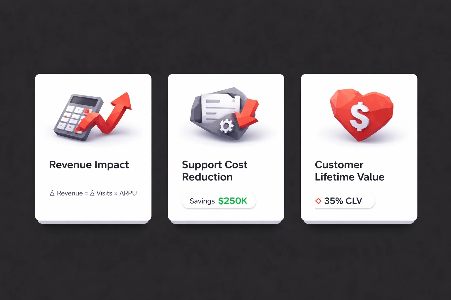
Executives need business cases. Here is how to build one.
Revenue Impact
Calculate revenue per visitor: (Total Revenue / Total Visitors). If optimization increases this by X%, the monthly impact is (Monthly Visitors × Current RPV × X%).
Support Cost Reduction
Better UX means fewer tickets. Calculate cost per ticket. If optimization reduces tickets by Y, the savings are (Y × Cost Per Ticket). We redesigned a SaaS onboarding flow and tickets dropped 60%, saving $3,200 a month. The 10 signs your website needs a UX overhaul checklist helps spot these opportunities.
Customer Lifetime Value
Better retention expands LTV. For SaaS, small retention gains compound. Reducing churn from 5% to 3% can increase LTV by 67%.
Funnel Improvements
Map your funnel: visitor → signup → activation → paying customer. Fix the weakest link first. Improving the first stage by a few points often has a bigger impact than fixing the last stage.
How this fits your design process
At Brandhero, optimization isn't a separate project. It is built into every phase.
During discovery, we set baselines. In wireframing, we build testable hypotheses. Post-launch, we schedule monthly reviews. This ongoing partnership is why we have a 95% client return rate.
For startups on Webflow and Framer, the no-code approach lets us test weekly instead of quarterly.
A 90-day plan to get started
Days 1-30: Foundation Install analytics. Do 8-10 user interviews. Run a heuristic evaluation. Document your top 10 improvement hypotheses.
Days 31-60: Testing Build prototypes for the best hypotheses. Test them with users. Run A/B tests on the live product. Deploy the winners.
Days 61-90: Scaling Analyze the long-term impact. Apply successful patterns elsewhere. Train the team. Schedule the next cycle.
By day 90, you will have proven improvements and a workflow that sticks.
When to hire experts
Bring in specialists if you lack internal research capabilities, if a redesign affects core metrics, or if your team is at capacity. Internal teams develop blind spots. External partners deliver unfiltered insights. Brandhero works with startups to deliver measurable business impact through this systematic approach.
Optimisation is what turns good products into leaders. Start small, measure everything, and scale what works.