

DAFO Analysis: A Strategic Framework for UX & Product Design

Brandhero Team
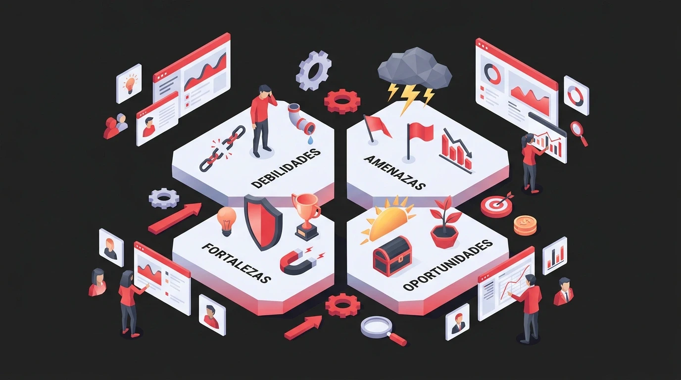
Learn what DAFO analysis means and how to use this design framework to uncover UX weaknesses, threats, strengths and opportunities that drive real growth.
DAFO Analysis: A Strategic Framework for UX and Product Design
DAFO analysis is a strategic planning framework that applies the four categories of SWOT, Debilidades, Amenazas, Fortalezas, Oportunidades (weaknesses, threats, strengths, opportunities), specifically to design and user experience decisions. Instead of scoring market position or financials, it maps what's broken, what's at risk, what's working, and where design can create advantage.
When you're running a startup or scaling a product, you need to know where you stand competitively. But most business frameworks feel like they were built for MBAs, not designers. They're too corporate, too abstract, or just irrelevant to the interface decisions you're actually making day to day.
At Brandhero Design, we've run this specific type of analysis with over 200 clients across 10+ countries. It helps spot design opportunities that actually move business metrics, whether you're planning a redesign, launching a brand, or fighting for budget internally.
What does DAFO mean?
DAFO is the Spanish-language acronym for Debilidades, Amenazas, Fortalezas and Oportunidades, translating directly to weaknesses, threats, strengths and opportunities. It's the same four-quadrant structure as the English SWOT framework, just using the term more common in Spanish-speaking business and design markets.
The order of the letters differs from SWOT (D-A-F-O versus S-W-O-T), but the categories map one to one: Debilidades equals Weaknesses, Amenazas equals Threats, Fortalezas equals Strengths, Oportunidades equals Opportunities. Anyone who has run a SWOT analysis already knows how to run a DAFO analysis.
Why does DAFO work for design strategy?
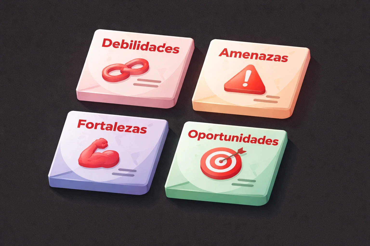
DAFO works for design because it forces you to look at the experiential layer, what users actually touch and feel, that traditional market and financial analysis skips entirely. A standard SWOT tells you about revenue and market share. A design-focused DAFO tells you why users bounce, what interface debt is costing you, and where a competitor's clunky app leaves an opening.
A design-focused DAFO breaks down like this:
Quadrant | Spanish term | What it covers in design |
|---|---|---|
Weaknesses | Debilidades | Outdated interfaces, broken mobile layouts, confusing navigation, inconsistent branding |
Threats | Amenazas | Competitor features, shifting user expectations, new tech you haven't adopted, accessibility laws you're ignoring |
Strengths | Fortalezas | Recognizable brand identity, intuitive flows, visual consistency, a user base that recommends you |
Opportunities | Oportunidades | Unmet user needs, emerging interaction patterns, underserved segments, technology competitors haven't touched |
When we run discovery sessions with new clients, this table is usually the first thing we fill in together. It moves the conversation past surface aesthetics and into strategic priorities that connect to actual business goals.
How do you run a Design DAFO analysis?
Running a Design DAFO takes five steps: gather real usage data, document weaknesses honestly, map external threats, catalogue what's actually working, then find where user needs, technical capability and market gaps intersect. Each step should produce evidence, not opinions, before you move to prioritization.
Here's the process we use when auditing websites and products. It's not theoretical, it's the same sequence in every engagement.
Step 1: Gather actual data
Don't guess. Collect:
Analytics: Bounce rates, funnels, drop-offs, mobile vs. desktop
User feedback: Support tickets, interviews, app store reviews, NPS. If your interview questions are leading or closed, the data you collect here will mislead you, so it's worth reviewing how to avoid closed questions in UX research before you run this step.
Competitive research: Screenshots of competitor UIs, feature breakdowns
Brand assets: Style guide, component libraries
Technical constraints: Platform limits, legacy code, accessibility status
DAFO forces you to combine what users say with what they do. Most teams skip this synthesis and jump to solutions, which is why redesigns often fail to move metrics. If you're doing this across an entire site rather than one product, a structured content audit is the fastest way to get this data in one place.
Step 2: Map your Debilidades
Be honest about what's broken. This is uncomfortable but valuable, and it's usually where teams find the most immediate wins.
Common weaknesses we see in our case studies:
Interface inconsistency: Your mobile app shouldn't feel like a different company built it. Document where the design language falls apart.
Poor information architecture: If users can't find what they need in three clicks, you have a structural problem. Check your navigation patterns.
Accessibility gaps: WCAG 2.1 compliance isn't optional. Screen reader support, color contrast, keyboard navigation, these expand your market and protect you legally.
Slow performance: If your hero section takes six seconds to load, a large share of users are gone before they see it. Performance is a design problem.
Unclear value prop: A beautiful homepage that doesn't explain what you do in 10 seconds is a messaging failure.
When we redesigned the brand for Talent500, the biggest weakness wasn't visual. The design language felt too casual for the serious HR decisions customers were making. Enterprise credibility was missing, and no amount of polish would have fixed that without a repositioning.
Step 3: Identify your Amenazas
You can't control external threats, but you can see them coming if you look beyond your closest competitors.
Competitor innovation: If competitors add AI personalization while you show everyone the same static homepage, that gap grows every quarter. Knowing where AI actually helps in design versus where it's just noise keeps you from chasing the wrong feature.
Platform changes: Apple and Google update interface guidelines constantly. Fall behind and your app feels dated fast.
Shifting expectations: Users expect dark mode, instant feedback, and seamless cross-device experiences now. What will be table stakes by 2027?
Regulatory pressure: GDPR and the European Accessibility Act mean non-compliant cookie flows or keyboard navigation aren't just design debt, they're legal risk.
Talent concentration: If your design system lives in three people's heads, losing one of them is dangerous.
One blockchain client faced a specific threat: their interface was so technical that mainstream users found it intimidating. As crypto adoption broadened, their complex design language became a barrier instead of a badge of credibility.
Step 4: Document your Fortalezas
This isn't ego. It's knowing what to protect while you fix everything else.
Brand recognition: If users can identify your product from a screenshot, that's an asset. Stripe's minimalism and Notion's flexible layouts became signatures rather than just style choices.
Design systems: A documented component library is a moat. Consistency at scale is hard to build and hard to copy.
User loyalty: High retention usually means your core experience taps into something psychological, not just functional. Our piece on psychological UI/UX design goes deeper into what actually drives that loyalty.
Accessibility leadership: If you're ahead on inclusive design, keep the lead. Catching up is harder than staying ahead.
Mobile execution: In a world where mobile usage dominates, nailing responsive or native mobile is foundational, not a nice-to-have.
Working with The Product Folks community, we found their strength was emotional connection. That warmth anchored the redesign and contributed to 45% sign-up growth.
Step 5: Find your Oportunidades
This is where strategy becomes advantage. Opportunities sit where user needs, technical capability and market gaps intersect, and they're usually the quadrant teams spend the least time on.
Underserved segments: Are there users competitors ignore? We helped Vahan design a bilingual interface for India's gig workers, a group mainstream fintech overlooks.
Emerging patterns: Voice, gesture, AR, what's shifting from experimental to expected? Early adoption in the right category differentiates you.
Content gaps: Many products nail UI but neglect content. Microcopy, empty states, error messages, these are chances to delight users that most teams skip.
Cross-platform gaps: If competitors have a great website but a terrible mobile app, that's your opening. Omnichannel excellence is rare.
AI that actually helps: Not the buzzword kind. Smart defaults, predictive interfaces. Conversational AI that feels human, not robotic.
Design system monetization: If you've built powerful internal tools, there may be an opportunity to productize them.
Super Precision, a manufacturing client, operated in a conservative industry where competitors had outdated sites. A modern presence differentiated them immediately because design itself was an untapped opportunity.
How do you turn a DAFO analysis into a design roadmap?
You turn DAFO into a roadmap by sorting every finding into four buckets, quick wins, strategic projects, future considerations, and things to avoid, then scheduling the highest-impact item in each quadrant across the next two to four quarters. Most frameworks fail in the execution gap: a brilliant analysis that doesn't change what you build is a waste of time.
What to prioritize first
Not everything matters equally.
Quick wins: High impact, low effort. Fix button contrast, patch broken flows. Build momentum.
Strategic projects: High impact, high effort. Core redesigns, scalable design systems, repositioning. These differentiate but need real investment.
Future considerations: Low impact, low effort. Minor aesthetic tweaks. Nice, not urgent.
Avoid: Low impact, high effort. Things that look impressive but don't align with goals. Just because a competitor did it doesn't mean you should.
When we worked with Stratbeans, the DAFO revealed their biggest opportunity wasn't a visual redesign. It was restructuring content architecture to match how enterprise buyers actually make decisions, a finding that connects directly to the kind of thinking in our UX business ROI guide.
Building the roadmap
DAFO should shape your next six to eighteen months, not just your next sprint.
Q1-Q2: Fix critical weaknesses hurting conversion. A broken mobile experience blocks everything else.
Q3: Fortify strengths. If onboarding works, make it exceptional.
Q4: Invest in future growth. Explore emerging tech, expand platforms.
Ongoing: Monitor threats. Competitive intelligence isn't a one-time task.
This prevents the overwhelm of trying to fix everything at once.
What does a DAFO analysis look like in practice?
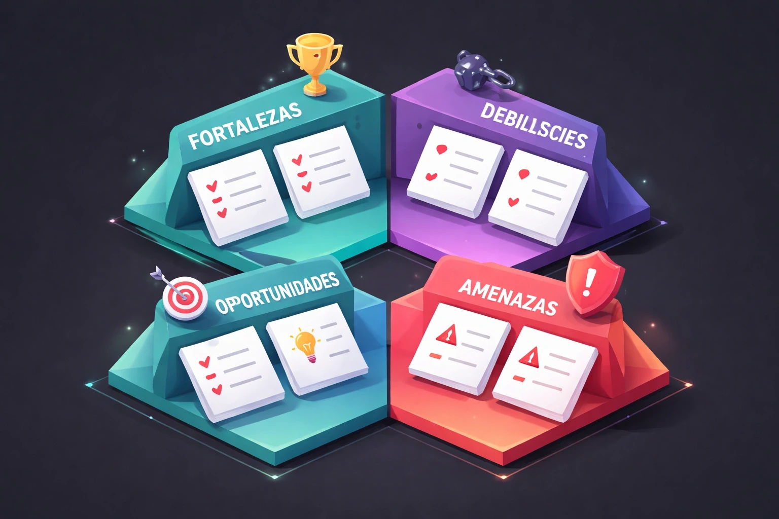
A real DAFO produces specific, evidenced findings in each quadrant, not vague statements, and leads to two or three concrete decisions rather than a long wish list. Here's how we applied this with a B2B SaaS client in early 2026, anonymized, but the process and the numbers are exact.
Situation: A four-year-old project management tool. Growth had plateaued. The product was good and the design was decent, but the company was struggling to stand out.
Debilidades found:
Web and mobile design languages didn't match
Onboarding had 60% drop-off
No dark mode
Weak accessibility
Amenazas recognized:
Three competitors launched AI scheduling
New EU accessibility regulations incoming
Small, stretched design team
Fortalezas catalogued:
Clean, distraction-free interface users loved
Strong integration ecosystem
Loyal power-user community
Fast performance
Oportunidades discovered:
Competitors chased enterprise; mid-market was open
"Simplicity" positioning could counter feature-bloated rivals
API allowed custom interfaces, personalization potential
User workarounds revealed unmet needs
What we did:
We skipped the full redesign.
Refined the core: Made the minimalist interface cleaner. "Distraction-free productivity" became the position.
Fixed what was broken: Redesigned onboarding with progressive disclosure. Added dark mode.
Defended: Built AI assistance that felt optional, matching their simplicity brand.
Exploited: Created industry-specific templates for mid-market segments competitors ignored.
Metric | Before | After |
|---|---|---|
Onboarding drop-off | 60% | Cut by 35% |
Acquisition (two quarters) | Flat | Up 28% |
Positioning | Generic feature list | "The simple alternative" |
Acquisition rose 28% in two quarters, and their positioning as "the simple alternative" sharpened in a crowded market. It came directly from the Oportunidades quadrant, not from a brainstorm.
What mistakes should you avoid when running a DAFO analysis?
The most common DAFO mistakes are treating opinions as insights, judging strengths without competitive context, letting analysis stall action, watching only direct competitors, and losing sight of the user. Each one turns a useful framework into a document nobody references again.
Opinions masquerading as insights: "Our design feels old" is an opinion. "Bounce rate rose 40% after competitors modernized" is an insight. Use evidence.
Ignoring context: "Good" mobile design isn't a strength if everyone else is excellent too.
Analysis paralysis: DAFO should drive action. Set a deadline, work with what you know, iterate later.
Only watching visible competitors: The best opportunities sit between categories. Adjacent threats get missed if you only watch direct rivals.
Forgetting the user: DAFO can become internally focused. The only analysis that matters is the one that improves user outcomes.
How does DAFO fit into an existing UX process?
DAFO sits before and alongside your usual UX process. It doesn't replace user research, usability testing, or design audits, it frames what to research and why. Run it at the start of discovery, reference it during strategy and execution, then revisit it after launch to see if your bets paid off.
Discovery: Run DAFO early. It frames what to research.
Strategy: Findings shape positioning and prioritization.
Execution: Decisions reference DAFO. When stakeholders question a choice, point to the threat you're mitigating.
Measurement: Post-launch, check if your bets paid off. This makes the next DAFO smarter.
At Brandhero Design, we include this in standard discovery. You stop designing based on aesthetics and start designing for advantage.
How often should you redo a DAFO analysis?
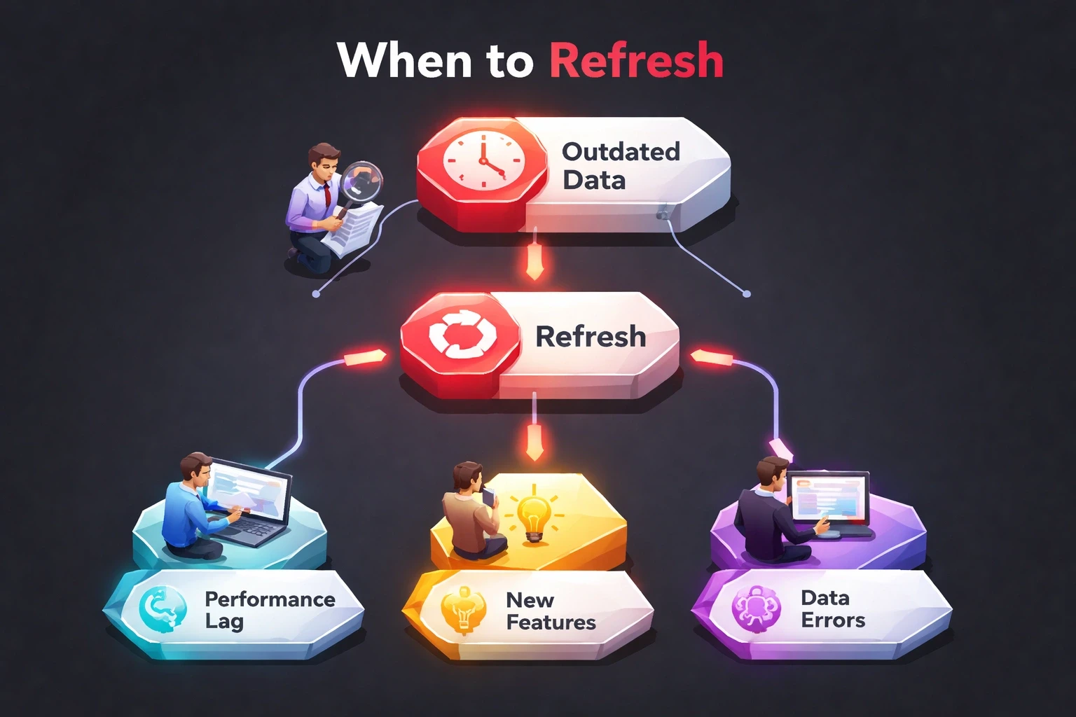
Redo your DAFO at least once a year, and always before a major redesign, after a significant market shift, or when growth has plateaued. Context changes faster than most teams update their strategy documents, so a DAFO that's two years old is usually describing a market that no longer exists.
Before major redesigns: Never start without knowing your position.
After market shifts: New competitors, regulations, or tech breakthroughs.
Annually at minimum: Expectations evolve, products mature.
When growth plateaus: Flat metrics usually mean strategic assumptions are stale.
Before entering new markets: A strength in one context might not travel to another.
The brands with consistent growth aren't necessarily the prettiest. They reassess position regularly. Design without strategy is decoration.
How do you measure whether a DAFO analysis worked?
You measure DAFO's success by tracking the specific metric tied to each finding, not by how good the workshop felt. Check whether the weaknesses you fixed moved the number they were hurting, whether threat gaps closed, whether strengths became more recognizable, and whether new opportunities turned into revenue.
Did you fix the weaknesses that mattered? Track the metric tied to each one.
Are you defending against threats? Monitor whether the gaps you flagged are actually closing.
Are strengths more distinctive? Surveys should show your differentiators gaining recognition.
Are opportunities becoming growth? Check if new segments are generating revenue.
DAFO connects design decisions to business outcomes. Track how improvements flow to retention, conversion, and revenue.
How do you make DAFO a habit instead of a one-off workshop?
You make DAFO stick by running it with cross-functional teams instead of just designers, referencing it in every roadmap review, and sharing the findings with leadership so resources follow the strategy instead of the loudest opinion in the room.
Run workshops with cross-functional teams. Engineers see different threats than marketers. Support knows weaknesses designers miss. That friction creates better insights than a designer working alone.
Keep the analysis alive. Reference it in reviews. When proposing new features, connect them back to the opportunity they address.
Share findings broadly. When leadership understands the strategy, resources follow.
At our agency, DAFO thinking runs through every project we take on. Whether designing a mobile OS for industrial robotics or reimagining a manufacturing brand, we understand the landscape before opening Figma.
How do you start your own DAFO analysis today?
Start by blocking two hours, drafting a rough DAFO without overthinking it, gathering three pieces of evidence, and picking one high-impact item to act on immediately. Momentum beats a perfect framework sitting in a slide deck.
Block two hours. Draft a rough DAFO. Don't overthink it, get it on paper.
Gather three pieces of evidence: user data, competitive research, and team insights.
Find the highest-impact item in each quadrant: the critical weakness, the urgent threat, the strongest strength, the biggest opportunity.
Pick one to act on now. Momentum beats perfection.
If this feels overwhelming or you need an outside perspective, that's what agencies like ours are for. We've run this dozens of times and spot patterns that are harder to see from the inside.
Design strategy isn't about pretty pixels. It's about intentional choices that compound into advantage. DAFO gives you the framework to make those choices with evidence, not just gut feel. Start with understanding your position, the rest follows.
FAQ: DAFO analysis questions answered
What is DAFO analysis?
DAFO analysis is a strategic planning framework, using the Spanish acronym for weaknesses, threats, strengths and opportunities, applied to design and user experience instead of just business finances. It helps teams identify what's broken in an interface, what competitors or trends threaten it, what's working, and where design can create a real advantage.
What does DAFO stand for?
DAFO stands for Debilidades, Amenazas, Fortalezas and Oportunidades, the Spanish equivalents of weaknesses, threats, strengths and opportunities. It's the same four categories as SWOT, just ordered and named differently, and it's used across Spanish-speaking business and design communities the same way SWOT is used elsewhere.
Is DAFO the same as SWOT analysis?
Yes. DAFO and SWOT cover identical categories, weaknesses, threats, strengths, opportunities, just in a different order and language. The letters change (D-A-F-O versus S-W-O-T) but the thinking behind each quadrant is the same, so anyone familiar with SWOT can run a DAFO analysis without learning a new method.
How long does a Design DAFO analysis take?
A first-pass Design DAFO can be drafted in two to three hours if you already have basic analytics and user feedback on hand. A thorough version, with competitive research, stakeholder workshops and documentation, typically takes one to two weeks, but a rough draft today beats a polished one next quarter.
Who should be involved in running a DAFO analysis?
Include designers, product managers, engineers and someone close to customer support or sales. Each role sees different weaknesses and threats: engineers spot technical debt, support hears complaints designers never see, and combining those perspectives is what makes DAFO more useful than a solo brainstorm.
Explore all blogs

Jun 18, 2026
Enhancing Customer Service Through UX Design & Strategic Audits
Enhancing Customer Service Through UX Design & Strategic Audits

Jun 16, 2026
User Insights: Unlocking Design Decisions with Data
User Insights: Unlocking Design Decisions with Data

May 31, 2026
User Experience Optimization: Boost Conversion & Retention
User Experience Optimization: Boost Conversion & Retention

May 31, 2026
User Experience Optimization: Fixing Friction for Growth
User Experience Optimization: Fixing Friction for Growth

May 11, 2026
Phone Number Chunking: Reduce Errors & Improve Conversion Rates
Phone Number Chunking: Reduce Errors & Improve Conversion Rates
May 9, 2026
Mastering Gating in UI/UX Design: Convert Without Pushing
Mastering Gating in UI/UX Design: Convert Without Pushing

May 7, 2026
Gestalt Laws Explain Visual Grouping for Designers
Gestalt Laws Explain Visual Grouping for Designers

May 6, 2026
Checklist for Evaluating Microinteractions in UX
Checklist for Evaluating Microinteractions in UX