


Gating app messages is a high-stakes game. You're asking a user often a stranger to your product to do work before they get the payoff. It's a UI/UX pattern that demands a specific action: sign up, grant a permission, upgrade. The reward is access to a conversation. The risk is they leave and never come back. With 77% of users ditching an app within three days, you don't get many chances to get this wrong.
The best gating is practically invisible. It feels like a natural step, not a shakedown.
Soft Gates Win. Hard Gates Are a Gamble.
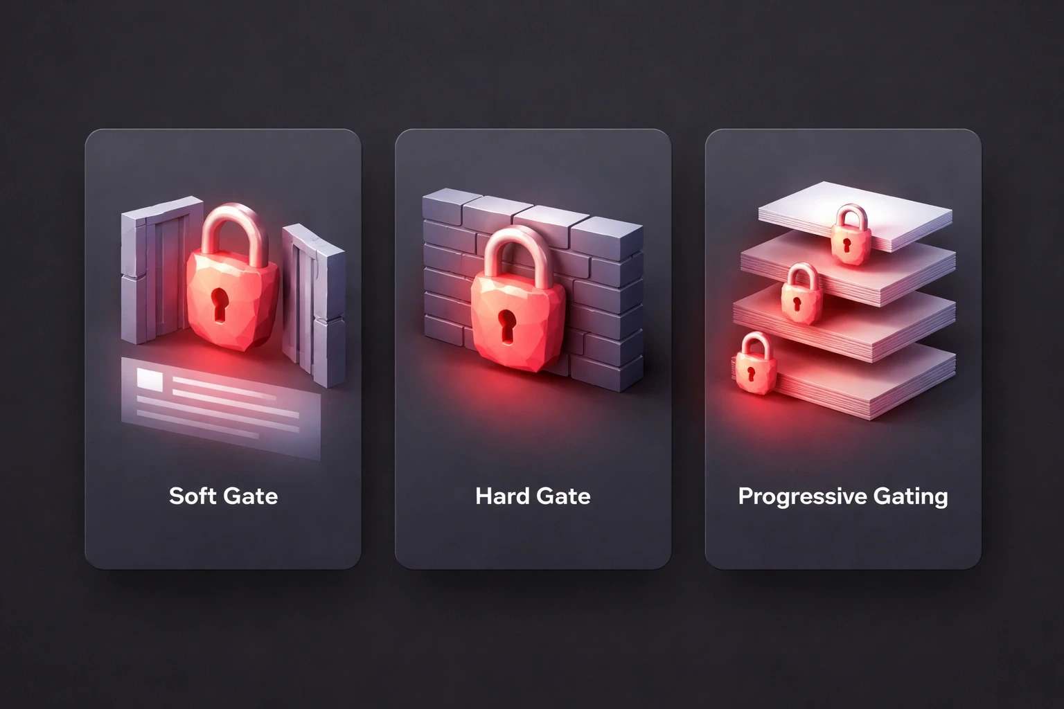
Soft gates convert 2-3x better because they aren't a brick wall. They're a window. You show the user something a blurred message, the first line of a chat, a list of participants and then you ask for the key. It’s a teaser. The user can see the value they're missing.
Hard gates, on the other hand, offer nothing. You tap a message and get a lock icon. LinkedIn uses this for InMail. It’s effective for monetizing premium features, sure, but it’s aggressive. You can expect 40-60% higher exit rates. Most users won't even know what they're walking away from.
Then there's progressive gating, which is my preferred approach for a lot of clients. You let the user experience the product first. Bumble lets you send 5-10 messages before asking for money. By that point, the user is invested. They've felt the value. They're not paying for a promise; they're paying to continue something they've already started. That taps into psychological UI/UX principles like reciprocity people are more willing to give when they've already received.
Permission gates are a specific beast. Don't ask for notification access the moment the app opens. That’s a cold ask. Wait until they’ve sent their first message. The context is clear: "Turn on notifications so you know when they reply." The benefit is obvious. The yes rate is higher.
It's All About Loss Aversion
If you want to understand why gating works, study loss aversion. People are terrified of missing out. A message that says "You have 3 unread messages" is infinitely more powerful than "Sign up to send messages." It creates urgency without being pushy.
There’s also the endowment effect. If a user writes half a message and then hits a gate, they’re 40% more likely to sign up. They own that half-written text. They want to finish it. Let them draft before you block.
You can use scarcity, but be careful. Countdown timers or "access expires in 10 minutes" can work, but if the scarcity is fake, you’ve burned that user forever. "5 people viewed your profile" works because it’s a curiosity gap. Just make sure the gap is real.
Social proof is your friend here. A gated thread that shows "1,247 people joined this conversation" signals value. It’s the crowd signaling that the jump is safe. We see this confirmed constantly in user psychology research.
Your Gate Screen Has 2 Seconds
That's it. In two seconds, the user has to understand: What am I missing? Why do I care? What do I have to do? If your gate screen is vague, you've lost them.
Be specific. "Sign up to continue" is lazy. "Create an account to reply to 12 waiting messages" is compelling. It tells a story. It changes the user's mental calculation from "this is work" to "this is worth it."
And give them an out. A single forced path sign up or leave creates a 35-50% abandonment spike. Offer a primary path (sign up), a secondary one (social login), and an exit ("Maybe later"). Respect their context. It sounds counterintuitive, but giving users a way to say "no" often builds enough trust that they come back later. We cover the visual hierarchy for these in our breakdown of UI/UX design principles.
Gate the Delivery, Not the Discovery
This is the golden rule. Let users discover value before you block it. Apps like Calm let you finish a session before gating the next one. In messaging, the "aha moment" is usually the first reply. That's when the user feels the magic. Gate right after that moment. They're emotionally high on the connection, and the cost of signing up feels small compared to the cost of losing that thread.
Don't gate based on time. Gate based on behavior. A prompt after 5 messages is infinitely better than a prompt after 3 days. One measures intent; the other measures nothing.
And for the love of UX, never gate mid-conversation. That's just rude. Gate at the natural breaks after a chat ends, or before a new one starts.
Accessibility Isn't a Nice-to-Have
If your gate isn't accessible, it's broken. Screen readers need to announce the lock and the unlock path. Keyboard navigation has to work. Color can't be the only indicator of a locked state add icons or text labels for color-blind users.
Ethical gating is about transparency. Be clear about what's restricted and why. Avoid the dark patterns: fake timers, impossible-to-find close buttons, or shame-based copy like "No thanks, I don't want to be successful." That stuff might juice conversion for a week, but it wrecks your brand's long-term reputation. Our strategic design frameworks go deeper into how these tactics backfire.
Build It Right: Technical Details
Nothing kills a gate faster than a bug. If a user signs up and the gate doesn't clear, they're gone. Your state management AsyncStorage, SharedPreferences, UserDefaults has to be bulletproof. Server-side validation is a must to prevent client-side tampering.
Deep linking is often an afterthought, but it's critical. If a user clicks a notification for a specific message, hits a gate, signs up, and lands on the home screen instead of the message… you've failed. Capture the destination, show the gate, store the path, and redirect them exactly where they wanted to go.
Track everything: impressions, interactions, completions, and abandonment points. The data will tell you where the friction is.
Testing: Don't Guess
You need about 1,000 impressions per variant to get reliable A/B test data. Test one thing at a time. Don't change the copy and the button color in the same test, or you won't know what worked.
But numbers don't tell the whole story. Watch users. Interviews reveal the anger or confusion that analytics hide. Our guide on user research methodologies can help you structure these sessions.
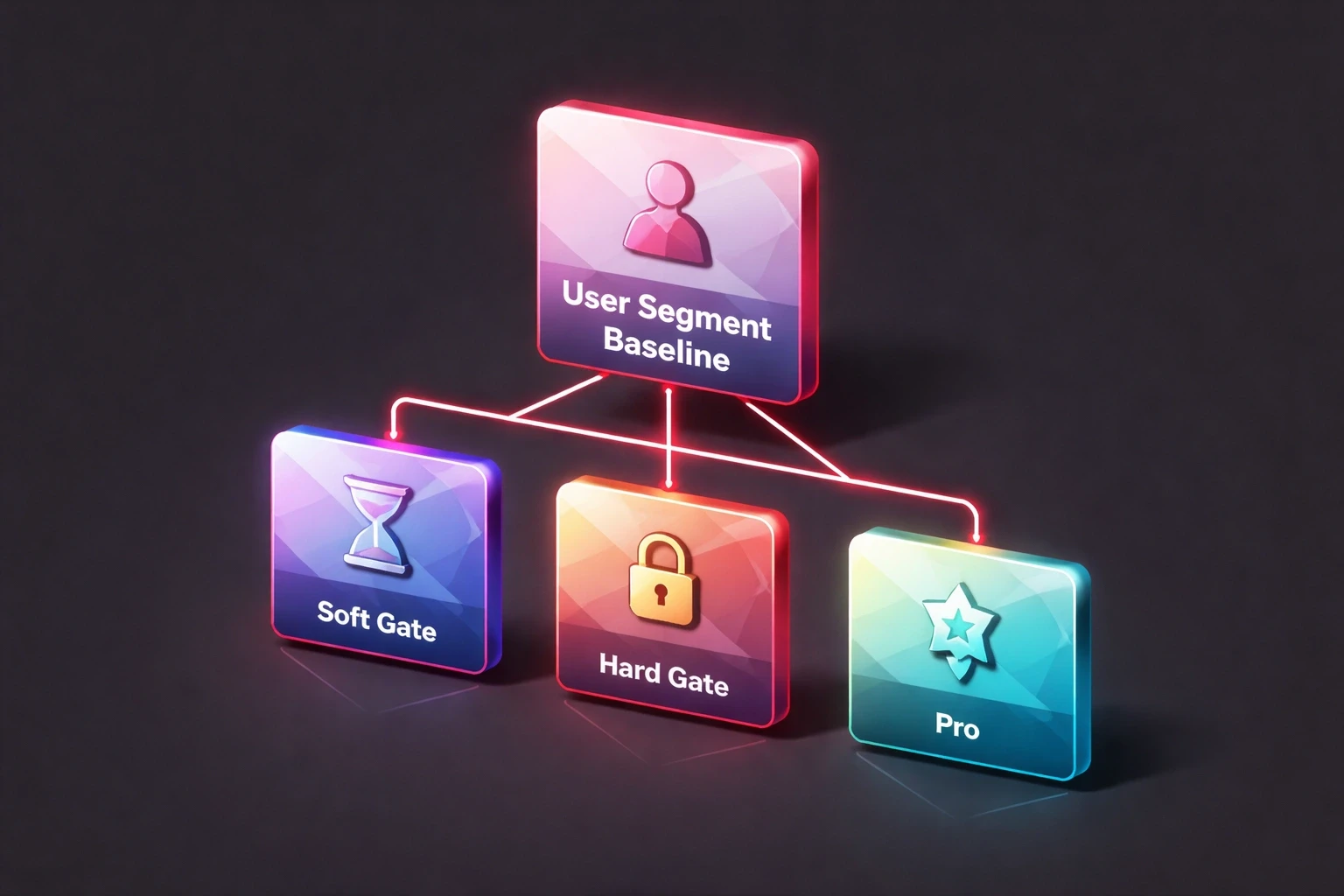
Segment your data. A soft gate might work for new visitors, while a progressive gate is better for returning users. There is no single winning strategy for everyone.
User Segment | Baseline | Soft Gate | Hard Gate | Progressive |
|---|---|---|---|---|
New visitors | 12% | 18% | 8% | 15% |
Returning (no account) | 22% | 31% | 14% | 28% |
Lapsed users | 35% | 42% | 29% | 38% |
Context Is Everything
A dating app gates differently than a healthcare app. On a dating platform, you gate until mutual interest is established. It cuts spam. In a professional network like LinkedIn, you gate cold outreach to monetize business development. In healthcare, HIPAA mandates gating via multi-factor authentication. When the gate is a legal requirement, the UX has to be flawless. That’s where customer experience design becomes non-negotiable.
Mobile vs. Web
Mobile gives you more tools (biometrics, push) but less patience. Touch targets need to be 44×44pt minimum. Mobile users are distracted they're on a bus, in a line, or walking. Your gate needs to be simpler, faster, and more forgiving than its desktop counterpart.
Look Past the Conversion Rate
A high conversion rate is meaningless if those users churn next week. Users who feel tricked into signing up leave 30-40% faster. Send an NPS survey after the gate. If conversion is up but NPS is down, you have a problem.
If you're spending money on ads, remember that a gate converting at 15% means you need nearly 7x the traffic to hit your goals. That’s a massive drag on your CAC. The math is unavoidable, and it’s central to the ROI of good UX.
The Future Is Personal
Generic gates are on the way out. Machine learning will soon predict who is likely to convert and serve them a stripped-down gate, while hesitant users get a softer, more informative experience. Biometrics are making the "work" of gating almost disappear Face ID turns 20 seconds of typing into a 2-second glance.
We're also seeing the rise of conversational gates, where an AI assistant talks the user through the sign-up process. It feels less like a form and more like a helpful interaction, something we discuss in our work on conversational AI design.
Gating is a promise. You are promising the user that what lies on the other side is worth their time and effort. If you keep that promise, you earn a user. If you break it, you become a cautionary tale. For teams building messaging products, working with experienced UI/UX partners helps ensure your gates build trust instead of burning it.