


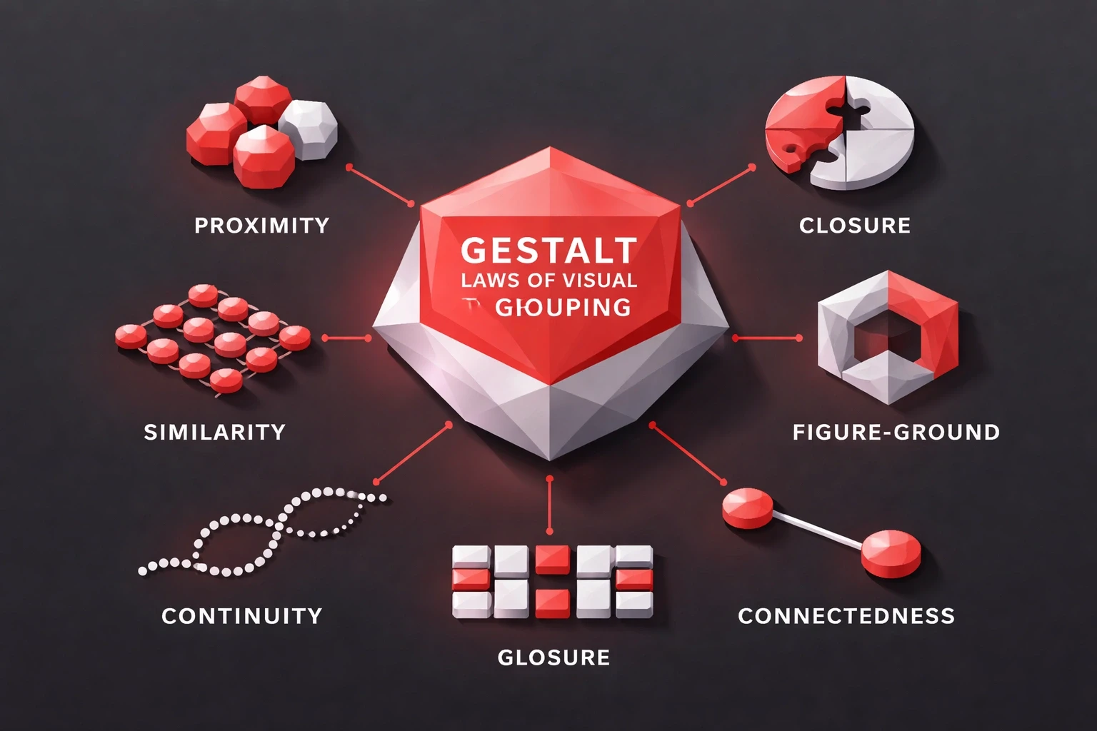
Gestalt laws explain how we visually group elements proximity, similarity, continuity, closure, figure-ground. Designers use them because they work with the brain's automatic processing, not against it.
This matters practically. Users judge interfaces in milliseconds. Their brains cluster elements before conscious thought kicks in. Get the grouping right and navigation feels obvious. Get it wrong and people struggle with tasks that should be simple. Conversion rates suffer.
The Science Behind Visual Grouping
German psychologists in the 1920s identified these patterns and called them Gestalt principles roughly "unified whole." The brain prefers complete forms over scattered parts. It looks for connections automatically.
These aren't aesthetic preferences. They're neurological shortcuts that evolved to help humans process complex environments fast. The same mechanisms that helped ancestors spot predators in brush now help users find the checkout button.
Modern neuroscience backs this. The visual cortex handles grouped information faster than isolated elements. Studies show users comprehend properly grouped layouts about 40% faster. That speed difference shows up in task completion, error rates, and satisfaction scores.
At Brandhero Design, we've tracked this across 200+ projects. The pattern holds: better grouping leads to better usability. Clients like Vahan and The Product Folks saw confusing interfaces become navigable once we fixed the grouping issues.
Proximity: Distance Creates Relationship
Proximity is the foundation. Items close together seem related. Items far apart seem separate. That's it.
Take a checkout form. Billing address fields placed side by side with minimal spacing read as one unit. Add significant whitespace before the payment section, and users recognize a new section without needing a header.
Relative distance beats absolute measurements. Form fields 16 pixels apart feel grouped. Put 48 pixels between them, and you've created a boundary stronger than a divider line.
Mobile interfaces depend on this. There's no room for heavy separation, so strategic proximity does the work. Our mobile-first app work showed how much difference spacing makes on small screens.
What works:
Group related settings within 12-24px
Separate sections with 48-96px margins
Put action buttons near the content they affect
Keep form labels close to their fields
Make internal card spacing tighter than gaps between cards
E-commerce product grids follow this. Consistent gaps read as a browsable collection. Break that rhythm with larger spacing, and you signal a category change or promotional feature.
Similarity: Look-Alikes Act-Alike
Similarity groups elements that share visual traits. Same color, shape, size, or texture, and users assume they function the same way. This is why consistency matters.
Every primary action uses the same blue button style, so users scan for blue when navigating. Drop a red button with identical styling into that context, and confusion follows. The color says "different," but the form says "same."
Shape consistency matters too. Icon sets with uniform geometry feel cohesive. Mix outlined with filled icons randomly, and you break the pattern. Users wonder if different styles mean different behaviors.
Our branding and UI/UX work builds similarity systems from day one. Typography hierarchies, color palettes, and component patterns create visual languages users decode without thinking.
Typography example:
Element | Treatment | Expectation |
|---|---|---|
H2 | 24px, Bold, Dark Blue | Section starters |
Body | 16px, Regular, Gray | Primary content |
Buttons | 14px, Semibold, White | Interactive |
Captions | 12px, Regular, Light Gray | Supplementary |
Apply consistently, and users bring expectations from thousands of previous digital experiences. Meet those expectations, or have a clear reason not to.
Color-coded navigation creates similarity groups. File managers use color to distinguish types. Users scan color before reading labels.
Continuity: The Eye Follows
Continuity makes aligned elements feel connected. The eye follows lines and directional cues naturally. It doesn't jump randomly.
Navigation bars use this. Horizontal alignment reads as a system. Stack the same items vertically with inconsistent alignment, and that unified feeling falls apart.
The principle goes beyond literal lines. Implied connections work too. Cards aligned to an invisible grid create continuity. Carousel indicators positioned consistently beneath images establish flow. Timeline layouts with connecting lines make chronological relationships clear.
Conversational AI interfaces rely on continuity. Message bubbles alternating left and right establish conversation flow. Threading with indentation clarifies who's responding to whom.
Applications:
Breadcrumbs with arrow separators
Progress indicators with connecting lines
Scroll animations following reading direction
Tabbed content with horizontal alignment
Multi-column layouts with consistent baselines
F-pattern and Z-pattern reading depends on continuity. Western users scan left-to-right, then down, then right. Layouts following these patterns feel natural.
Break continuity intentionally to grab attention. When every card aligns except one, that anomaly draws the eye. Use it for promotions or critical warnings.
Closure: The Brain Fills Gaps
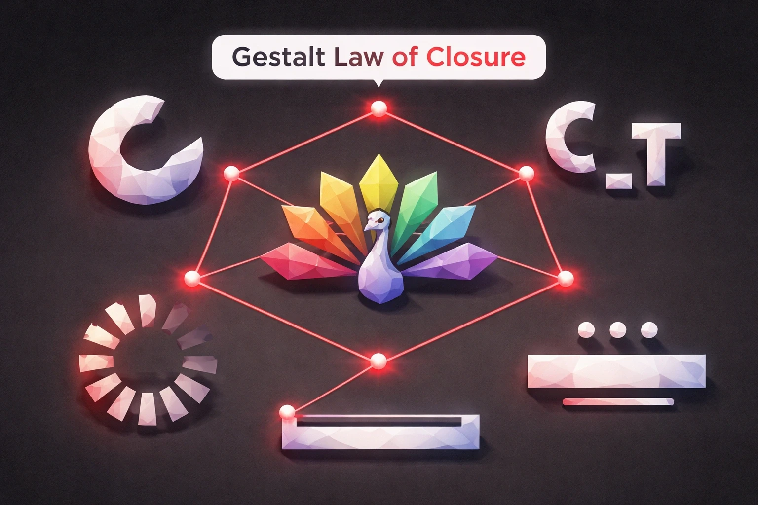
Closure is the brain completing patterns from partial information. You recognize letters with missing pieces. You see circles from arcs.
Logo designers exploit this constantly. NBC's peacock suggests six feathers while showing only colored segments. Your brain completes it. Loading spinners use partial circles to imply motion with minimal animation.
Forms benefit too. Border-bottom inputs suggest rectangles without drawing all four sides. Users recognize fields from single underlines because they've learned the pattern.
Our manufacturing brand work applies closure technically. Machinery diagrams simplified through strategic omission stay comprehensible while reducing visual noise. Engineers recognize complete systems from schematic abbreviations.
Elements using closure:
Hamburger menus (three lines suggesting a list)
Play button triangles
Progress bars with gaps
Partial borders on active fields
Skeleton screens suggesting content structure
Modals with rounded corners and shadows create closure through implied boundaries. Overlays dim background content, using transparency to suggest separation.
Apple's marketing uses whitespace to define product boundaries without borders. Product silhouettes emerge from emptiness.
Figure-Ground: What Stands Out
Figure-ground determines what pops versus what recedes. Your brain constantly decides what deserves attention and what provides context. Strong separation makes interfaces scannable.
Contrast drives this. Dark text on light backgrounds text figures against paper ground. Reverse it, and the effect persists but inverts.
Landing page heroes maximize this separation. Headlines and CTAs figure strongly against simplified backgrounds. Supporting content recedes.
Our UI/UX work prioritizes figure-ground clarity at every level. Primary navigation against header backgrounds. Content areas against page backgrounds. Interactive elements against content sections.
Strengthening techniques:
Drop shadows suggesting elevation
Blur effects pushing content back
Saturation emphasizing figures
Size making important elements prominent
Z-index layering for depth
Modals demonstrate this. Dialog boxes figure prominently. Dimmed page content recedes. Focus stays on what needs attention.
Ambiguous figure-ground causes problems. Multiple elements with similar contrast and size compete. The eye struggles to prioritize. Visual uncertainty leads to decision paralysis.
Our case studies show figure-ground optimization improving conversions. CTAs that figure strongly through color and placement see 30-60% higher click-through than low-contrast alternatives.
Common Law of Region: Boundaries Group
The law of region: elements within boundaries appear grouped. Boxes, cards, panels, containers these organize information explicitly.
Card-based designs use this heavily. Each card contains related information. The boundary signals belonging more clearly than proximity alone.
Regional grouping overrides other principles. Put dissimilar elements in a shared border, and users perceive relationship. Remove the border from similar nearby elements, and grouping weakens.
Dashboards depend on this. Separate panels for analytics, notifications, quick actions create mental models. Users learn where to find things based on boundaries.
In practice:
Navigation menus in header containers
Sidebars with filtration controls
Content cards organizing products
Section dividers
Table rows grouping data
Border treatment affects strength. Heavy borders create strong separation. Light borders or subtle background shifts provide gentler boundaries.
Nested regions establish hierarchy. Pages contain sections. Sections contain cards. Cards contain fields. Each level communicates structure through containment.
Combining Principles
Real interfaces need multiple principles together. Proximity, similarity, continuity, closure, figure-ground, and region combine into visual systems. Individual principles matter less than their interaction.
Shopping cart example: Product cards use region to group items. Within cards, proximity positions thumbnails near names. Similarity makes "Remove" buttons recognizable. Continuity guides eyes down the list. Figure-ground makes checkout prominent. Closure allows minimal borders.
When principles conflict, choose by priority. Proximity might suggest one grouping while similarity suggests another. What relationship matters most for the task?
Our strategic approach starts with content hierarchy. What needs primary attention? What relationships enable tasks? Grouping principles reinforce those priorities.
Application framework:
Define hierarchy and relationships
Apply regional grouping for major sections
Use proximity within regions
Establish similarity systems for repeated elements
Ensure figure-ground clarity for primary actions
Apply continuity for scanning paths
Use closure to minimize visual noise
Testing validates it. Watch users with prototypes. Do they hesitate? Misinterpret relationships? Eye-tracking shows whether grouping guides attention as intended.
Responsive Considerations
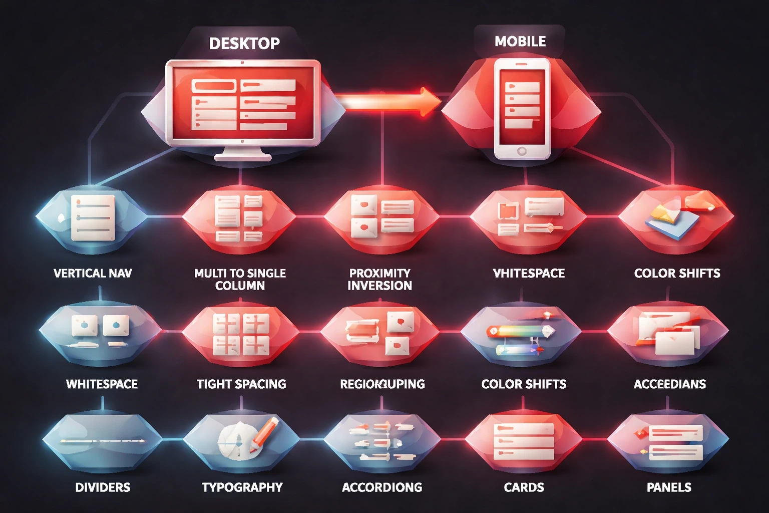
Screen size forces adaptations. Desktop layouts become mobile stacks. Horizontal nav becomes vertical. Multi-column becomes single stream. Principles stay constant. Applications shift.
Proximity often inverts on mobile. Desktop designs separate sections with whitespace. Mobile tightens spacing to reduce scroll while maintaining boundaries through color shifts, dividers, typography changes.
Regional grouping strengthens on small screens. Without horizontal space, mobile depends on explicit containers. Cards, accordions, panels create boundaries in vertical layouts.
Mobile-first projects we've delivered use adaptive strategies. Touch targets need larger areas, affecting proximity. Thumb zones influence placement. Scroll replaces hover.
Responsive considerations:
Maintain similarity across breakpoints
Adjust proximity ratios while preserving relationships
Strengthen regional boundaries when space contracts
Ensure figure-ground clarity despite size reductions
Preserve navigation continuity despite layout shifts
Progressive disclosure becomes essential. Desktop interfaces showing all options overwhelm mobile screens. Grouping guides what hides behind interactions. Related items collapse. Primary actions stay visible.
Typography scaling affects similarity. Relative relationships matter more than absolute measurements. Keep headline-to-body ratios consistent across breakpoints.
Accessibility
Grouping serves users differently by ability. Visual grouping helps sighted users. Screen reader users need semantic HTML. Motor-impaired users benefit from grouped interactive zones. Inclusive design addresses all.
ARIA landmarks complement visual grouping. Navigation gets role="navigation". Main content gets role="main". Sidebars get role="complementary". Screen readers announce regions, creating non-visual grouping.
Keyboard navigation should respect visual grouping. Tab order follows logical sequence. Grouped controls tab through sequentially before jumping to the next group. Focus indicators show position.
Color similarity challenges colorblind users. About 8% of men can't rely on color alone to group elements. Combine color with shape, position, or icons.
Accessible techniques:
Semantic HTML (nav, section, article, aside)
ARIA landmarks for regions
Heading levels for hierarchy
Fieldset and legend for form groups
Skip links to major content groups
Focus management in modals
Contrast affects figure-ground. WCAG requires 4.5:1 for text, 3:1 for large text and UI components. Meeting these keeps figural elements distinguishable for low-vision users.
Our user-centered approach includes accessibility from the start. Grouping accounts for diverse perception. Visual design and inclusive functionality coexist.
Testing Grouping
Assumptions need validation. What designers intend and users perceive often differ.
Card sorting exposes mental models. Give users content items and watch how they cluster. Mismatches show where to refine.
First-click tests measure clarity. Present tasks and track where users click first. Good grouping guides to correct locations. Hesitation signals confusion.
Heat maps reveal attention patterns. Do users scan grouped sections as wholes? Follow intended paths? Heat mapping tracks actual gaze patterns.
Testing methods:
Tree testing for information architecture
Five-second tests for comprehension
A/B testing grouping treatments
Session recordings of navigation
Think-aloud usability testing
Quantitative metrics complement observations. Time-to-task improves when grouping reduces search. Error rates decline when clear grouping prevents misclicks.
Our UX research methods combine approaches. Wireframe testing validates concepts. Prototype testing refines details. Post-launch analytics finds remaining friction.
Design Systems
Scalable systems codify grouping into patterns. Component libraries, spacing systems, and grids ensure consistency across products and teams.
Spacing scales establish proximity systematically. Define 4-8 values (8px, 16px, 24px, 32px, 48px, 64px) with semantic meaning. "Tight" groups related elements. "Relaxed" separates sections. Designers apply tokens, not arbitrary values.
Component variations encode similarity. Buttons include primary, secondary, tertiary variants. Each follows consistent patterns shape, padding, typography while color and emphasis differ.
Layout systems enforce continuity. Grids ensure alignment. Column definitions maintain relationships across breakpoints.
System elements supporting grouping:
Spacing tokens (xs, sm, md, lg, xl, xxl)
Color tokens for figure-ground
Typography scales for hierarchy
Component libraries with built-in grouping
Layout templates encoding patterns
Icon sets maintaining similarity
Documentation should explain when to apply principles, not just show results. "Use 16px between label and input because proximity signals relationship."
Enterprise design systems we've built use principle-based thinking. Teams maintain consistency by understanding logic, not memorizing specs.
Common Mistakes
Experienced designers still misapply these. Recognizing mistakes prevents revisions.
Inconsistent spacing kills proximity. Some items 16px apart, others 20px the pattern breaks. Users wonder if the difference means something. Establish systems and enforce them.
Over-grouping creates monotony. Everything equally grouped means nothing stands out. Hierarchy needs variation. Some groupings strong, others loose. Contrast creates scannable layouts.
Ambiguous figure-ground confuses priorities. Multiple elements with similar prominence compete. Users struggle to find starting points. Establish clear primary, secondary, tertiary levels.
Mistakes:
Mixing similar and dissimilar elements without logic
False groupings through poor proximity
Breaking continuity without reason
Overusing borders and dividers
Ignoring established conventions
Fighting learned patterns frustrates users. Web conventions exist because millions of sites trained expectations. Logo top-left. Navigation horizontal or hamburger. Footer with supplementary links. Violate only with research justification.
Premature decoration adds noise. Decorative elements competing with functional grouping distract. Strip to essentials first. Add decoration only where it strengthens principles.
What's Next
New paradigms need adapted principles. Voice, AR, gesture controls each translates grouping from visual to experiential.
Voice interfaces group through sonic cues. Changing voice actors signals categories. Pauses create proximity in lists. Phrasing patterns establish similarity.
AR layers digital onto physical. Proximity keeps annotations near objects. Similarity identifies virtual elements. Figure-ground separates layers.
Gesture interfaces group spatially. Related controls cluster in gesture space. Swipe directions establish continuity. Boundary zones create regions without visible borders.
Emerging territory:
Spatial computing with 3D elements
AI-generated layouts adapting to context
Haptic feedback reinforcing grouping
Temporal grouping in animation
Adaptive interfaces learning behavior patterns
Machine learning personalizes grouping. Interfaces might reorder menu items based on usage, maintaining principle logic while adapting implementations.
As AI transforms design workflows, understanding perception principles becomes more valuable. Algorithms generate layouts. Designers evaluate whether grouping serves human cognition.
These principles transform psychology into tools. They explain why some interfaces feel intuitive and others frustrate. Proximity, similarity, continuity, closure, figure-ground, region master these and you control how users navigate.
Not decoration rules. Cognitive shortcuts the brain uses constantly. Design with them, complexity becomes clarity. Ignore them, even simple interfaces confuse. Every spacing decision, color choice, layout adjustment either works with natural perception or against it.
The best designs make grouping invisible. Users don't notice principles. They just complete tasks. That invisibility is the goal.
If you want to apply these principles to your next project, reach out to Brandhero Design. Nine years, 200+ projects, and we're still refining how these techniques work in practice.