


There’s a specific kind of frustration that hits when a form rejects your phone number because you added a space or a dash. Phone number chunking breaking +16502530000 into +1 (650) 253-0000 isn't just about aesthetics. It’s a usability hack that reduces cognitive load, makes numbers scannable, and can cut input errors by up to 40%.
This seemingly minor pattern sits at the intersection of cognitive psychology, localization, and conversion optimization. If you’re building signup flows, checkout pages, or contact forms, the way you capture phone numbers changes completion rates, user confidence, and downstream data quality. Bad chunking or inconsistent formatting adds friction, and that friction compounds when you’re scaling globally.
Why Phone Number Chunking Matters in UI/UX Design
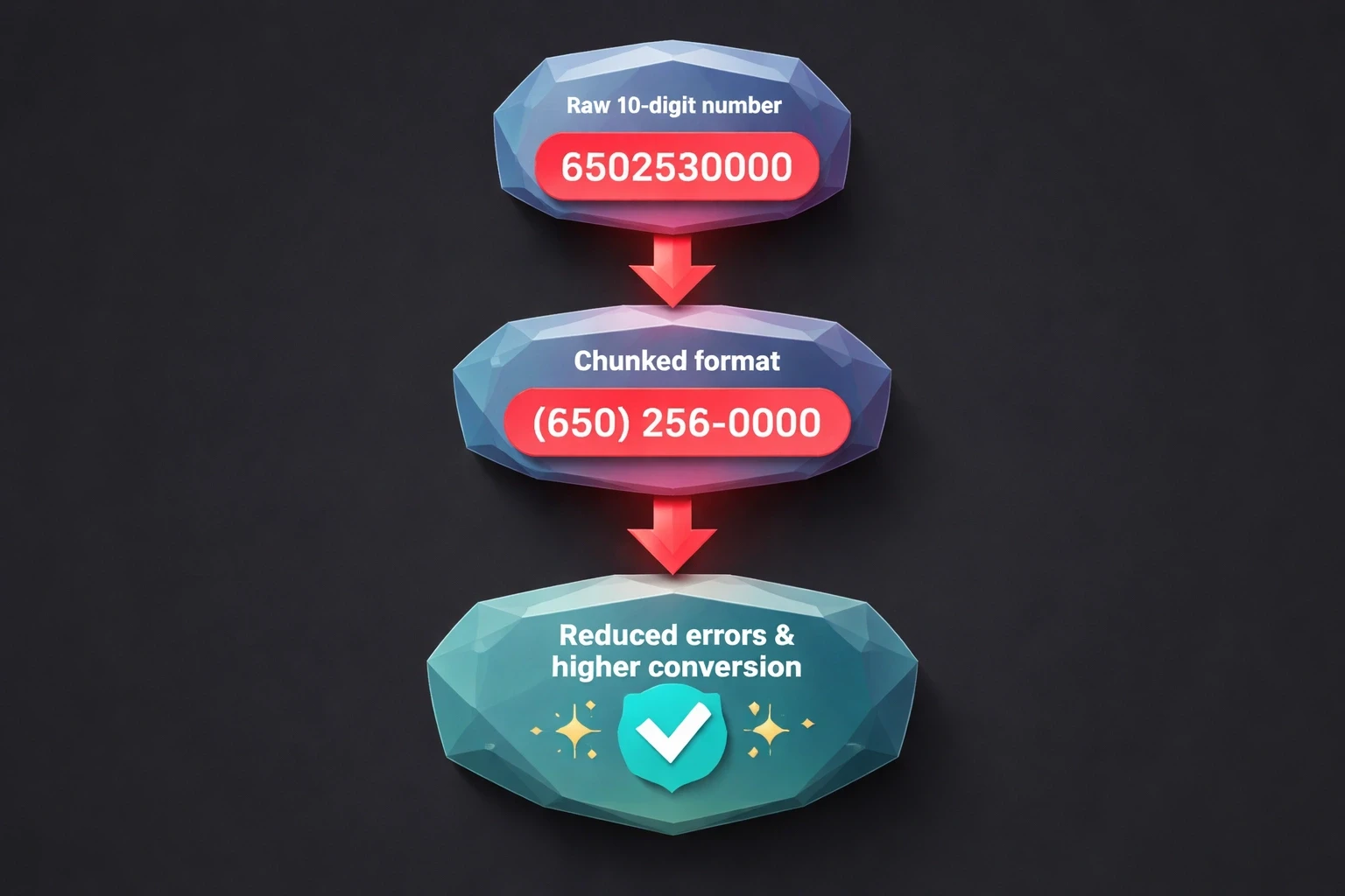
The logic here relies on Miller’s Law the idea that humans can hold about 7±2 items in working memory. A raw 10-digit string like 6502530000 blows past that limit, forcing users to scan the number multiple times just to verify they typed it right. Breaking it into (650) 253-0000 creates three manageable chunks. It reduces errors and speeds up the task.
The Baymard Institute found that form fields requiring unformatted number entry see 23% higher abandonment in mobile checkout flows compared to auto-formatted alternatives. Users perceive unformatted fields as "broken" or untrustworthy, especially when the interface ignores familiar regional patterns. That perception gap costs conversions, particularly for startups scaling internationally.
The damage isn't limited to form completion. Customer service teams report that poorly formatted numbers in CRMs increase call connection failures by 15-18% because agents have to manually reformat digits. Automated SMS verification fails when numbers lack country codes or contain stray characters. A single input field design choice can mess up entire operational workflows.
For B2B platforms and enterprise tools, chunking is a compliance issue. Healthcare portals, financial apps, and logistics dashboards that mishandle phone numbers risk HIPAA violations, failed two-factor authentication, and delayed critical messages. The stakes are higher in regulated industries or emergency services.
How Different Regions Chunk phone Numbers
Regional chunking follows cultural norms and telecom history. North American numbers (NANP) use (XXX) XXX-XXXX, keeping the area code separate to reflect geographic routing. Users in the US and Canada recognize this structure instantly; presenting them with European or Asian formats causes cognitive dissonance that feels unprofessional.
European formats are all over the place. UK numbers look like +44 20 7946 0958, while French numbers use paired digits: +33 1 42 86 82 00. German numbers cluster differently: +49 30 123456. You cannot use a single "international" pattern and expect it to work for everyone. You need adaptive formatting based on the country code.
Asian markets add layers of complexity. Indian mobile numbers follow +91 98765 43210. Japanese numbers use hyphens: +81 90-1234-5678. Chinese numbers often appear as +86 138 0013 8000 in a 3-4-4 pattern. Designing for these markets means working with local UX researchers to validate assumptions against actual behavior.
Latin American and Middle Eastern formats vary even more. Brazil uses nine-digit mobile identifiers: +55 11 98765-4321. The UAE follows +971 50 123 4567. Sub-Saharan African nations mix colonial-era patterns with local conventions. Design systems that claim to be "universal" are usually just Western-centric and break at scale.
Region | Format Example | Chunking Pattern | Notes |
|---|---|---|---|
North America | +1 (650) 253-0000 | (XXX) XXX-XXXX | Area code in parentheses |
United Kingdom | +44 20 7946 0958 | +44 XX XXXX XXXX | City code after country |
Germany | +49 30 123456 | +49 XX XXXXXX | Variable city code length |
India | +91 98765 43210 | +91 XXXXX XXXXX | Mobile prefix clusters |
Japan | +81 90-1234-5678 | +81 XXX-XXXX-XXXX | Hyphenated groups |
Brazil | +55 11 98765-4321 | +55 XX XXXXX-XXXX | Nine-digit mobile |
The table above shows why one-size-fits-all inputs fail. Design systems that hardcode chunking logic for a single region build walls for international users, who must mentally reformat their number or just leave.
Implementing Auto-Formatting in Form Inputs
Auto-formatting applies chunking dynamically as the user types. Done right, it eliminates manual spacing, reduces errors, and gives real-time validation. The input becomes a helper, not a passive box.
Use established JavaScript libraries like libphonenumber (Google’s parser) or intl-tel-input. These maintain updated international format databases, auto-detect country codes, and reformat input on-the-fly. Don't build this yourself; phone number validation is deceptive and full of edge cases.
The UX needs to format without messing up the cursor. If a user types 6502530000, they should see (650) 253-0000 appear without the cursor jumping around. Libraries that reset focus create a jarring experience. Test this on desktop and mobile.
On mobile, trigger the numeric keyboard (input type="tel"). Pair this with auto-formatting that handles paste behavior users copy numbers from emails or contacts all the time. The system should strip invalid characters, reformat, and validate silently.
Visual feedback matters. Show a checkmark or green border when the number is valid. Keep it neutral during entry and save error states for actual failures (wrong digit count, invalid area code). Don't flag errors while the user is still typing; that feels hostile.
Mobile app design gains a lot from chunking. Touchscreens are imprecise, making digit entry error-prone. Auto-formatted inputs let users verify formatting instantly instead of counting individual digits.
When to Use Static Display vs. Input Formatting
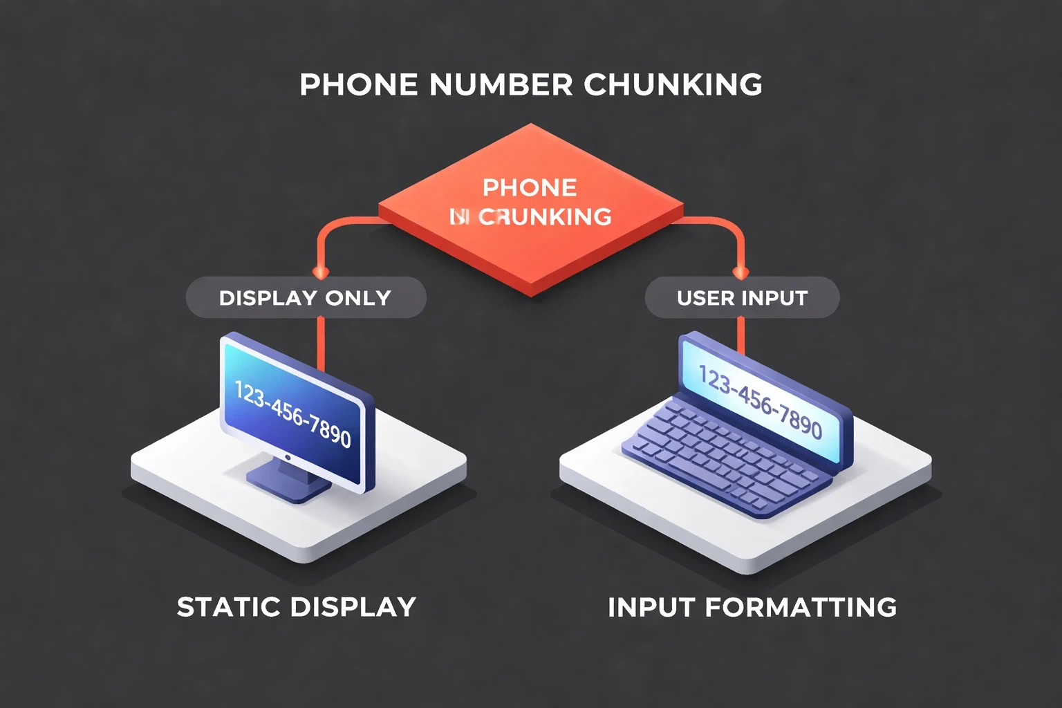
Static displays show stored numbers on confirmation screens, profile pages, or dashboards. These prioritize scannability. Display logic should always chunk numbers based on the detected region, even if the database stores raw digits.
Input formatting happens during active entry. The goal is lowering cognitive load while capturing clean data. Inputs need sophisticated logic for incomplete entries, paste events, and mid-edit corrections.
Hybrid scenarios pop up in editable profile fields. When a user clicks edit, the input should show formatted text, not raw digits. This maintains consistency. On save, validate and store the clean value, then show the formatted version.
Admin dashboards and CRM interfaces should always display chunked numbers with country codes. Support agents scanning long lists need to distinguish +1 from +44 or +91 instantly. Color-coding or country flags helps, especially in global operations centers.
Confirmation screens and receipts act as records. Display numbers with full international formatting (+1 650-253-0000) to remove ambiguity. Users screenshot these; unclear formatting generates support tickets later.
Common Mistakes That Break Phone Number UX
Hardcoding US-centric formats is the most common error. Forms assuming 10-digit NANP numbers immediately alienate international users. Startups targeting global markets need region-aware inputs from the start; retrofitting localization is expensive.
Restricting input to digits only prevents users from typing formats they prefer. Power users type (650) 253-0000 instinctively; forcing them to delete punctuation creates friction. Robust inputs accept multiple formats, strip non-numeric characters server-side, and display the canonical format back.
Mismatched display and input formats confuse people. If a confirmation screen shows +1-650-253-0000 but the edit field shows (650) 253-0000, users wonder if the system captured it correctly. Consistency signals reliability.
Premature validation errors trigger before the user is done. Flagging a red error after "650" creates anxiety. Validate on blur or submit, not on every keystroke. Real-time formatting is helpful; real-time error nagging is hostile.
Ignoring mobile paste behavior breaks workflows. Users paste unformatted strings like "6502530000" or formatted ones like "+1 (650) 253-0000". Inputs that choke on either fail basic usability. Strip formatting on paste, reformat, and validate silently.
Lack of country code detection forces manual work. Selecting "United States" should auto-populate +1 and format for NANP. Design systems should link country selection to phone formatting logic.
Storing formatted strings in databases creates debt. Save raw digit strings with separate country code fields; apply formatting only in presentation. This lets you reformat for different contexts (SMS APIs, voice calls, exports) without regex gymnastics.
Testing Phone Number Chunking Across Devices
Desktop testing needs to cover Chrome, Firefox, Safari, and Edge on Windows, macOS, and Linux. Focus on cursor behavior during auto-formatting, paste handling, and keyboard navigation (Tab, Shift+Tab). Test with mouse and keyboard-only users for accessibility.
Mobile testing requires physical devices. Emulators miss keyboard behavior nuances, autocorrect interactions, and zoom. Test on flagships and budget devices; JavaScript performance issues often only surface on slower hardware.
Accessibility testing must verify screen readers. JAWS, NVDA, and VoiceOver need to announce formatted numbers intelligibly. Error messages must be programmatically associated with inputs (aria-describedby) so assistive tech users get feedback.
User research with diverse participants reveals edge cases QA misses. Recruit users from target markets with different languages, devices, and technical skills. Watch them try to enter a number without guidance; their struggles highlight real friction.
A/B testing different formatting approaches quantifies impact. Test auto-formatting vs. manual, with-country-code vs. without. Measure completion rates, error rates, and time-on-field. Even small conversion improvements add up, especially in e-commerce checkout flows.
Heatmaps and session recordings from tools like Hotjar show where users struggle. If recordings show users deleting and retyping numbers, the formatting logic is broken. If they abandon immediately after the phone field, the pattern is too confusing.
How Phone Number Chunking Affects Form Conversion Rates
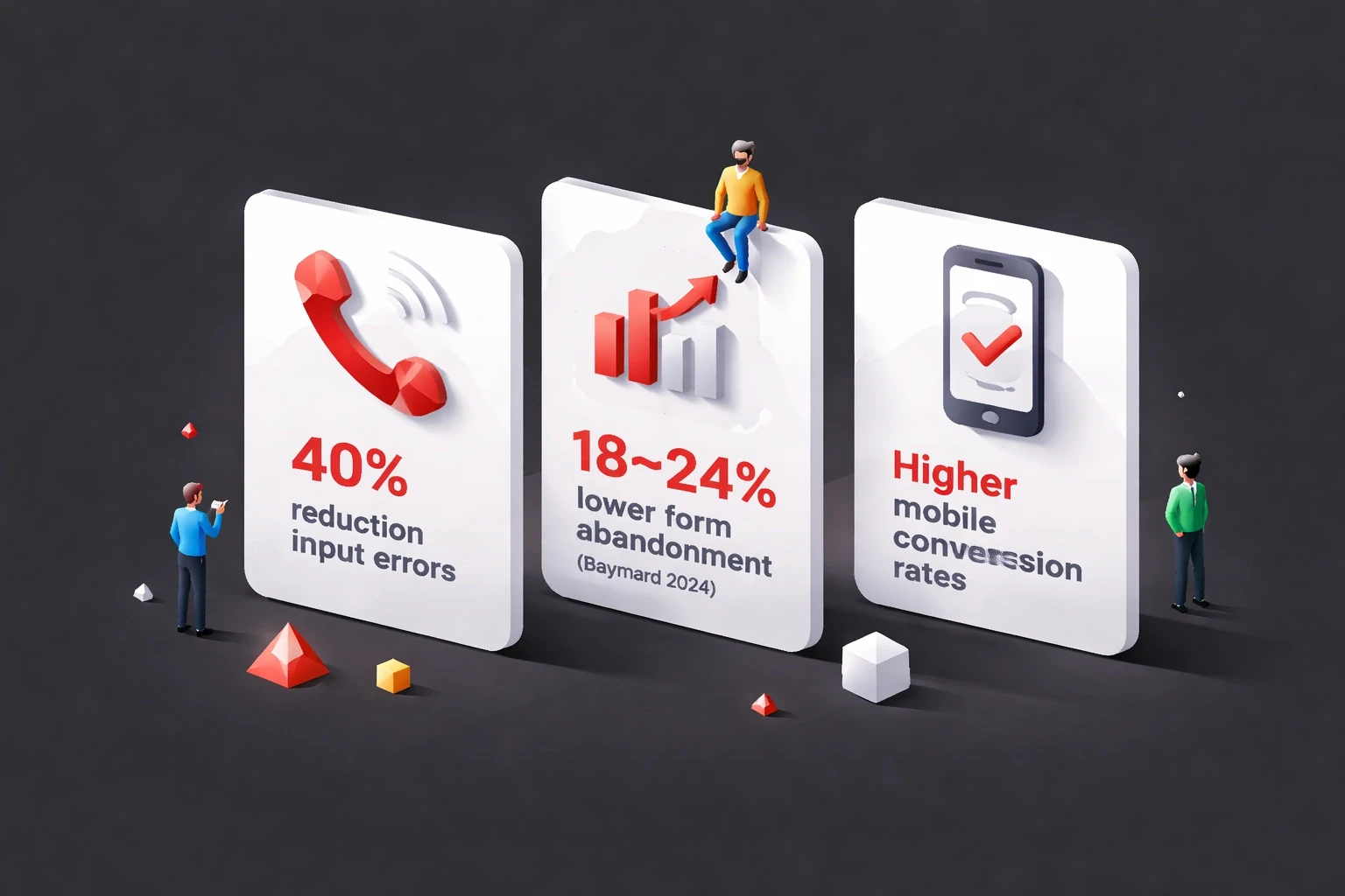
Properly chunked phone inputs reduce form abandonment by 18-24% according to Baymard's 2024 checkout research. This scales with form complexity; the more fields a user has to complete, the more critical it is to minimize friction in each one. Phone numbers sit in a cognitive "effort zone" where small improvements yield outsized returns.
Mobile conversion rates see bigger gains. Thumbs aren't as precise as mice, and small screens make scanning long strings hard. Auto-formatted inputs provide immediate visual confirmation, helping mobile users finish faster. Mobile-first design approaches should treat chunking as mandatory.
International users show the most dramatic shifts. Users trying to enter non-US numbers in US-formatted fields abandon at rates over 40%. Region-aware formatting drops this to baseline. For global SaaS platforms, this single change can unlock markets.
Trust signals multiply the impact. When users see their number formatted correctly in real-time, the system feels intelligent. This perception extends to the brand; users attribute professionalism to companies that handle details elegantly. The opposite is also true: broken formatting signals amateurism.
Error recovery improves with better chunking. When validation fails, well-formatted numbers help users spot mistakes faster. Visual grouping makes transposed digits obvious. Compare reading "6502530000" vs. "(650) 253-0000" when looking for a typo the latter takes much less effort.
Integrating Phone Number Chunking with Design Systems
Design system documentation should specify chunking patterns for supported regions. Include code examples, format masks, and validation rules. Teams shouldn't need to research international formats; centralize that knowledge.
Component libraries should offer pre-built phone inputs with built-in formatting. React, Vue, Angular, and Svelte have mature libraries (react-phone-number-input, vue-tel-input, ngx-intl-tel-input). Evaluate these before building custom components; most teams overestimate their uniqueness.
Figma mockups should show realistic formatted examples. Place "(650) 253-0000" in input fields, not "Phone Number" placeholder text. This helps stakeholders understand the experience and catches region-specific issues early.
Design systems for enterprise clients must account for internal tools, customer products, and integrations. Abstract formatting logic into shared utilities for consistency. Divergent implementations create data quality issues and maintenance debt.
Versioning matters. When updating chunking logic for new regions or telecom changes, provide migration paths. Breaking changes in phone formatting cascade through systems, breaking SMS delivery, call routing, and data exports.
Accessibility Considerations for Chunked Phone Numbers
Screen readers announce punctuation in formatted numbers unless suppressed. Use aria-label to provide clean readings: aria-label="Phone number 6 5 0 2 5 3 0 0 0 0" while displaying (650) 253-0000 visually.
Keyboard navigation must preserve logical tab order. The phone input should follow country selection. Avoid splitting inputs into separate fields (area code, exchange, number); this triples tab stops and frustrates keyboard users.
Error messages must be specific. "Invalid phone number" is useless. "Phone number must be 10 digits for United States" tells users how to fix it. Associate errors with inputs using aria-describedby.
Color alone cannot indicate validation state. Supplement borders with icons (checkmarks, X symbols) and text labels. About 8% of males and 0.5% of females have color vision deficiency; accessible design patterns account for this.
Voice input users need flexible pattern matching. When a user dictates "six five zero two five three zero zero zero zero", inputs should parse this into (650) 253-0000. This requires NLP beyond basic formatting but improves accessibility for users with motor impairments.
Future Trends in Phone Number Input Design
AI-powered inputs will predict and validate numbers before typing finishes. Machine learning trained on telecom databases could flag impossible combinations instantly, preventing errors rather than correcting them.
Biometric authentication may reduce phone number entry frequency. Face ID and fingerprints enable passwordless flows where phone numbers are just account identifiers, not verification mechanisms. Design priorities shift from entry UX to management UX.
WebAuthn and passkeys might deprecate phone numbers as security factors. SMS two-factor authentication is vulnerable to SIM swapping; hardware keys are safer. As this tech matures, phone inputs may become optional in signup flows.
Conversational interfaces like chatbots and voice assistants need different chunking strategies. Users speaking numbers naturally chunk them ("area code six five zero…"), but voice recognition must parse varied speech patterns.
Global standardization efforts by ITU and GSMA may reduce regional variation, but cultural preferences for chunking will likely persist. Even if technical formats converge, UX will need to respect local conventions.
Measuring the Impact of Phone Number Chunking
Analytics should track field-level metrics: time-to-completion, error rates, abandonment rates specifically for phone inputs. Compare these against other fields. If users spend 3x longer on phone inputs than email, formatting is likely the culprit.
Session recordings reveal qualitative insights. Watch users interact: Do they hesitate? Delete and retype? Abandon after errors? These behaviors surface UX debt.
Customer support ticket volume provides indirect measurement. Track tickets related to phone issues: failed verification codes, wrong contact info, duplicate accounts. Improving chunking should decrease this load.
Conversion funnel analysis should segment by device and region. If mobile users abandon more than desktop, or specific countries show higher drop-off, phone input design is likely the cause. Data-driven design decisions need granular segmentation.
A/B testing provides causal proof. Test competing formats for randomized cohorts and measure completion, error, and downstream metrics. Small improvements compound over user lifetimes, especially in subscription products where onboarding friction determines retention.
Phone number chunking shows how micro-interactions shape macro outcomes. This single pattern influences conversion, data quality, efficiency, and brand perception. Designers and developers who master these details build products that feel effortless qualities that drive sustainable advantage.