

User Insights: Unlocking Design Decisions with Data

Brandhero Team
Discover how user insights reveal audience needs, reduce design guesswork, and drive product improvements with actionable data.
User insights explain what your users do, why they do it, and what it means for your product. You pull them from interviews, analytics, and observation. Without them, you're just guessing. You waste time building features nobody uses while competitors grab the users you frustrated.
What user insights actually reveal about your audience
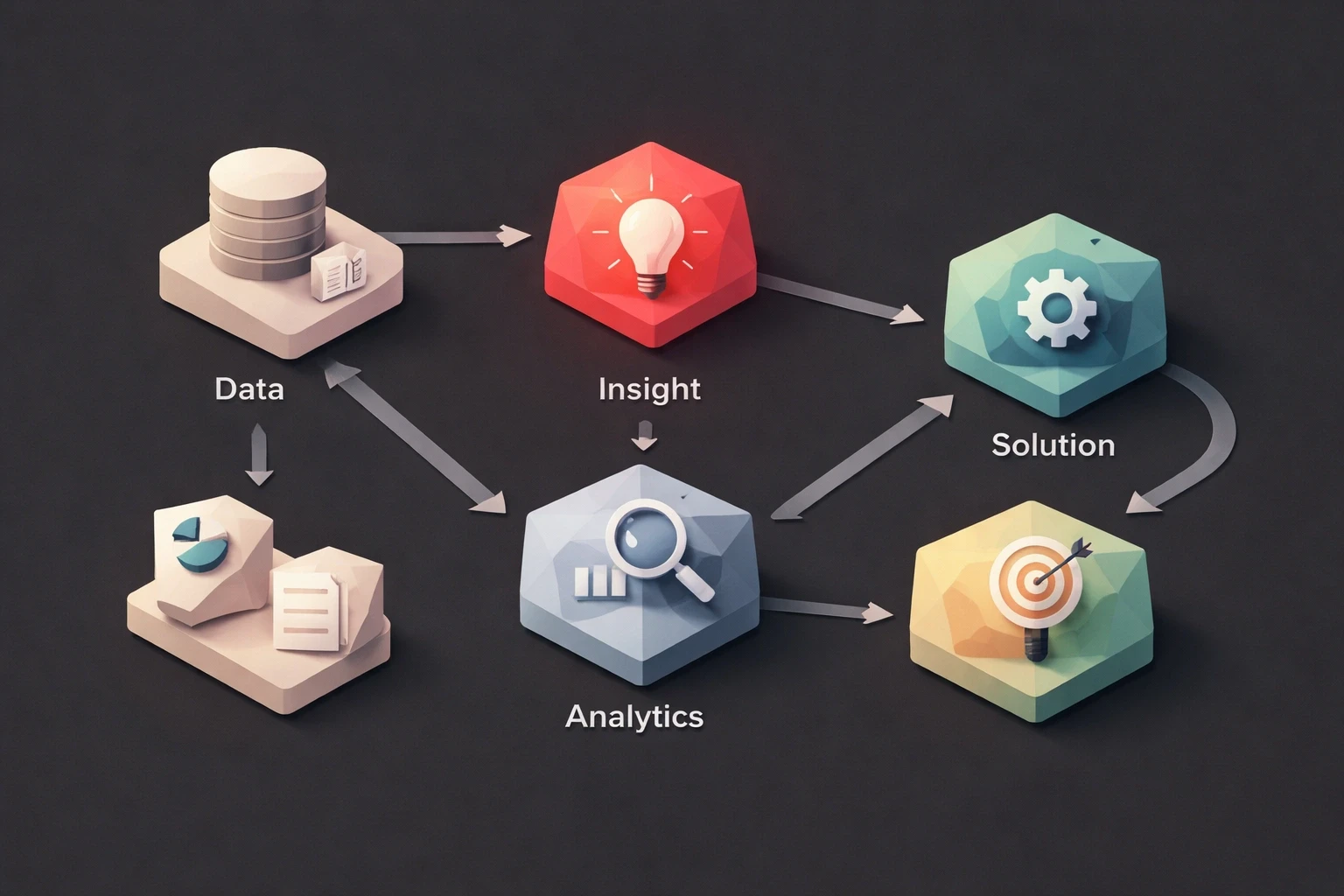
If analytics show 68% of visitors bail on your payment screen, that's data. When you talk to those people and find out they don't trust a single-field credit card input because they can't verify the numbers independently, that's an insight. It's what leads to a phone number chunking solution that actually works.
Insights connect behavior to motivation. Your SaaS dashboard might show power users spending 40% of their time in settings menus. Talk to them, and you realize they're just compensating for missing workflow shortcuts. That changes your next sprint.
They also keep you from confusing correlation with causation. Dark mode users might convert 15% higher, but before you default everyone to dark themes, you should check if those users are just more tech-savvy and were going to convert anyway. Good insights prevent wasted design effort.
The best ones challenge what the team assumes. When Brandhero's UI/UX design process uncovers that enterprise buyers care more about vendor stability than feature lists, it changes the copy, even if the internal team swears that product capabilities are the main selling point.
The categories of user insights that drive results
Behavioral insights track what users actually do, not what they say they do. Session recordings showing people clicking non-interactive elements reveal expectation mismatches. Heatmaps showing ignored CTAs above the fold while 80% of conversions come from footer links should make you rethink your navigation.
Analytics give you the patterns, but you need context. A 90-second average session duration is great for a meditation app, terrible for a comparison shopping tool. Segment by user type, acquisition channel, or lifecycle stage to make the data useful.
Attitudinal insights capture what people think and feel. They explain the "why" behind the behavior. If 43% of churned users cite "overwhelming interface complexity" rather than pricing in exit surveys, you have a UX optimization problem, not a discounting problem.
Behavior and attitude don't always align. Users might complete tasks efficiently while reporting high frustration, meaning they've found workarounds for bad design. Or they might fail at tasks but report high satisfaction because they blame themselves, not your product.
Contextual insights describe the environment. Discovering that 70% of your mobile app traffic happens during morning commutes completely changes how you handle loading, offline functionality, and content chunking. Context also includes technical constraints, like lighting conditions affecting dark mode effectiveness, or social factors, like healthcare apps being used in clinical settings where privacy is a requirement.
Competitive insights show how users experience alternatives. If users describe competitor workarounds that look just like yours, you've found an industry-wide problem you can differentiate on. And remember, users don't compare your B2B dashboard to other B2B dashboards. They compare it to Spotify and Notion.
How to collect user insights
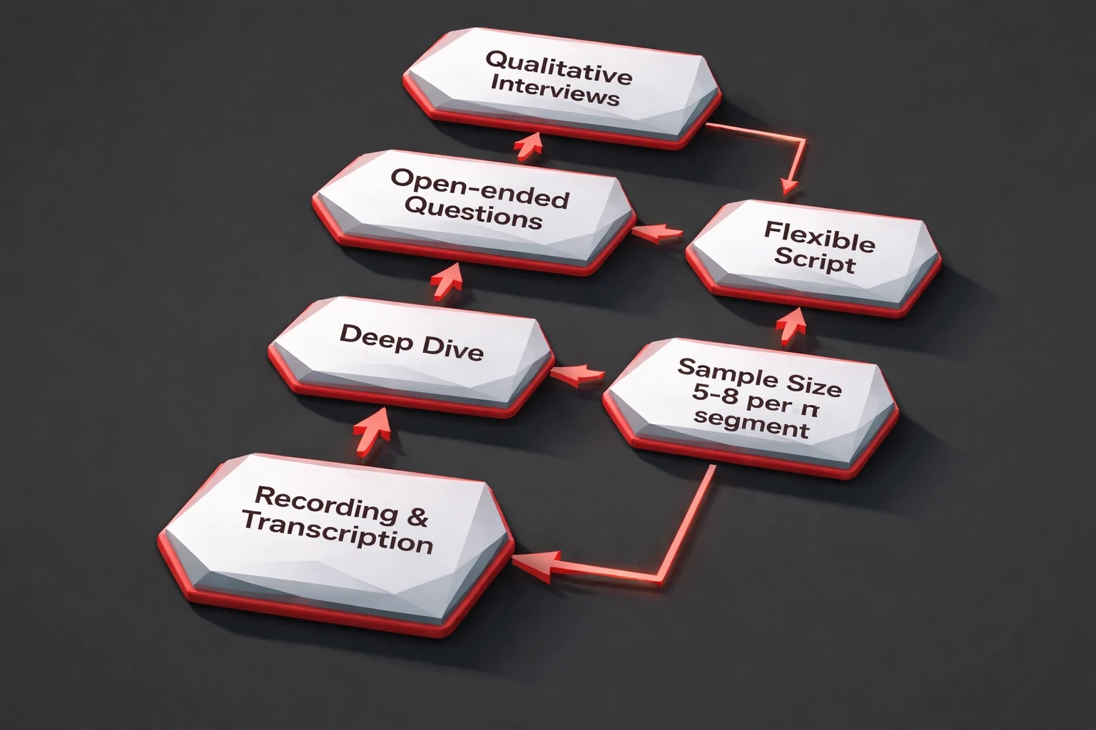
Qualitative interviews give you depth from small samples. Start with open-ended questions that get people talking: "Walk me through the last time you tried to solve [problem your product addresses]." You'll hear workflows and pain points that closed questions miss.
Don't stick too rigidly to a script. If a participant mentions adjusting their workflow because your product lacks something, dig into that. Five to eight interviews per segment is usually enough to start seeing patterns. Record and transcribe everything, because you will miss things while taking notes.
Usability testing shows you where things break. Give people a task like "Add three items to your cart and complete checkout" and watch them fail. When someone says "I'd click here but I'm not sure what happens," you've found a conversion psychology opportunity. Five users will typically uncover 85% of major issues. Don't test with your colleagues. Recruit from your actual user base.
Analytics track behavior at scale. Tools like Mixpanel or Amplitude show drop-off points and user flows. But numbers need interpretation. A 12% bounce rate on a pricing page sounds bad until you realize unqualified people are leaving quickly while the right people convert at 40%. Segment everything. If mobile users abandon forms at three times the desktop rate, the device experience is the problem, not the offer.
Surveys and feedback collect attitudes at scale. Post-task surveys can reveal when an efficient workflow feels complex to users. That's a customer experience design problem requiring a different fix than actual task failure. Time your surveys well. Trigger NPS after meaningful engagement, not just randomly. Keep them short, maybe five questions, and mix closed ratings with one open-ended question so people can explain themselves.
Synthesizing raw data into actionable insights
Getting the data is only half the job. You have to make sense of it.
Affinity mapping is messy but it works. Put interview quotes, observation notes, and survey responses on sticky notes (physical or digital) and group them. Don't use predetermined categories; let the patterns emerge. If 23 notes from different sources all cluster around "confusion about pricing tiers," you have a validated insight. Get engineers and marketers in the room for this. They notice different things than designers do.
Persona development gets a bad rap because most personas are useless. "Sarah, the startup founder" is only helpful if she represents real research patterns, like the fact that she prioritizes speed over customization and abandons products requiring IT involvement. Include direct quotes in your personas. Specify what success looks like for them. And keep it to three to five primary types. Any more and nobody can remember them.
Journey mapping visualizes the experience across touchpoints. Plot stages from awareness through retention. These maps show how early friction compounds into later churn. Users abandoning trials might actually have had unrealistic expectations set by marketing interactions weeks prior. Mark the frustration peaks and satisfaction valleys on your map. The "aha moment" deserves more design investment than routine transactions.
When you write down an insight, force it into a specific format: [User segment] needs [solution] because [underlying motivation], as evidenced by [supporting data]. For example: "Enterprise prospects need transparent pricing because uncertainty blocks internal approval, as evidenced by 67% of sales calls requesting this info and competitive win/loss analysis citing pricing clarity in 8 of 12 lost deals." If you can't fill in those blanks, it's not an insight. It's just a hunch.
Put all these insights somewhere the whole team can access them, like Notion or Airtable. Tag them by product area and user segment so people can actually find them when making decisions about strategic design initiatives.
Applying user insights to improve products
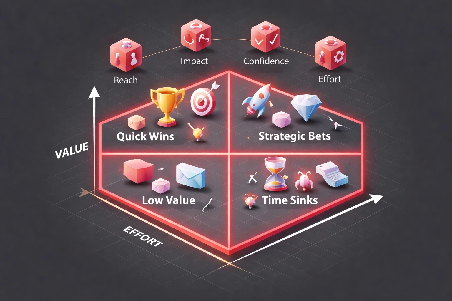
Not all insights are created equal. Use a value-complexity matrix to sort them. Quick wins (high value, low effort) go straight to the backlog. Big strategic bets (high value, high effort) get roadmap slots.
You can also use RICE scoring (Reach × Impact × Confidence ÷ Effort) when insights compete for resources. An insight affecting 80% of users with high confidence and low effort will always beat a niche improvement with uncertain validation.
Always tie insights to business metrics. If onboarding confusion drops trial-to-paid conversion from 18% to 12%, that gets fixed immediately because it hits revenue. Complaints about button colors can wait.
When translating insights into design, don't just go with the first solution. If users miss notifications, you could increase visual prominence, add sound, implement smart defaults, or rethink the hierarchy. Prototype at the right fidelity. Sketches validate direction. High-fidelity prototypes test execution details and psychological UI/UX principles like trust-building.
A/B testing validates whether your changes actually worked. Test single variables to measure specific hypotheses. If the insight was that pricing felt opaque, measure time-to-decision and support ticket volume, not just clicks. Make sure you have enough traffic for statistical significance before calling it. A 12% improvement on low traffic is just noise.
Insights go stale. Quarterly research rotations revisit core assumptions. The insight driving your 2025 navigation redesign might be useless in 2026 if users arrive with different mental models shaped by AI in design standards. Build insight validation into sprint retrospectives. Did the last deployment do what the research predicted? If not, figure out why.
Common mistakes that undermine user insight quality
Confirmation bias is the big one. We've all been in meetings where leadership insists users will love a complex feature once they "learn it," completely ignoring the data saying they hate it. Before you interpret data, write down your team's hypotheses. Then actively look for evidence that proves you wrong. Those outliers are usually the most valuable insights.
Sample bias happens when you only talk to your power users. You'll learn what enthusiasts need but miss why normal people struggle. Recruit methodically. Use screeners. Include former users and non-users whose perspectives challenge your assumptions. Also, remember that people who volunteer for research usually have strong opinions. Weight your insights by how representative the participants are, not just by how loud they are.
Premature solution-jumping is when someone says "We need a mobile app!" before anyone asks if users want one. Enforce problem definition first. When feature requests come in, ask which segment needs it, what problem it solves, and what they do right now without it. Separate your discovery phase from your delivery phase so implementation momentum doesn't override learning.
Analysis paralysis is the opposite problem. You research forever, always finding new questions, while competitors ship imperfect solutions and learn from real usage. Set timeboxes based on decision urgency. Sprint planning needs answers in days, not months. Ship based on directional insights, measure the outcome, and refine. Learning from a live product is usually faster and richer than endless pre-launch research.
How Brandhero transforms user insights into growth
At Brandhero, we build user research into every phase. We start by finding out what the client assumes their users want, and then we go talk to the users to see if they're right. Usually, they're at least a little wrong.
We test wireframes and prototypes constantly. During a fintech project, our research showed enterprise users trusted familiar banking metaphors over innovative interface patterns. So we tested variations balancing innovation with recognition, figuring out exactly which elements needed to feel familiar to build trust.
After launch, we track the metrics to see if the reality matches the research. When it doesn't, we run quick research sprints to figure out why and adjust. Our work samples show conversion improvements up to 200% and revenue growth up to 75%. That doesn't happen by guessing. It happens when you stop building based on internal opinions and start building on validated user needs.
Explore all blogs
Jun 16, 2026
User Insights: Unlocking Design Decisions with Data
User Insights: Unlocking Design Decisions with Data

May 31, 2026
User Experience Optimization: Boost Conversion & Retention
User Experience Optimization: Boost Conversion & Retention

May 31, 2026
User Experience Optimization: Fixing Friction for Growth
User Experience Optimization: Fixing Friction for Growth

May 11, 2026
Phone Number Chunking: Reduce Errors & Improve Conversion Rates
Phone Number Chunking: Reduce Errors & Improve Conversion Rates
May 9, 2026
Mastering Gating in UI/UX Design: Convert Without Pushing
Mastering Gating in UI/UX Design: Convert Without Pushing

May 7, 2026
Gestalt Laws Explain Visual Grouping for Designers
Gestalt Laws Explain Visual Grouping for Designers
May 6, 2026
Checklist for Evaluating Microinteractions in UX
Checklist for Evaluating Microinteractions in UX

May 6, 2026
How Generative AI Transforms Digital Art
How Generative AI Transforms Digital Art