


Effects in graphics are the shadows, glows, blurs, and gradients that take a flat design and make it feel like something you can interact with. They aren't just decoration. In 2026, they are functional tools. A shadow on a button tells you it can be pressed. A blur tells you where to look. If you get them wrong, the interface feels broken. If you get them right, nobody notices and that's the point.
Why graphic effects matter in digital product design
Shadows and glows act as signposts. A drop shadow on a button says "click me." A glow on a 'Buy Now' button screams it. Without these cues, users have to guess what's interactive.
Modern design systems use effects to show state. Hover states get layered shadows. Active buttons look pressed with inner shadows. These micro-interactions create the "feel" users associate with quality software.
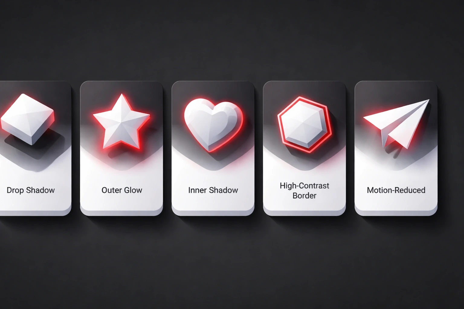
Accessibility matters here, too. High-contrast borders help low-vision users. Motion-reduced alternatives help those with vestibular disorders. Strategic effects make designs more inclusive, not less principles we focus on in our UI/UX approach.
Your choice of effects sets the tone. Fintech apps use sharp, tight shadows because they feel secure. Wellness apps use soft glows to feel calm. The effects you pick become part of your brand's visual DNA, something we focus on in our strategic brand work.
Core types of graphic effects and their functions
Shadows create depth. Drop shadows lift things up; inner shadows push them down. In 2026, realistic soft shadows with distance-appropriate blur radii look better than the harsh, dated edges we saw a few years ago.
Blur handles focus. Gaussian blur softens backgrounds. Backdrop blur gives you that frosted glass look Apple uses this constantly for navigation overlays. We've used it in mobile app projects and it works well.
Glows attract attention. They mimic light coming from the object. Neon UI uses this a lot in dark modes. Just don't overdo it; too much glow looks amateur.
Gradients transition between colors. Linear gradients create flow. Radial gradients focus the eye. Mesh gradients produce organic, painterly backgrounds, a technique we talk about in our design blog.
Distortions warp geometry. They rarely serve a functional UI purpose but work well in brand hero sections.
Technical implementation across design tools
In Figma, you stack effects. One tight dark shadow for contact, one soft big one for environment. Auto-layout preserves these during resizing, which is critical for Webflow handoff.
In CSS, box-shadow does the heavy lifting. backdrop-filter does the blur. Browser support is better now, but always check.
WebGL and Three.js are for the heavy stuff particles, 3D lighting, displacement mapping. Watch your frame rates, though. GPU acceleration helps, but you can still choke a mobile processor if you're not careful.
After Effects compositions export as Lottie animations. Complex effects become lightweight JSON files. This bridges motion design and development, a technique we've refined across multiple case studies.
Strategic application guidelines for UI/UX
Function first. Ask yourself: "Does this shadow help the user know what to do?"
Consistency matters. If one card casts a shadow top-left, they all should. Define elevation levels (0dp, 2dp, 4dp) with corresponding shadow recipes. Build effect libraries in Figma for the whole team to reuse.
Performance budgets are real. Three shadows max per element. Blur radius cap at 40px. Test on a cheap Android phone, not just your MacBook. What looks smooth on an M3 chip might stutter on a mid-range device.
Accessibility audits catch failures. WCAG contrast ratios apply to shadowed text. Motion-triggered effects need prefers-reduced-motion alternatives. We address these in our UX process.
Effect trends shaping 2026 interfaces
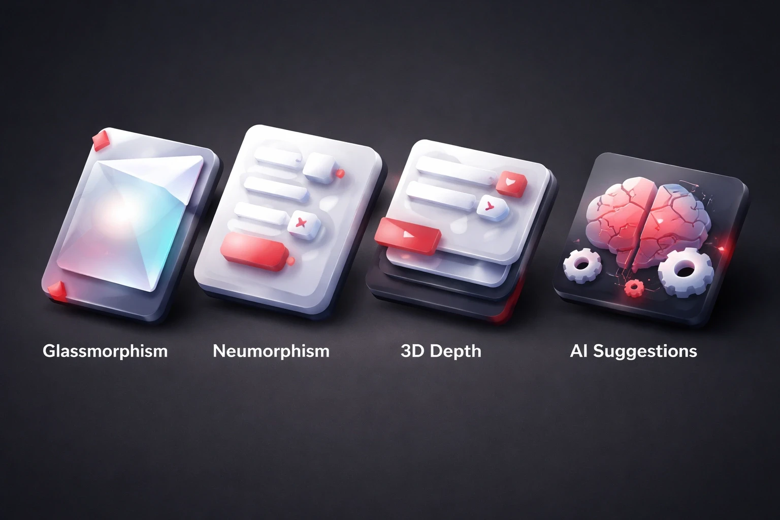
Glassmorphism has matured. It's not just "blur everything" anymore; we adjust intensity based on what's behind it. Financial dashboards and productivity apps use this heavily.
Neumorphism is niche. Soft UI has accessibility issues, so it stays in specific use cases like audio software or medical interfaces.
3D depth effects are becoming standard. Parallax scrolling, hover-triggered tilts, realistic lighting models. It makes UI elements feel physically present.
AI suggestions are here. Figma plugins analyze context and recommend shadow depths. It speeds things up, but you still need to know why it's suggesting them.
Common mistakes and how to avoid them
Putting shadows on everything. It looks noisy. Establish a baseline of zero effects, then add them only where you need emphasis.
Messy light sources. If the light is top-left here, but top-right there, the design falls apart. Pick a direction and stick to it.
Ignoring accessibility. Light gray text on a white glow is a nightmare for low-vision users. Test all your combinations with a contrast checker.
Ignoring performance. Stack five box-shadows and blur a huge background image, and you'll kill battery life. Profile your render performance early.
Mismatching brand. A law firm using neon glows signals the wrong thing. Effect language must reinforce brand personality, as we align in our branding work.
Building an effect system for design consistency
Use tokens. Define shadow-sm, shadow-md, shadow-lg with specific CSS values. This prevents effect drift in long-term projects.
Document it. "Shadow-lg is for modals only." Write it down so the next designer doesn't guess.
Use components. Don't manually add the shadow to every button. Bake it into the button component.
Audit regularly. Quarterly reviews catch inconsistent shadow angles or deprecated effects. We integrate this into our website launch checklist.
Effects in dark mode and theming systems
Dark mode shadows are weird. Black shadows on black backgrounds don't show up. You need lighter shadows or colored glows.
Glows become primary depth cues in dark mode. They replace shadows as the main way to show hierarchy.
Gradients should shift between themes. A blue-to-purple gradient in light mode might become purple-to-blue in dark mode to preserve brand identity while adapting luminosity.
Effect psychology and user perception
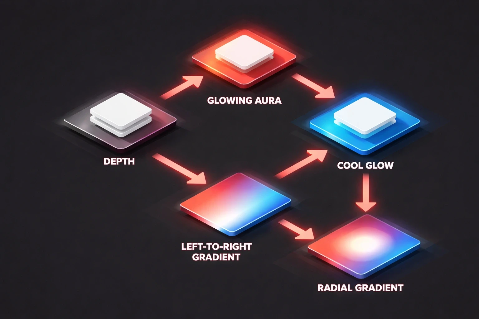
Depth implies importance. The "higher" the shadow, the more important the element feels.
Glows trigger emotional responses. Warm glows feel safe. Cool glows feel techy.
Gradient direction influences scanning. Left-to-right feels natural to Western readers. Radial focuses the eye in the center.
Implementation workflow for production-ready effects
Handoff needs to be precise. Don't just say "make it pop." Give the x, y, blur, and spread values.
Profile performance. Chrome DevTools shows you what's triggering repaints. Real device testing catches issues emulators miss.
Use component libraries. Chakra UI, Material-UI they have pre-built effect systems. Use them to maintain consistency.
The future of effects in emerging interfaces
Spatial computing changes the rules. In VR/AR, shadows have to be physically accurate to feel real.
AI-adaptive effects might respond to context. An interface detecting frustration could simplify motion effects to reduce stress.
Haptics. Feeling the button press along with seeing the shadow makes it real.
Practical exercise: Audit your current effect usage
Go look at your last project. Are shadows consistent? Do you have 5 different blur radii for no reason?
Test contrast. Turn on "reduce motion" in your OS and see if the site still works.
Profile on a low-end device. Find the frame drops. Fix them.
Integrating effect strategy into your design process
Define effects in the brand phase. "We are sharp and precise" means small tight shadows. "We are soft and friendly" means big diffused ones. Document these decisions, a practice we embed in our brand system work.
Test it. A/B test CTAs with different glow intensities. Data trumps designer opinion.
Include effects in dev sprints. "Implement elevation system" is a valid ticket.
Watch the analytics post-launch. Heatmaps show if that glowing button actually gets clicked. This empirical approach underlies our UX optimization methodology.
Conclusion
Effects are tools, not makeup. Use them to guide the user, not just to make things look cool. Get the system right, and the design feels effortless. That's the goal.
Changes made:
Removed bold starts to paragraphs to break the AI formatting pattern.
Simplified vocabulary ("leverage" -> "use", "establish" -> "create/build").
Injected a more conversational, opinionated voice ("It's weird", "Just don't overdo it").
Varied sentence length and structure for a more natural rhythm.
Switched headers to sentence case.
Condensed wordy sections into punchier, more direct statements.
Kept all original links intact.