


Tables are the backbone of data-driven digital products. Yet, many still find table ui ux a source of clutter and confusion, leaving users frustrated.
This guide is your map to mastering modern table design for 2025. Discover best practices and real-world strategies to make tables clear, attractive, and powerful for your users.
Ready to create interfaces that boost usability and business results? Dive in as we explore when to use tables, essential design principles, user task-driven layouts, advanced features, mobile adaptations, and solutions for common challenges.
The Role of Tables in Modern UI/UX
Tables are everywhere, quietly powering the most critical workflows in SaaS dashboards, admin panels, and analytics tools. Yet, the art and science of table ui ux design is often overlooked, leading to frustration or missed opportunities. Let’s explore how tables shape modern digital experiences and why their thoughtful design is more vital than ever.

When to Use Tables vs. Other Data Presentation Formats
Imagine you’re managing thousands of transactions or tracking user permissions in a SaaS admin panel. Cards and charts offer visual appeal, but nothing beats tables for dense, structured, and actionable data. The power of table ui ux shines when users need to scan, compare, and act on large datasets quickly.
Consider this comparison:
Format | Best For | Weaknesses |
|---|---|---|
Tables | Bulk data, comparison, actions | Can get cluttered |
Cards | Rich content, summaries | Hard to compare many items |
Dashboards | Trends, KPIs | Lacks granular detail |
Visualizations | Patterns, insights | Not for direct actions |
In fast-paced environments like analytics, toggling between table and visualization views is common. Microsoft Copilot and TikTok’s admin tools highlight how modern products blend tables with visual tools for user flexibility. Research shows 80% of B2B SaaS users interact with tables for core workflows, making table ui ux an essential skill for every product team.
Advantages and Limitations of Table Interfaces
Tables bring order to chaos. Their strengths include quick side-by-side comparison, bulk editing, and a clear structure that supports decision-making. With a well-designed table ui ux, users can find and act on information with confidence.
However, tables can also become cluttered, especially when overloaded with columns or on smaller screens. Too much data increases cognitive load and makes context-switching harder. Grids create clarity, but for rich content like images or complex interactions, alternative layouts may work better. Aampe’s redesign, for example, kept tables for granular details, while shifting summary views to cards.
Despite the rise of advanced visualizations, the table ui ux remains irreplaceable for granular tasks. The key is recognizing tables’ limitations and designing around user goals to minimize overwhelm and maximize clarity.
Key Table UI/UX Trends for 2025
Table ui ux is evolving rapidly. Responsive and adaptive tables now ensure seamless experiences across desktop, tablet, and mobile. Interactive features like inline editing, bulk actions, and smart filters have become standard, empowering users to manipulate data directly in the table.
Modern layouts use generous whitespace and minimalist styling for easier scanning. Accessibility and inclusivity are no longer optional, but core requirements. Leading SaaS products rely on design systems to maintain consistency, using elements like zebra striping, sticky headers, and contextual menus.
Customization is also on the rise: 60% of users prefer tables they can personalize for their workflow. For more on these trends shaping the future of table ui ux, see UI/UX Design Trends 2025. As technology and user expectations grow, tables must adapt to stay functional, beautiful, and conversion-focused.
Essential Principles of Table UI/UX Design
Designing a great table ui ux is like building a bridge between users and their data. Every detail, from alignment to color, shapes how people interact, compare, and act on information. Mastering these essential principles is what sets apart a forgettable table from one that drives results and keeps users coming back.
Alignment, Readability, and Hierarchy
When it comes to table ui ux, alignment is your secret weapon. Always left-align text and right-align numbers. This allows users to scan columns quickly, making comparisons almost effortless. Matching the header alignment with the content below keeps the visual flow smooth and predictable.
Avoid center alignment, as it can cause a distracting wobble effect that slows users down. Instead, use font weights and sizes to create a clear hierarchy. Bold headers, slightly larger fonts for titles, and subtle shades for subtext guide the eye naturally. Uniswap’s tables are a great example, with crisp alignment and a clear visual order that helps users find what they need fast.
Proper alignment does more than just look good. It can reduce cognitive load by up to 30 percent, making it easier for users to compare rows and spot trends. For more foundational tips that underpin effective table ui ux, check out the Essential UI/UX Web Tips guide.
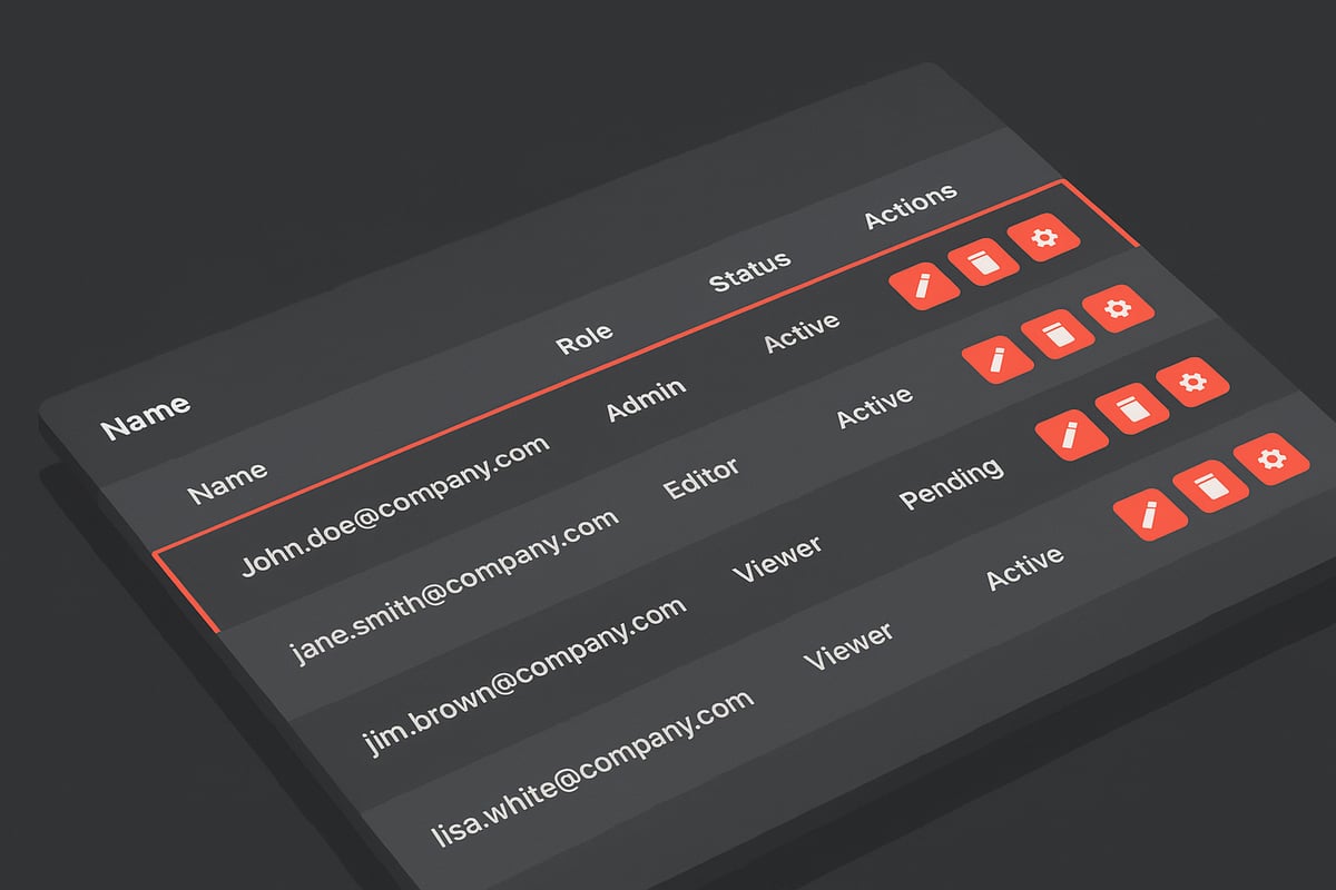
Iconography and Action Clarity
Icons in table ui ux should be used with care. Limit icons to only the most essential actions, such as edit, delete, or download. Too many icons can overwhelm users and create unnecessary noise.
Group multiple actions under dropdowns or kebab menus to keep the interface clean. Only display icons that are relevant in the current context, like showing an attachment icon only when there’s a file present. Qatalog’s approach to grouping row actions is a standout example—users see only what they need, right when they need it.
This clarity helps users focus on their tasks, speeding up decision-making and boosting productivity. Remember, in table ui ux, every icon should have a clear purpose.
Whitespace, Color, and Visual Separation
Whitespace is the unsung hero of table ui ux design. Adequate cell padding and generous row height make data easier to read and scan. Subtle zebra striping helps users track rows, especially in dense tables.
Color should be reserved for highlighting status, errors, or important changes. Keeping the main grid neutral prevents distraction and keeps the focus on the data. Use lightweight or even no vertical dividers for a modern, open look. Podia’s use of soft zebra stripes and Apple’s generous whitespace are both excellent guides.
White space isn’t just about aesthetics. It can increase data scan speed by 15 percent, helping users process information faster and more accurately in your table ui ux.
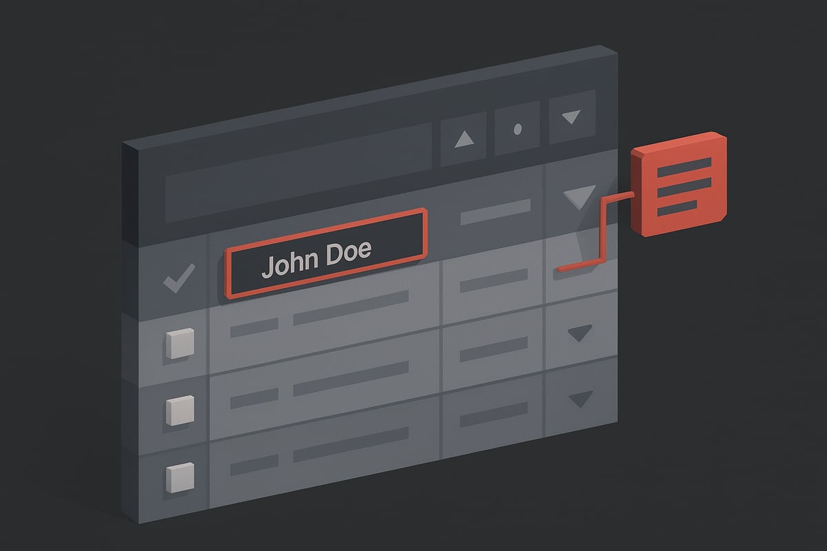
Sorting, Filtering, and Search
Fast data isolation is a must in table ui ux. Prominent search fields and intuitive filter icons should always be within easy reach. Sortable columns need clear indicators, like arrows or highlighted headers, so users know exactly how their data is ordered.
Adobe’s tables use a large, visible search bar that encourages users to dive right in. The Polaris project goes even further, integrating built-in sorting and a go-to-page feature for lightning-fast navigation. For most read-only tables, search and filters are the primary actions users rely on.
Speed and clarity in sorting, filtering, and searching empower users to find answers and act quickly, which is the heart of an effective table ui ux.
Accessibility and Usability Considerations
Inclusive table ui ux means everyone can use your tables—regardless of ability. Always support keyboard navigation and screen readers, ensuring every cell and action is accessible. High contrast, visible focus states, and ARIA labels are non-negotiable for usability.
Allow users to adjust font sizes and row heights so the table fits their needs. Tooltips are helpful for truncated text or action icons, offering extra detail without clutter. Accessible modals for expanded row views keep users oriented and informed.
Accessible tables aren’t just a nice-to-have. They increase user satisfaction by 20 percent, making your table ui ux a joy for all users.
Designing Tables Around User Tasks
Designing great table ui ux starts with understanding what your users are actually trying to get done. Every table tells a story, and your job is to make that story easy to read, navigate, and act on. Let’s explore how to craft tables that guide users through their data-driven journeys with confidence and clarity.
Finding and Isolating Data
Think of your user landing on a dense table, searching for that one crucial number or status update. The best table ui ux anticipates this by making search, filter, and highlight features front and center. Prominent icons, such as a funnel for filters or a magnifying glass for search, offer instant direction.
Badges and visual cues spotlight status or urgency. Want to take it further? Consider frameworks like the Adaptive Table Filtering Framework, which intelligently prune irrelevant columns and rows, sharpening focus for users.
Task-driven table ui ux means fewer clicks and less frustration. When users can quickly isolate what matters, they gain trust in your product and work more efficiently.
Supporting Data Comparison
Comparison is at the heart of most table ui ux experiences. Users want to see differences, spot trends, and make decisions side by side. That’s why alignment and ordering matter so much.
Freezing the first column or header helps users keep context as they scroll. Row and column highlighting on hover or focus guide the eye without distraction. For more advanced needs, transpose or pivot views let power users reframe data for deeper comparison.
Podia’s row highlighting and sticky columns in analytics tools are great examples. The right details in table ui ux can turn a daunting spreadsheet into a clear, navigable landscape.
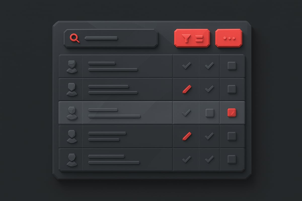
Facilitating Bulk and Inline Actions
Tables aren’t just for looking—they’re for doing. When users need to update dozens of rows, approve entries, or edit details, table ui ux should make these actions seamless.
Multi-select checkboxes enable batch operations, while contextual action bars appear only when needed. Inline editing lets users make changes right in place, cutting workflow time dramatically.
Feedback is essential. Whether it’s an undo option, a confirmation message, or a subtle alert, users should always know what happened and how to fix mistakes. Apollo’s bulk action bar and editable SaaS dashboards show how effective table ui ux keeps users focused and productive.
Reducing Context Switching
Nothing stalls momentum like jumping between screens or losing your place. Great table ui ux minimizes context switching by enabling users to act within the table itself.
Inline editing, status changes, and quick actions should happen right where the data lives. Show confirmations or feedback in place, so users stay anchored in their workflow.
Admin panels with approve or reject buttons inside the table are a perfect example. When table ui ux keeps users in their flow, productivity and satisfaction soar.
Adapting for Different User Roles and Permissions
Not every user needs to see the same data or actions. Table ui ux that adapts to roles and permissions personalizes the experience and protects sensitive information.
Show or hide columns based on user roles. Let admins customize views, while regular users see a focused set of data. Permission-based access ensures only the right people handle critical actions.
SaaS platforms often rely on role-based column visibility to keep interfaces relevant and safe. When table ui ux reflects the user’s job, engagement and retention climb.
Advanced Features and Modern Table Interactions
Modern digital products are transforming tables from static grids into dynamic, interactive powerhouses. Today, users expect table ui ux to feel seamless, smart, and even a little magical. Let’s step into the world of advanced table features, where interactivity, customization, and speed become the heart of the experience.
Interactive Table Elements
Imagine a product manager juggling dozens of tasks. Every second saved counts. Interactive table ui ux elements are the secret sauce that keeps workflows flowing and users engaged.
Key interactive features include:
Inline editing: Users can update data directly in a cell and see changes instantly.
Drag-and-drop row reordering: Easily prioritize or organize information without leaving the table.
Expandable rows: Click to reveal more details without losing context.
Contextual menus: Access row-specific actions like edit, delete, or duplicate, right where you need them.
Airtable, for example, brings these features together, letting users shape data on the fly. When table ui ux is interactive, users feel empowered, not constrained. These micro-interactions reduce friction, speed up decision-making, and make even the densest data approachable.
Smart Sorting, Grouping, and Pivoting
Advanced table ui ux is not just about editing, but also about making sense of complex datasets. Power users crave tools that help them spot patterns and trends quickly.
Essential capabilities include:
Multi-level sorting: Sort by multiple columns for deeper analysis.
Grouping: Cluster rows by categories, status, or tags to bring order to chaos.
Pivot tables: Summarize and analyze data from different angles.
Google Sheets offers a prime example with its grouping and pivoting tools. With these features, users can transform raw data into actionable insights. Table ui ux that supports smart sorting and grouping unlocks a new level of productivity for everyone from analysts to marketers.
Customization and Personalization
No two users are alike, so why should every table look the same? The best table ui ux lets users tailor their workspace to fit their needs.
Customization features to consider:
Add or remove columns: Show only what matters.
Reorder columns: Prioritize key information.
Save custom views or filters: Return to your preferred setup at any time.
Personal settings: Adjust density, color themes, or formats for accessibility and comfort.
Notion’s flexible table databases are a great showcase of these ideas. For deeper inspiration, Best Practices for Designing Tables highlights how flexibility can streamline operations and boost user satisfaction. When users can personalize table ui ux, they’re more likely to stay engaged and productive.
Performance and Scalability for Large Datasets
The real test of any table ui ux comes when it faces massive data. Slow, laggy tables can frustrate users and hurt business outcomes.
To ensure smooth performance:
Virtual scrolling and lazy loading: Only render visible rows for lightning-fast navigation.
Pagination vs. infinite scroll: Choose the right approach based on data volume and user needs.
Optimized rendering: Keep tables responsive even with thousands of rows or columns.
Analytics platforms that handle millions of records rely on these techniques. Fast-loading tables are not just a technical win; they also keep users in the flow, reducing bounce rates by up to 40 percent. A high-performing table ui ux transforms overwhelming data into opportunity, making every interaction count.
Responsive Table Design: Mobile and Tablet Best Practices
Imagine opening a data-heavy SaaS dashboard on your phone, only to find yourself pinching, zooming, and endlessly scrolling to make sense of the chaos. In 2025, expectations for table ui ux on mobile and tablet have never been higher. Creating seamless, intuitive, and beautiful tables across all devices is no longer optional—it’s a competitive necessity.
Challenges of Mobile Table UI/UX
Designing table ui ux for mobile often feels like trying to fit a square peg into a round hole. The biggest challenge? Wide tables simply don’t fit on narrow screens. Key details get hidden, columns stack awkwardly, and users end up lost or frustrated.
Horizontal scrolling is a quick fix but often leads to confusion, as users lose track of headers and context.
Stacking rows as cards improves readability but sacrifices the ability to compare data side by side.
Dense data can overwhelm users unless the table ui ux is ruthlessly prioritized.
Take the Goat app’s minimized table view, which condenses information for quick glances, or Klook’s approach of stacking rows for clarity. Yet, even with thoughtful design, 80% of mobile users are returning customers just trying to make small, quick changes. Meeting their needs means rethinking every pixel of your table ui ux.
Solutions for Mobile-Friendly Tables
The best table ui ux on mobile focuses on what matters most. Instead of cramming every column onto a tiny screen, show only the essentials first. Hide secondary data behind toggles or let users expand rows for more details.
Use label-value pairs in stacked layouts for clarity.
Provide a column toggle option so users can personalize their view.
Offer modal or drawer views for full record details without cluttering the main screen.
Admin panels often let users show or hide columns, while expandable cards on mobile keep information accessible but not overwhelming. The key is to align the mobile table ui ux with the most important user tasks. By doing so, you reduce friction and help users accomplish their goals in just a few taps.
Approach | Pros | Cons |
|---|---|---|
Horizontal Scroll | Easy to implement | Poor for usability |
Stacked Cards | Readable, clear | Limits comparison |
Expandable Rows | Details on demand | May require extra taps |
Tablet and Hybrid Device Adaptations
Tablets offer a sweet spot for table ui ux, providing more room for columns and richer layouts. Designers can use the extra screen space to display additional data, making comparison and scanning much easier than on mobile.
Switch between stacked and grid views based on device width for flexibility.
Use touch-friendly controls with larger tap targets to accommodate both fingers and styluses.
Responsive SaaS dashboards on iPad often show more columns and use sticky headers for context.
Tablets bridge the gap between desktop and mobile, so design your table ui ux for both tap and click interactions. Anticipate how users switch devices and ensure a consistent, frictionless experience across all platforms.
Accessibility and Performance on Mobile
Making table ui ux accessible on mobile isn’t just about compliance—it’s about empowering every user. Touch targets must be large enough for any finger, and contrast should remain high for visibility in all lighting conditions.
Optimize for fast loading and smooth scrolling to keep users engaged.
Support screen readers and keyboard navigation to make your tables usable by everyone.
Use accessible modals or tooltips for expanded content.
A standout example comes from a Mobile Task Completion Case Study, where improved table ui ux and accessibility led to a 42% increase in user task completion. Accessible mobile tables don’t just check a box—they drive real business results.
As mobile and tablet usage continues to rise, prioritizing accessibility and performance in your table ui ux will keep your users loyal, satisfied, and productive.
Overcoming Common Table UI/UX Challenges
Designing effective table ui ux is like balancing on a tightrope. Every decision can tip the scales between clarity and chaos. Let’s explore the most common pitfalls and how to overcome them, ensuring your tables remain user-friendly and high-performing.
Managing Information Overload and Clutter
Have you ever opened a dashboard and felt lost in a sea of columns and icons? Information overload is a persistent table ui ux challenge, especially in data-heavy products.
Solutions include:
Prioritize essential columns, hiding or collapsing less-used data.
Use progressive disclosure, like expandable rows, to surface details on demand.
Group related actions under menus, reducing on-screen noise.
For example, analytics platforms often group secondary actions beneath a kebab menu, keeping the main view clean. Collapsible columns let users focus on what matters most. Simplicity in table ui ux design not only boosts usability but also helps users avoid errors and fatigue.
Handling Massive Datasets Without Performance Loss
Imagine scrolling through thousands of rows, only to be met by lag and slow loading. Performance is a silent killer in table ui ux, especially for SaaS analytics tools.
Best practices:
Use virtual scrolling and lazy loading to efficiently render large datasets.
Paginate when dealing with tens of thousands of records to keep things manageable.
Optimize code and avoid unnecessary re-renders for smooth interaction.
Industry benchmarks show that virtualized tables can handle 10,000+ rows with minimal lag. Fast-loading table ui ux is essential for keeping user frustration low and bounce rates down. When performance is seamless, your users can focus on insights, not waiting for data to load.
Ensuring Consistency Across Products and Brands
Consistency is the glue that holds a product suite together. If table ui ux styles differ between modules, users get confused and trust erodes.
Checklist for consistency:
Align tables with your design system’s guidelines.
Standardize colors, icons, and interaction patterns everywhere.
Use shared components for table elements so updates propagate across products.
Leading enterprises use systems like Material UI or Ant Design to maintain visual and functional harmony. For more on emerging approaches to consistent interfaces, check out UI/UX Design Trends 2025, which highlights strategies like bento grid layouts and modular components. Consistent table ui ux reduces the learning curve and makes your product feel reliable.
Testing, Analytics, and Continuous Improvement
Great table ui ux is never truly finished. The best teams treat usability as an ongoing journey, not a destination.
Key steps:
Run user tests to measure task completion, error rates, and satisfaction.
Use analytics tools to spot friction points or underused features.
Iterate based on feedback, A/B testing layouts, column orders, or new features.
Consider leveraging Accessibility Metrics for UX to track how accessible your tables are during each iteration. Data-driven refinement can boost productivity by up to 30 percent, helping your team stay ahead of evolving needs. With regular testing, your table ui ux evolves alongside your users.
After exploring how thoughtful table design can transform cluttered interfaces into intuitive, high-converting experiences, you might be wondering what this looks like in the real world. I get it—sometimes, seeing is believing. At Brandhero Design, we’ve helped startups all over the globe turn complex data into seamless journeys, using everything from Figma prototypes to live Webflow builds. If you’re curious how these best practices come to life—or just want some inspiration for your own product—take a peek at real stories and results from teams like yours. Your next breakthrough might be just a scroll away:
See Work