

Psychological UI/UX Design: Boost Startup Conversions with Human-Centric Strategies
Brandhero Team
Discover how psychological principles in UI/UX design can transform your startup's conversion rates. Learn about cognitive load, social proof, reciprocity, and ethical strategies to drive user trust and growth.
When you're building a startup, every pixel matters. Not because of aesthetics, but because each design decision either nudges users toward conversion or pushes them away. The gap between a 2% conversion rate and a 12% one often isn't your product or pricing it's the psychological triggers embedded in your UI/UX.
After working with over 200 startups, we've seen how understanding user psychology transforms products from "nice to look at" into actual revenue generators. This isn't about manipulation. It's about removing friction, building trust, and designing for how humans actually think.
Here's what actually moves the needle.
Why Psychology Matters More for Startups
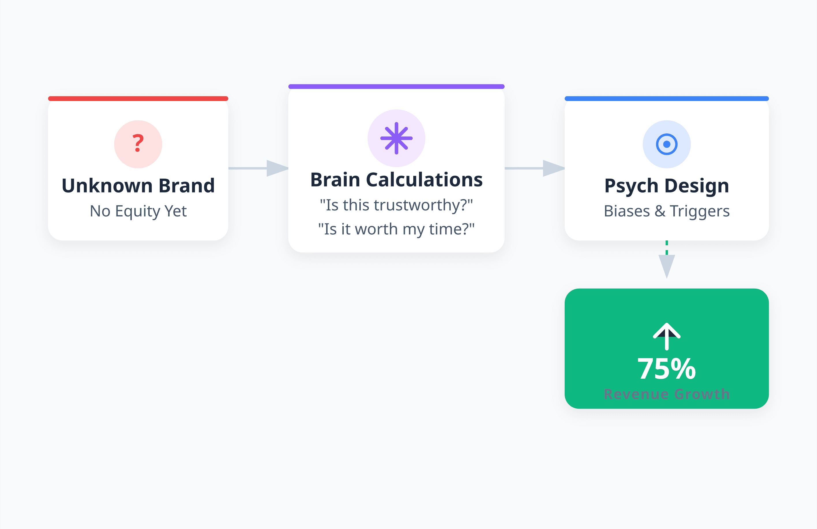
Your startup faces a specific challenge: you're asking users to trust a brand they don't know, often with their money, data, or time. Established companies have brand equity. You don't. That's why psychological design principles matter more for you.
Research shows design-focused companies see up to 75% higher revenue growth. But it's not just "good design" it's psychologically-informed design that understands cognitive biases, decision shortcuts, and emotional triggers.
When users land on your product, their brains run rapid background calculations: Is this trustworthy? Is it worth my time? What happens if I click? Good design answers these before users ask them.
The Cognitive Load Principle
Here's a counterintuitive truth: every option you add makes decisions harder. The human working memory holds about 3-5 items. When you overwhelm users with choices, their brains freeze a phenomenon Barry Schwartz calls the "paradox of choice." Users often pick the easiest option: leaving.
What actually works:
Limit primary navigation to 5-7 items
On landing pages, one primary action (not three equal CTAs)
Break complex forms into multi-step processes
Use progressive disclosure reveal advanced features only when needed
Cut redundant elements
We redesigned a SaaS dashboard for a fintech startup by reducing 23 visible features on the home screen to 5 contextual ones. Activation jumped 47% because new users could finally understand what to do first.
Visual Hierarchy
Users don't read interfaces they scan them in predictable patterns. Eye-tracking studies show most people follow F-patterns or Z-patterns. This isn't random; it's how brains efficiently process information.
Visual hierarchy uses size, color, contrast, and positioning to guide attention. It's not about making things "look nice." It's about architecting a visual journey that ends in conversion.
Techniques that convert:
Make primary CTAs 20-30% larger than secondary actions
Use high-contrast colors for conversion elements
Position critical information in the upper-left quadrant
Create white space around important elements
Use directional cues to point toward CTAs
On a pricing page, if every tier looks equally prominent, users struggle. But when you visually emphasize your most popular plan (larger card, different color, "Recommended" badge), conversions increase because you've reduced decision friction.
Social Proof: The Trust Shortcut
When facing uncertainty, humans look to others for cues it's an evolutionary survival mechanism. For startups lacking brand recognition, social proof is your trust currency.
But here's where most startups fail: they add a generic "1000+ users" counter and think they're done. Effective social proof is specific and placed at decision-making moments.
What actually converts:
Specific testimonials: "Increased conversions by 34% in two weeks" beats "Great product!"
Real names, photos, companies: Stock photos destroy credibility
In-context placement: Show testimonials about ease-of-use near signup forms, not just on a dedicated page
Activity indicators: "23 people viewed this in the last hour"
Third-party validation: Badges from ProductHunt, G2, industry awards
For a wellness platform, we moved client results from a separate testimonials page to the signup flow right before payment information. Completion rate increased 28% because we addressed doubts exactly when they arose.
Looking to elevate your startup's digital presence? Explore how our UI/UX design approach transforms challenges into conversion opportunities.
Reciprocity: Give Value First
Robert Cialdini's reciprocity principle states that humans feel obligated to return favors. In UI/UX, this means providing value before requesting commitment.
Freemium models work partly because of reciprocity after users get value from your free tier, they feel more inclined to upgrade. But reciprocity extends beyond pricing into micro-interactions throughout your interface.
Applications:
Offer valuable content without requiring signup first
Show potential results before asking for payment
Provide helpful tooltips that assist, not just upsell
Give free trial extensions when users engage deeply
Share useful resources even if they don't promote your product
One B2B startup created an ROI calculator that provided detailed projections before collecting contact information. This increased qualified lead rate by 63% because users felt grateful and more willing to continue the relationship.
Anchoring: Pricing Presentation
The first number users see becomes their reference point for evaluating everything else. This has massive implications for pricing and value propositions.
Most startups show their cheapest plan first. This often backfires it anchors users to the lower value, making premium tiers feel expensive by comparison.
What works:
Display your most expensive tier first (if appropriate)
Show original price crossed out next to discounted price
Present annual pricing first, then monthly
Compare features against what users currently use
Use "most popular" labels to create positive anchors
For an enterprise software startup, we restructured their pricing page to lead with enterprise tier, then professional and basic. Average contract value increased 19% because the enterprise anchor made the professional tier (their target) seem more reasonable.
Color Psychology
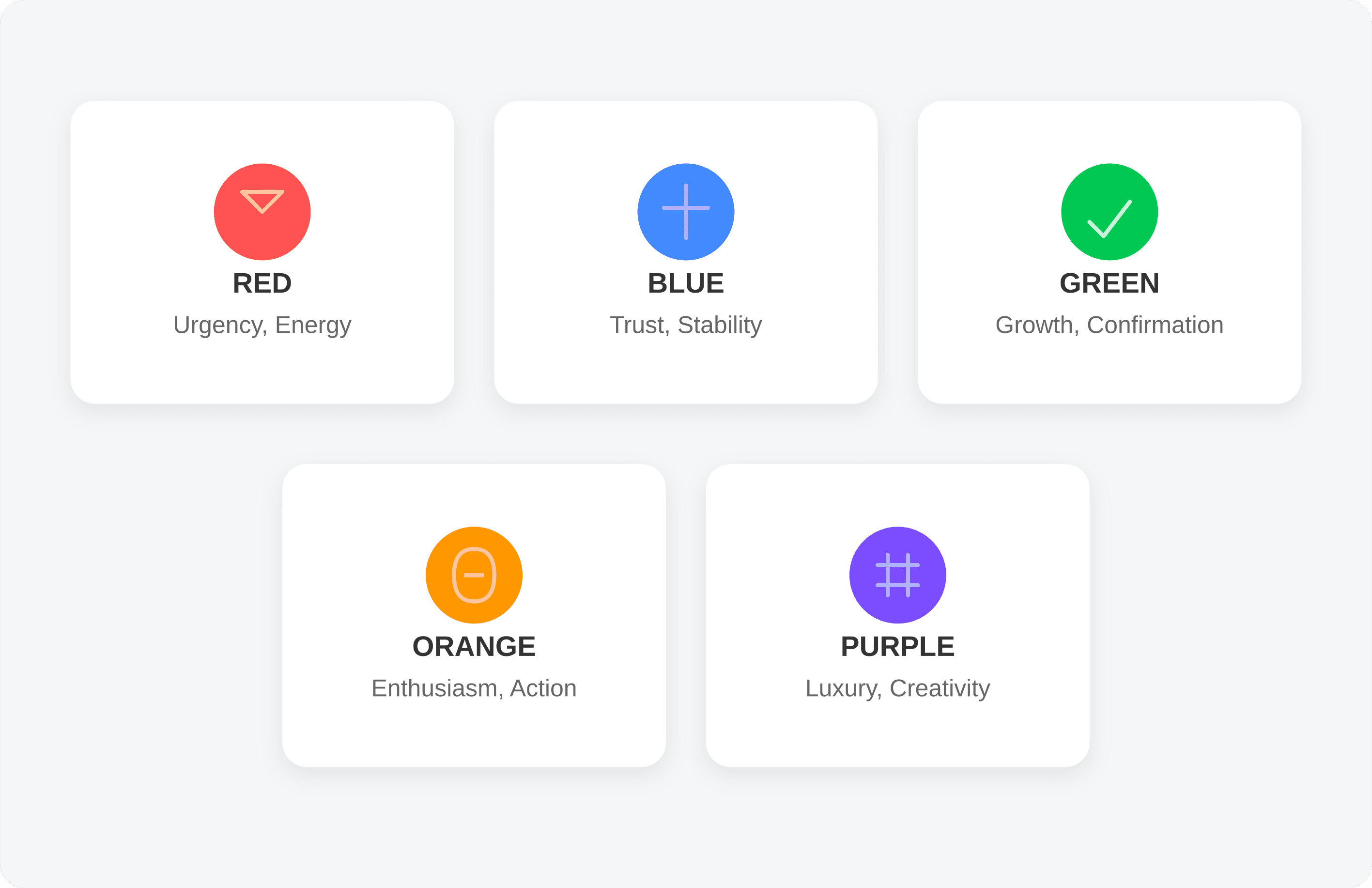
Colors trigger emotional responses that influence decision-making often without conscious awareness. But there's no universal "best color" for conversion. Context, brand alignment, and contrast matter more than whether your button is red or green.
Considerations:
Red: Urgency, energy (CTAs, warnings, food brands)
Blue: Trust, stability (financial services, healthcare, enterprise)
Green: Growth, confirmation (wellness, finance, positive actions)
Orange: Enthusiasm, action (creative industries, younger audiences)
Purple: Luxury, creativity (premium products, beauty)
What matters most is ensuring your CTA has sufficient contrast (minimum 4.5:1 ratio for accessibility) and aligns with your brand.
A blockchain startup wanted green CTAs because "conversion experts say so." But their brand was positioned around premium innovation purple aligned better while still achieving contrast. Conversion improved because they maintained brand coherence, not despite breaking conventions.
Scarcity and Urgency: Use Wisely
Humans value things more when they perceive them as scarce. This principle works but it's the most abused in conversion optimization, often damaging trust for short-term gains.
Fake countdown timers, artificial scarcity ("Only 2 left!" that never changes), and manufactured urgency destroy credibility when users discover the deception. For startups building long-term brands, authentic scarcity is far more powerful.
Ethical applications:
Real-time inventory numbers for limited products
Genuine launch periods for new features
Early-bird pricing with transparent deadlines
Limited spots for beta programs or workshops
Seasonal offerings that authentically end
Instead of fake countdown timers, highlight genuine context: "Your trial expires in 3 days" or "Pricing increases next month for new customers." Transparency builds trust while still motivating action.
The Peak-End Rule
Daniel Kahneman's research revealed that people judge experiences based primarily on two moments: the peak (most intense point) and the end. Duration and average quality matter far less than these emotional anchors.
For startups, this means two strategic opportunities: create delightful peak moments in your user journey, and ensure your process ends on a positive note.
Strategies:
Add unexpected delight after conversion (personalized thank-you video, bonus resource)
Make the final step of onboarding celebratory, not mundane
Create "aha moments" where users experience value quickly
End support interactions with helpful resources, not just problem resolution
Design success states that feel rewarding (animations, congratulatory messages)
For a productivity app, we redesigned their first-task completion experience with a brief animation and encouraging message. This micro-interaction became a peak moment users mentioned in reviews. Day-1 retention improved 22% because that emotional anchor made the entire experience feel positive.
Reducing Friction
Friction isn't just slow loading times or complicated forms it's any element that makes users pause and question their next action. Psychological friction occurs when interfaces create uncertainty, confusion, or distrust.
Common friction points:
Unclear button labels ("Submit" vs. "Get My Free Guide")
Asking for information before explaining why you need it
Multi-step processes without progress indicators
Unexpected costs appearing late in the funnel
Login requirements before users understand value
Jargon that confuses general audiences
Audit your conversion funnel by asking at each step: "Would I feel confident taking this action?"
We helped a dev tools startup increase trial signup by 41% through friction reduction alone: clarifying button labels, adding inline explanations for technical fields, and moving "Why we need this" information next to form fields rather than buried in an FAQ.
Curious how we approach conversion challenges? Check our work with startups across industries.
The Autonomy Paradox
Users want to feel in control of their decisions, yet they also want guidance. This tension creates a design paradox: how do you direct users toward conversion without making them feel manipulated?
The solution lies in autonomy-supportive design guiding users while preserving their sense of choice and agency.
Techniques:
Use suggestive language ("Most users start with…") rather than commands
Offer "Skip" options even for recommended steps
Explain the benefit of actions before requiring them
Allow easy reversal of decisions (undo options, simple cancellation)
Present recommendations as helpful guidance, not mandatory paths
A subscription startup increased conversions by 33% by changing their annual plan CTA from "Switch to Annual" to "See how much you'd save with annual billing" same offer, but the language preserved user autonomy.
Commitment and Consistency
Once people commit to something small, they're psychologically motivated to act consistently with that commitment. In UX, this means designing progressive engagement from micro-commitments to larger conversions.
Strategies:
Start with low-friction actions (email signup) before higher-commitment ones (paid account)
Use multi-step forms that require small commitments before the big ask
Celebrate small wins that reinforce commitment to the journey
Reference previous actions to create consistency motivation ("You're almost there!")
Make early interactions positive so users commit to continuing
An e-commerce startup restructured their checkout by first asking users to customize their product, then collecting payment details. Because users invested time in customization (small commitment), they were more likely to complete purchase cart abandonment dropped 27%.
Designing for Decision-Making Modes
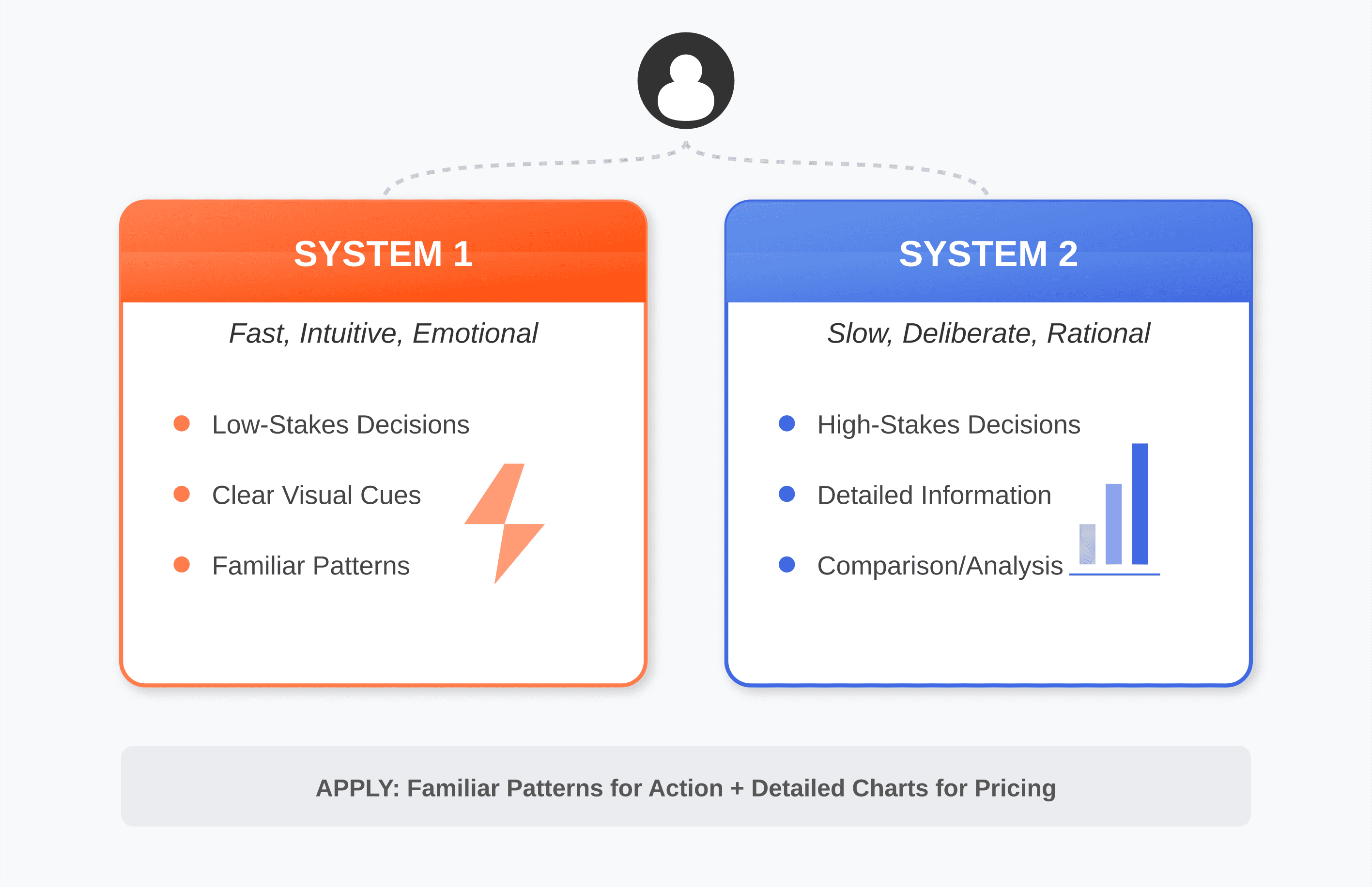
Daniel Kahneman describes two thinking systems: System 1 (fast, intuitive, emotional) and System 2 (slow, deliberate, rational). Effective UI/UX design speaks to both.
For low-stakes decisions or familiar actions, design should enable fast System 1 processing: clear visual cues, familiar patterns, emotional resonance. For high-stakes decisions like purchasing, provide the detailed information System 2 needs to feel confident.
Application:
Use familiar UI patterns for common actions (System 1 can process quickly)
Provide detailed comparison charts for pricing decisions (System 2 analysis)
Lead with emotional benefits, back up with rational features
Make impulsive actions easy, but build in confirmations for irreversible ones
Test whether users need more information or less friction depends on decision weight
For a fintech startup, we designed their dashboard for System 1 efficiency (quick actions visible, familiar patterns), but their investment pages engaged System 2 (detailed information, comparison tools, risk disclaimers) different psychological modes for different user goals.
The Trust Equation
Trust doesn't happen by accident it's engineered through specific design decisions. The Trust Equation provides a framework: increase credibility, reliability, and intimacy while reducing self-orientation.
UI/UX applications:
Credibility: Professional design, grammatical precision, third-party badges, industry certifications
Reliability: Consistent performance, clear error messages, transparent status updates
Intimacy: Conversational microcopy, human photography, personalized experiences
Low self-orientation: User-first content, helpful resources without immediate upsells, transparent pricing
Startups often maximize self-orientation (aggressive CTAs, feature-focused copy, constant upgrade prompts) while minimizing intimacy and reliability. Flipping this ratio dramatically improves conversion because users trust the experience.
Loss Aversion
People feel the pain of loss roughly twice as strongly as the pleasure of equivalent gain. This means how you frame your value proposition significantly impacts conversion.
Loss-framed messaging often outperforms gain-framed:
"Don't miss out on…" vs. "Get access to…"
"Stop losing customers to…" vs. "Increase customer retention with…"
"Protect your data from…" vs. "Secure your data with…"
Context matters. For aspirational products (lifestyle, growth, creativity), gain-framing works better. For protective products (security, insurance, backup), loss-framing resonates more.
A cybersecurity startup increased conversions 38% by reframing their hero message from "Powerful protection for your applications" to "Stop the data breaches that cost companies an average of $4.35M" same product, different psychological trigger.
Putting It Together
Psychology-informed UI/UX isn't about applying every principle everywhere. It's about deploying the right psychological triggers at the right moments in your user journey.
Framework for conversion funnels:
Awareness: Social proof, credibility signals, clear value proposition, emotional connection
Consideration: Detailed information for System 2, comparison tools, reciprocity, testimonials addressing specific doubts
Decision: Reduced cognitive load, clear hierarchy, strategic anchoring, scarcity if authentic
Action: Minimal friction, progress indicators, autonomy-supportive language, commitment building
Retention: Peak-end optimization, celebratory moments, reliable experience, low self-orientation
Small businesses implementing these principles often partner with specialized agencies. Learn more about how UI/UX design drives success for growing companies.
Measuring Psychology
You can't improve what you don't measure. Beyond standard conversion rates, track metrics that reveal psychological effectiveness:
Time to first value: How quickly users experience benefit
Hesitation metrics: Mouse movement patterns, rage clicks, form abandonment points
Trust indicators: Support inquiry rates, pricing page time, checkout abandonment reasons
Emotional response: User testing with facial expression analysis, post-interaction surveys
Decision confidence: Survey users about confidence during conversion
These deeper metrics reveal where psychological friction exists, even when overall conversion rates seem acceptable.
The Ethical Dimension
There's a fine line between persuasion and manipulation. Conversion-optimized design should make good decisions easier, not trick users into unwanted actions.
Guidelines:
Never use fake scarcity, false urgency, or deceptive practices
Don't hide costs, terms, or important information
Make cancellation and reversal as easy as signup
Disclose how you use personal data before collecting it
Design for long-term user value, not just short-term conversion
Startups that prioritize ethical persuasion build sustainable brands. Those that manipulate might see initial bumps but suffer from churn, negative reviews, and damaged reputation far costlier than lower conversion rates.
Understanding the business value of UX design means recognizing that user trust compounds over time.
The Future of Conversion Psychology
Several trends are reshaping how psychological principles apply to UI/UX:
Personalization at scale: AI enables interfaces that adapt to individual psychological profiles showing social proof to conformist users, detailed specs to analytical ones, emotional benefits to intuitive decision-makers.
Voice and conversational interfaces: As interfaces become more conversational, principles of interpersonal psychology (rapport building, active listening, mirroring) become UX considerations.
Ethical AI and transparency: Users increasingly demand to understand how algorithms influence what they see, requiring transparent design that builds trust.
Micro-interactions with macro impact: The psychology of delight through thoughtful animations, haptic feedback, and responsive design becomes even more important as baseline functionality becomes commoditized.
Your Next Steps
Start with these actions:
Audit your current interface against these principles where are you creating unnecessary cognitive load, friction, or mistrust?
Run qualitative user testing asking participants to think aloud as they navigate your conversion funnel their verbalizations reveal psychological stumbling blocks.
Implement one change at a time and measure its impact before moving to the next this reveals which principles matter most for your specific audience.
Study session recordings to identify hesitation patterns, repeated actions, or abandonment triggers.
A/B test psychological variations to understand what resonates with your users.
The startups that win won't just have better products they'll have interfaces that understand human psychology deeply enough to turn browsers into believers, visitors into customers, and transactions into relationships.
Every design decision is a psychological intervention. The question isn't whether you're influencing behavior you already are. The question is whether you're doing it strategically, ethically, and effectively.
Ready to transform your startup's UI/UX with psychological design principles? Explore our case studies to see how we've helped startups across industries optimize for conversion through human-centered design.
Explore all blogs

Jun 18, 2026
Enhancing Customer Service Through UX Design & Strategic Audits
Enhancing Customer Service Through UX Design & Strategic Audits
Jun 16, 2026
User Insights: Unlocking Design Decisions with Data
User Insights: Unlocking Design Decisions with Data

May 31, 2026
User Experience Optimization: Boost Conversion & Retention
User Experience Optimization: Boost Conversion & Retention
May 31, 2026
User Experience Optimization: Fixing Friction for Growth
User Experience Optimization: Fixing Friction for Growth

May 11, 2026
Phone Number Chunking: Reduce Errors & Improve Conversion Rates
Phone Number Chunking: Reduce Errors & Improve Conversion Rates
May 9, 2026
Mastering Gating in UI/UX Design: Convert Without Pushing
Mastering Gating in UI/UX Design: Convert Without Pushing

May 7, 2026
Gestalt Laws Explain Visual Grouping for Designers
Gestalt Laws Explain Visual Grouping for Designers

May 6, 2026
Checklist for Evaluating Microinteractions in UX
Checklist for Evaluating Microinteractions in UX