

Dark Mode, Eye Strain & Nielsen Norman Group's Findings
Brandhero Team
What does Nielsen Norman Group's dark mode usability and eye strain research actually say? We break down the findings, the AAO's position, and what to build.
Nielsen Norman Group's usability research has found that dark mode (negative polarity, light text on a dark background) is often harder to read for sustained tasks than light mode, even though most people say they prefer how it looks. That gap between what users say they want and what their reading performance actually shows is the single most important finding behind any search for "Nielsen Norman Group dark mode usability eye strain," and it's the part most summaries of this topic skip entirely.
This article breaks down exactly what NNG's usability testing says, what it means for readability specifically, what the American Academy of Ophthalmology adds from the clinical side, and how to turn both into actual product decisions. You'll find a side-by-side comparison table, a step-by-step implementation checklist for building dark mode properly, and a testing framework you can run on your own product this week.
What changed in this refresh: we've expanded the Nielsen Norman Group section into three parts covering their methodology, the preference-versus-performance gap, and readability specifically, since that's where most of this page's remaining search traffic comes from. We've also added a direct NNG-vs-AAO comparison table, tightened the FAQ, and added more concrete implementation detail. The core advice, that dark mode is context-dependent rather than universally better, hasn't changed.
What Does Nielsen Norman Group Say About Dark Mode Usability and Eye Strain?
Nielsen Norman Group's usability work has repeatedly found that dark mode is not a straightforward upgrade for readability or eye comfort. Across their testing, negative polarity interfaces tend to be harder to read for sustained tasks than positive polarity, even when the same participants rate the dark version as more visually appealing. The preference and the performance don't line up, and that disconnect is exactly what this section exists to untangle.
Preference vs. Performance: The Core NNG Finding
People consistently say they like dark mode more than they perform on it. In NNG's usability sessions, participants often described dark interfaces as more modern, calmer, or easier on the eyes in the moment, while their actual task completion times and error rates told a different story on reading-heavy screens. This is the single most important thing to take from NNG's research: a satisfaction survey about dark mode and a usability test of dark mode will frequently disagree with each other, so you can't rely on either one alone.
How Did Nielsen Norman Group Actually Test This?
NNG's approach leans on the same methods they use for any interface comparison: give real participants real tasks, in both conditions, and measure outcomes rather than opinions. That typically means timed reading or scanning tasks, error-rate tracking, and separate post-task preference ratings, compared across a light theme and a dark theme of the same interface. The point of separating those measures is exactly the gap described above: a theme can win on stated preference and still lose on measured legibility, and you only catch that if you test both.
The practical lesson for product teams is to stop treating "users prefer dark mode" as proof that dark mode is working for them. Preference tells you what people will choose if offered a toggle. Performance tells you what actually happens once they're using it for twenty minutes straight.
Does Nielsen Norman Group's Research Show Dark Mode Hurts Readability?
For many reading-heavy tasks, yes, their findings lean toward dark mode being harder on readability, not easier. The effect is strongest for users with astigmatism or age-related contrast sensitivity loss, and weakest (sometimes reversed) for users who are light-sensitive or reading in very low ambient light. Readability isn't one fixed outcome of a color choice, it's the result of contrast handling, font weight, and the viewer's own eyes interacting with that color choice. That's also why NNG's broader usability work keeps returning to the same point: legibility depends on font weight, size, and contrast handling far more than on background color alone. A dark theme built with proper contrast tokens can perform fine. A dark theme that's just an inverted light theme usually doesn't.
If you're weighing a UI decision like this, it helps to be clear on where UI choices end and UX outcomes begin, since a color theme is a UI decision but its effect on reading speed and error rate is a UX outcome, and the two need separate testing.
The practical takeaway for teams shipping dark mode: treat it as a design system decision with its own contrast rules, not a color swap. We cover exactly how to do that further down.
Nielsen Norman Group vs. American Academy of Ophthalmology: What Each Actually Says
These two sources get cited interchangeably online, but they're answering different questions. NNG studies usability, how fast and accurately people read and complete tasks in each mode. The AAO studies eye health, whether a theme causes or prevents physical strain and damage. Conflating them is how a lot of "dark mode cures eye strain" claims get started.
Question | Nielsen Norman Group (usability) | American Academy of Ophthalmology (eye health) |
|---|---|---|
Is dark mode easier to read? | Often no, for sustained reading tasks, especially with poor contrast handling | Not their focus; they look at strain causes, not reading speed |
Does dark mode prevent eye strain? | Not directly studied as a health outcome | No; blink rate, distance, and duration cause strain, not screen color |
Do users prefer dark mode? | Frequently yes, even when performance is worse | Not their domain |
Does blue light matter? | Not their focus | Blue light is not considered the primary cause of digital eye strain |
What should teams actually fix? | Contrast tokens, font weight, theme-specific design | Blink rate, viewing distance, the 20-20-20 rule |
The Mechanics: Why Dark Mode Works (and Why It Doesn't)
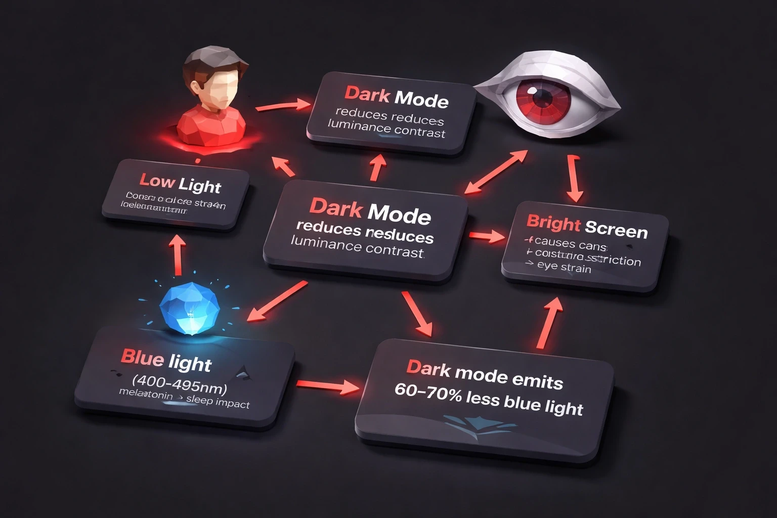
Dark mode cuts eye strain in low light. That's the simple part. It lowers the luminance contrast between your screen and the room around you. When your pupils dilate in a dark room, a bright white screen forces them to constrict rapidly, that's the strain you feel. Dark interfaces keep things stable.
There's also the blue light factor, though it's more nuanced than most articles make it sound. Wavelengths in the blue range are associated with melatonin suppression, and dark mode interfaces generally emit noticeably less blue light than standard white backgrounds because there's less bright surface area to emit it from. Whether that translates into meaningfully better sleep for the average user is still debated, and we go into what the American Academy of Ophthalmology actually says about this below.
But here's where it gets messy. If you have astigmatism, which affects a meaningful share of adults, white text on black creates a "halation effect." The letters bleed light into the dark background. It looks fuzzy. That's why dark mode feels "harder to read" for a lot of people, even though it's technically dimmer.
And if you're over 45? Presbyopia reduces contrast sensitivity. Aging eyes need more contrast to distinguish letterforms, not less. Black text on white (positive polarity) often reads better for this group, no matter the lighting.
When Does Dark Mode Actually Help Eye Strain?
Dim rooms and night use. Users consistently report less fatigue running dark interfaces in evening light compared to a bright light-mode screen in a dark room. If you're building UI/UX for digital products, think about automatic theme switching based on time or ambient light sensors rather than forcing users to remember to toggle it.
OLED screens. True black pixels consume far less power than lit pixels. On mobile-first experiences like financial apps, that's a real battery benefit on top of the comfort argument.
Long reading sessions, for some users. Some people reading for extended periods in controlled, dim environments prefer dark interfaces. News readers, documentation sites, and messaging apps tend to see stronger engagement when they offer a theme choice rather than forcing one.
Light sensitivity. For people with photophobia, migraines, or those recovering from eye surgery, dark mode isn't a preference, it's an accessibility requirement. Offering theme controls is part of designing with empathy, an idea we explore more in how human judgment still leads in design decisions AI can't make.
When Does Light Mode Win?
Bright daylight conditions favor light mode. If you're outside or in a well-lit office, screen reflectivity kills dark interface legibility. You end up cranking the brightness anyway, negating the whole point.
Tasks requiring color accuracy or fine detail, photo editing, proofing, design review, work better in light mode. Your cone cells need adequate light to discriminate colors properly, and low-light viewing conditions measurably reduce color discrimination compared to well-lit ones.
Reading comprehension is another one. For long documents, many readers find positive polarity (dark text on light) easier to sustain attention on, and proofreading in particular tends to go better in light mode. It's simply easier to catch errors in high-contrast, familiar reading conditions.
Age matters here too. For products targeting users over 50, light mode should probably be the default. Demographic realities like this should drive interface decisions, not just trends, the same way they shaped our approach on a project like YogaVision.
Dark Mode vs Light Mode: Quick Reference
Condition | Better mode | Why |
|---|---|---|
Low light or nighttime use | Dark | Lower screen-to-room contrast, less pupil strain |
Bright daylight or well-lit office | Light | Less glare and reflectivity issues |
Astigmatism | Light | Avoids halation and text bleed |
Age 45+ (presbyopia) | Light | Higher contrast sensitivity needed |
OLED mobile devices | Dark | True black pixels draw less power |
Long-form reading, proofing | Light | Better sustained attention and error detection |
Photophobia or migraine sensitivity | Dark | Reduces light-triggered discomfort |
Color-critical work (editing, design review) | Light | More accurate color discrimination |
What Does the American Academy of Ophthalmology Recommend About Dark Mode?
The American Academy of Ophthalmology does not recommend dark mode as a fix for eye strain specifically. Its position, in short: screens themselves aren't damaging your eyes, and blue light from a phone or laptop is not the primary cause of digital eye strain. What actually causes the discomfort people call "eye strain" is a combination of reduced blink rate, poor viewing distance, and long uninterrupted focus, none of which a color theme solves on its own.
Where the AAO's guidance does touch dark mode is around evening use and sleep. Reducing screen brightness and warm-toned or dimmed displays in the hours before bed can help some people wind down, and dark mode is one way to get there, but it's the brightness reduction doing the work, not the color inversion itself. The Academy's standing advice for eye strain is still the 20-20-20 rule: every 20 minutes, look at something 20 feet away for 20 seconds.
The practical implication for product teams: don't market dark mode as an eye-health feature on its own. Pair it with sensible defaults, lower default brightness at night, sane font sizes, adjustable contrast, and let dark mode be one part of that system rather than the whole pitch.
How to Design Dark Mode Interfaces Without Making Eye Strain Worse
Don't just invert colors. That's lazy and it looks terrible.
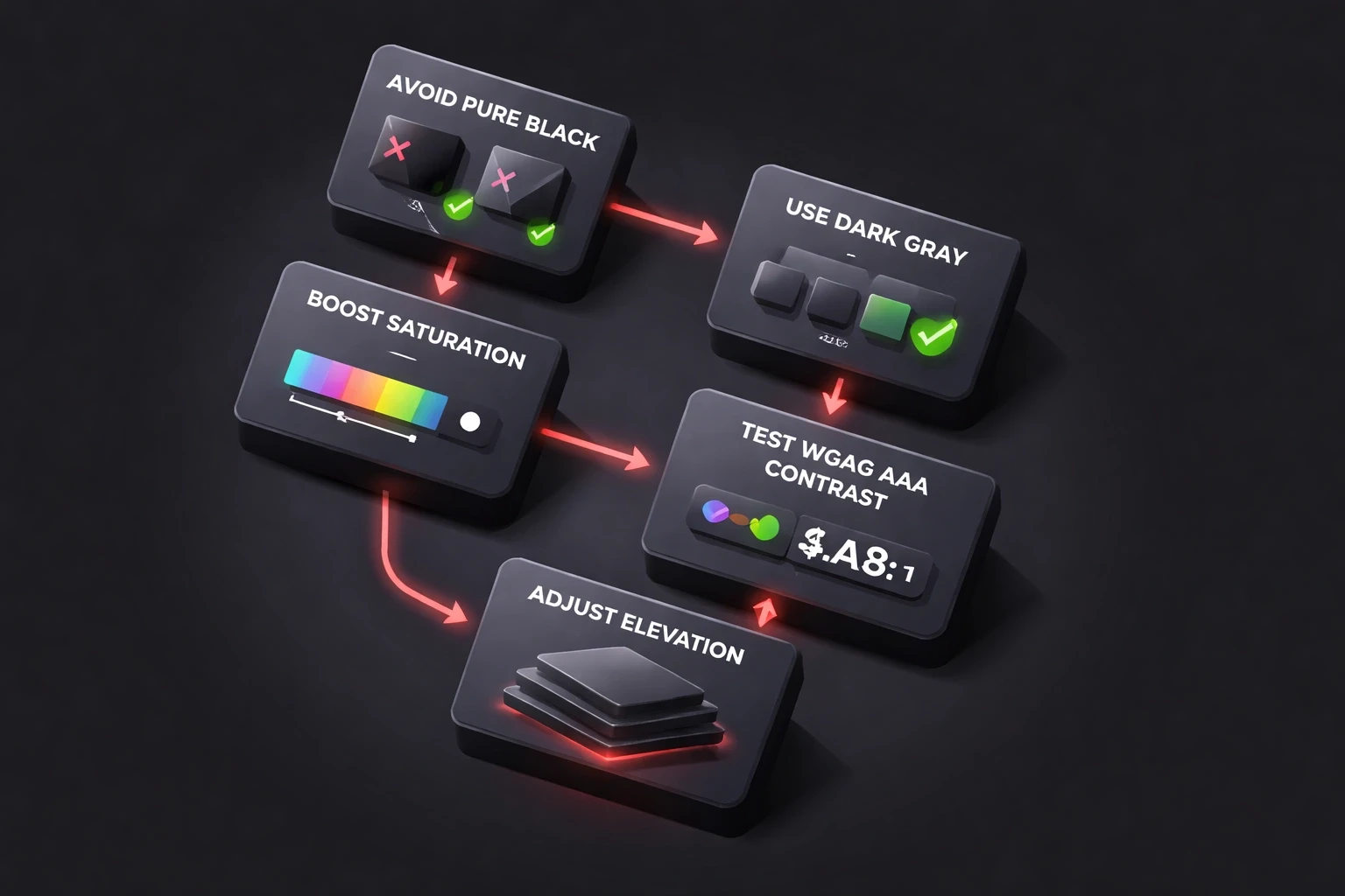
Skip the pure black. #000000 creates too much contrast against light text, which causes halation. Use dark grays like #121212 to #1E1E1E instead. Google's Material Design guidelines have long recommended this exact range because a slightly lifted dark gray reduces strain while keeping the "dark" feel.
Don't invert colors blindly. Reds and oranges get muddy on dark backgrounds. Boost saturation slightly and shift the hue a touch to maintain visual hierarchy. Test for WCAG AAA contrast ratios (7:1 minimum for body text) while you're at it, WCAG 2.2 is still the current standard as of this refresh.
Flip your elevation logic. In light mode, shadows create depth. In dark mode, elevated surfaces get lighter, not darker. Cards should sit a shade lighter than the background, around #1E1E1E against a #121212 base, rather than relying on a drop shadow that barely shows up.
Build adaptive color tokens, not two static palettes. Create semantic tokens that shift per theme, a primary button might be #0066FF in light mode but a lighter #4D94FF in dark mode to preserve the same perceived brightness.
Keep grouping and hierarchy legible in both themes. Dark UI removes some of the visual cues (shadow, subtle borders) that light UI leans on, so proximity, alignment, and grouping have to do more of the work. This is exactly where Gestalt principles of visual grouping earn their keep in a dark interface.
Respect the system setting. Use
prefers-color-schemein CSS. If a user has their OS set to dark, your app should generally follow suit unless you have a specific, tested reason not to.
You see this level of care show up in modern B2B interfaces that treat dark mode as its own design system rather than a filter over the light one.
Why Neither Mode Actually Fixes Eye Strain on Its Own
Here's the thing: eyes evolved for reflected light, not emitted light. Neither screen mode is "natural." Both create artificial viewing conditions your visual system has to accommodate.
And neither mode fixes the fundamental problem. Blink rate drops substantially during screen use regardless of theme, and that's the real driver of dryness and fatigue for most people. The 20-20-20 rule, every 20 minutes, look 20 feet away for 20 seconds, matters more than your color palette.
Individual variation is huge. Some people see better in dark mode due to specific refractive errors. Others get headaches within minutes. Designers argue about this constantly. Forcing one option creates friction. Choice matters more than being right about which mode is "better."
How Do You Test Whether Dark Mode Actually Helps Your Users?
Run both themes through the same test, not separate impressions of each. Here's a practical sequence:
Set a real reading or task scenario. Test both themes with real people doing actual tasks for 30 or more minutes, not a quick glance. Measure completion times and error rates.
Watch for the brightness tell. If users crank up brightness in dark mode, that's a sign the theme is working against them, not for them, no matter what they say afterward.
Separate preference from performance in your notes. Ask what they liked, but score what they actually did. This is the same preference-versus-performance gap NNG's own testing keeps surfacing, and it's why asking open, non-leading questions in research sessions matters more than it sounds.
Track theme adoption and session behavior in analytics. If dark mode users show shorter sessions or higher bounce, dig into why before assuming it's the theme itself, it might be a contrast issue in one specific screen. Treat it like any other conversion friction problem rather than a design taste debate, and lean on real usage data over assumptions when you decide what to fix.
Audit accessibility on both themes, not just one. Run contrast checkers on both. Check that color-coded information is still distinguishable in dark mode specifically, since hue shifts can flatten differences that were obvious in light mode. Test with simulated vision conditions, cataracts, color blindness, low vision.
Measure battery impact where it's real. On mobile, measure battery drain across themes on OLED devices specifically, the power savings argument doesn't hold on older LCD screens.
Dark Mode Adoption in 2026: The Numbers and Why They're Misleading
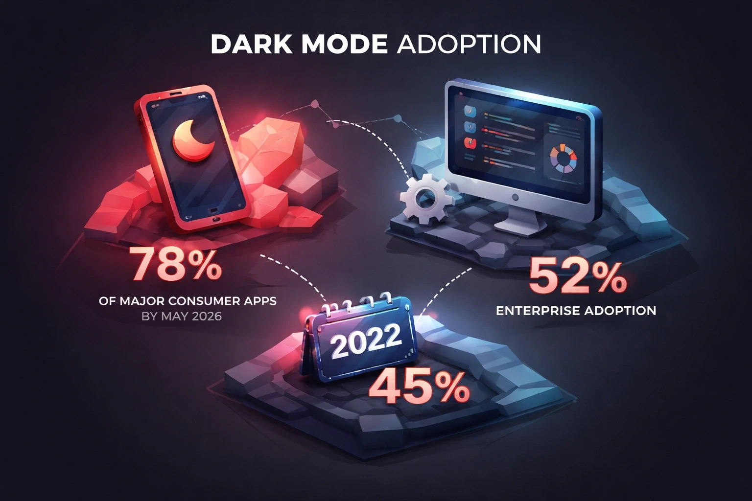
By 2026, dark mode has become the norm for major consumer apps rather than the exception, it's genuinely hard to find a widely used consumer app that doesn't offer it. Enterprise software still lags well behind, mostly because legacy systems weren't built with theming architecture in mind, and professional tools built for detail work in daylight offices often still default to light mode for good reason.
Apple, Google, and Microsoft all ship dark mode specs as a standard part of their design systems now, and design tools like Figma generate theme variants automatically. The tooling barrier that used to slow this down is essentially gone.
But here's the catch: novelty distorts the picture. A large share of users who enable dark mode try it for a week and quietly switch back once they realize certain content is harder to read in it. The users who stick with dark mode long-term skew younger and more technical, developers and heavy app users in particular. That's worth remembering before you assume high initial adoption means high satisfaction.
Is Dark Mode an Accessibility Requirement?
For some users, yes, effectively. WCAG 2.2 doesn't mandate dark mode itself, but it requires sufficient contrast in whatever theme you ship, and a dark mode with a weak contrast ratio fails harder than a light mode that properly meets the 7:1 standard for enhanced contrast.
Put the toggle somewhere obvious. Don't bury it three menus deep. Users with light sensitivity need it fast, sometimes mid-session when migraine symptoms hit.
Better yet: offer automatic switching based on ambient light sensors or time of day. iOS and Android both expose these APIs, and it works well in practice. We saw this succeed with community platforms where usage contexts varied wildly across the user base.
Is Dark Mode Just About Eye Comfort, or Is There More to It?
There's more to it. Dark mode has cultural weight. Developer tools, creative software, and gaming platforms lean dark for brand reasons, not eye comfort. It signals "professional" or "technical" in those contexts regardless of the actual usability tradeoffs.
Regional differences exist too. Some markets that rely on dense, complex characters retain light mode more often because those glyphs generally need higher contrast to stay legible. Latin-alphabet interfaces tend to handle reversed polarity a bit more gracefully.
And sometimes it's just taste. Some people find dark mode moody or depressing. Others can't focus without it. User psychology around color and mood drives theme preference as much as biology does, which is one reason we spend so much time on psychological UI/UX design and human-centric strategy when we build product interfaces.
So What Should You Actually Do About Dark Mode?
Default to light mode unless you're building dev tools, entertainment apps, or something designed explicitly for late-night use. Add dark mode as a real, tested feature, not a checkbox you tick to look modern. A badly implemented dark mode hurts credibility more than having no dark mode at all.
Test with real people in their actual environments. Watch them use it at night. See how they hold their phones. Ask them what feels off, and don't assume their answer will match the usability data, sometimes it won't, and that gap is useful information.
Build flexibility into your branding system from the start. That vibrant orange logo on white might look garish on charcoal. You need adaptive assets from day one, not a scramble to fix it after launch. Getting this right isn't purely cosmetic either, theme decisions touch retention and conversion, the same metrics covered in our guide to UX and business ROI.
Keep the layout consistent. Only color should change. If your interface shifts structure between themes, users get disoriented. They expect the same product, just rendered differently.
The Bottom Line on Dark Mode and Eye Strain
There is no universal answer. Dark mode helps if you're under 40, have good eyesight, and are reading in a dim room on an OLED screen in the evening. It hurts if you're older, have astigmatism, or are working in bright daylight on detail-heavy tasks.
The real question isn't "is dark mode better?" It's "does dark mode help my users in their context?" You have to know who uses your product, when, where, and for what. Generic advice, including some of what's floating around the internet on this exact topic, ignores individual variation.
Eye strain comes from screen distance, brightness, blink rate, and duration more than color scheme. Offer choice. The most eye-friendly interface adapts automatically, shifting themes based on time and environment while letting users override it. That flexibility mirrors how our visual system actually works. Support human adaptability. Don't force uniformity.
Frequently Asked Questions About Dark Mode and Eye Strain
What does Nielsen Norman Group say about dark mode usability and eye strain?
Nielsen Norman Group's usability research has found that dark mode (negative polarity) is often harder to read for sustained tasks than light mode, even though users frequently say they prefer how it looks. Preference and reading performance don't always align, so usability should be tested separately from stated preference.
Does Nielsen Norman Group's research show dark mode hurts readability?
For sustained reading tasks, their findings lean toward dark mode hurting readability for many users, particularly those with astigmatism or age-related contrast sensitivity loss. The effect comes from font weight, size, and contrast handling, not the background color alone, so a well-built dark theme can still perform fine.
What does the American Academy of Ophthalmology recommend about dark mode?
The AAO doesn't recommend dark mode as an eye-strain fix specifically. It maintains that screens and blue light aren't the main cause of digital eye strain, blink rate and viewing habits are, and it continues to recommend the 20-20-20 rule regardless of which theme you use.
Is dark mode actually better for your eyes?
Sometimes. It reduces strain in low light and on OLED screens at night, but it can make text harder to read for people with astigmatism or age-related contrast sensitivity loss. There's no single answer, it depends on lighting, the individual's eyes, and the task.
Should dark mode be the default in a new product?
Usually not, unless your product is a developer tool, entertainment app, or something built specifically for evening use. Light mode is the safer default for most general audiences, with dark mode offered as a well-built, tested option rather than a token feature.
Why do users say they prefer dark mode even when it tests worse?
Stated preference reflects aesthetics and mood in the moment, not measured reading speed or error rate over time. Nielsen Norman Group's testing separates the two on purpose, because relying on preference alone would lead teams to ship themes that look good but quietly slow users down.
Explore all blogs

Jun 18, 2026
Enhancing Customer Service Through UX Design & Strategic Audits
Enhancing Customer Service Through UX Design & Strategic Audits
Jun 16, 2026
User Insights: Unlocking Design Decisions with Data
User Insights: Unlocking Design Decisions with Data

May 31, 2026
User Experience Optimization: Boost Conversion & Retention
User Experience Optimization: Boost Conversion & Retention
May 31, 2026
User Experience Optimization: Fixing Friction for Growth
User Experience Optimization: Fixing Friction for Growth

May 11, 2026
Phone Number Chunking: Reduce Errors & Improve Conversion Rates
Phone Number Chunking: Reduce Errors & Improve Conversion Rates
May 9, 2026
Mastering Gating in UI/UX Design: Convert Without Pushing
Mastering Gating in UI/UX Design: Convert Without Pushing

May 7, 2026
Gestalt Laws Explain Visual Grouping for Designers
Gestalt Laws Explain Visual Grouping for Designers
May 6, 2026
Checklist for Evaluating Microinteractions in UX
Checklist for Evaluating Microinteractions in UX